
Our Blog
Behind The Dashboard
Behind every great decision is great data. In this blog, we dive into how to build better dashboards, avoid common mistakes, and make your reports stand out. From practical Power BI tips to advanced techniques, we’re here to make data visualization easier and more effective.
Thank you! Your submission has been received!
Oops! Something went wrong while submitting the form.

Business
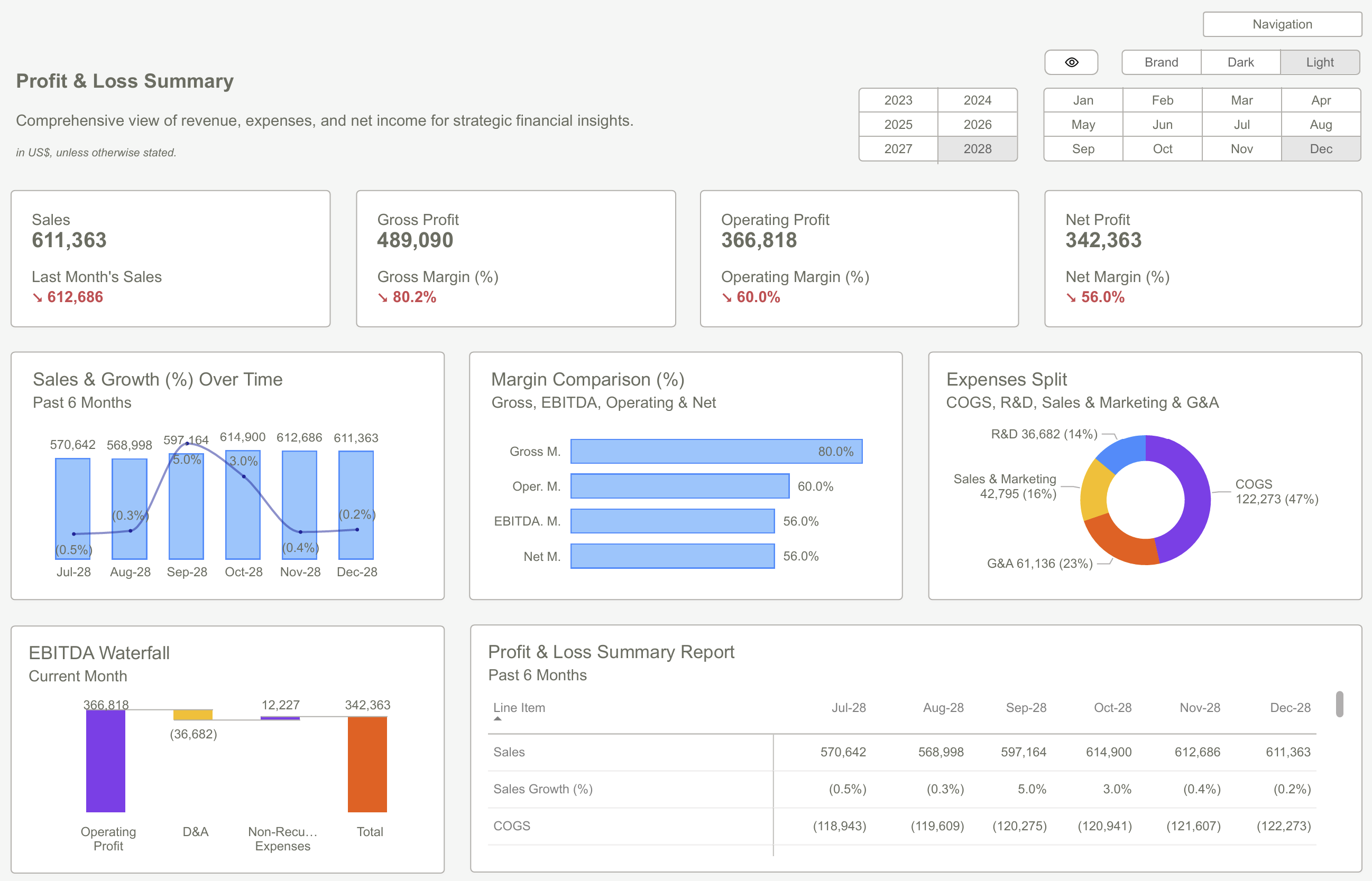
Why Power BI Reporting Dashboards Are Key to Scaling Small Businesses?
Use Power BI Reporting Dashboards to promote smarter growth. Simplify data, find insights, and make sure decisions that will help small organizations grow more quickly with greater control and clarity.

Design
Power BI Dashboard Examples: Essential Design Patterns That Users Love [2025 Guide]
A practical guide to dashboard types, features, and design patterns that make Power BI dashboards work in the real world.

Business
How to Design PowerBI Dashboards That Actually Drive Business Decisions
How to Design PowerBI Dashboards That Actually Drive Business Decisions
Templates
5 Real Power BI Dashboard Examples (With Screenshots & Use Cases)
See how real professionals use Power BI dashboards to manage finances, track performance, and gain insights—instantly.

KPIs
Financial Power BI Dashboard Guide: Turn Complex Data Into Clear Insights
Master the art of creating a Financial Power BI Dashboard with our guide. Learn how to streamline report development, enhance data insights, and boost your organization’s financial reporting efficiency.
Templates
Power BI Reporting Templates: A Step-by-Step Blueprint for Beginners [2025]
Discover how Power BI Reporting Templates can simplify reporting, save hours of work, and help beginners build professional dashboards with ease. Follow our step-by-step guide to start your data journey today.

Templates
How to Build Your First Power BI Reporting Dashboard
Learn how to plan, design, and build your first Power BI Reporting Dashboard—from identifying key business questions to creating interactive visuals that drive smarter, data-informed decisions.

Templates
How to Create Power BI Templates That Save Hours of Development Time
Learn how to build smart Power BI templates that save hours, boost consistency, and streamline reporting—so your team can focus on insights instead of repetitive report development.

Data
How Does a Power BI Interactive Dashboard in Dark Mode Improve Data Visualization and User Experience?
Improve data clarity and user comfort with a Power BI interactive dashboard in dark mode—reduce eye strain, boost contrast, and create a sleek, modern look for better decision-making.
Subscribe to our newsletter
Leave your details below to stay up-to-speed with latest blogs, updated and new products' launches.