
Power BI has managed to keep its leadership position in Gartner's Magic Quadrant for Analytics and Business Intelligence Platforms for nearly 17 years. PowerBI dashboards continue to prove their worth when making business decisions.
The human brain processes visual information better than text. Many dashboards miss this advantage completely. PowerBI dashboard examples often show cluttered displays with unnecessary information that make it difficult to extract meaningful insights. Your decision-making process becomes more effective when you limit visuals to eight per report page and establish a clear visual hierarchy.
You might be searching for PowerBI dashboard samples or building your first business intelligence tool. We'll help you design dashboards that look professional and shape business decisions effectively. Let's take a closer look at everything in dashboard design that will turn your data into practical insights.
Define the Dashboard’s Purpose and Audience
A crucial first step comes before I create any PowerBI visual: defining what the dashboard needs to do. The best PowerBI dashboards go beyond attractive visuals. They serve as tools that answer specific business questions and help make decisions.
Define the Dashboard's Purpose and Audience
Identify the business question you want to answer
Clear business questions are the foundations of any effective PowerBI dashboard. My experience shows that dashboards without a defined purpose rarely lead to action.
Ask yourself these questions:
- What business problem needs solving?
- Which decisions will this dashboard help make?
- What metrics matter most for this challenge?
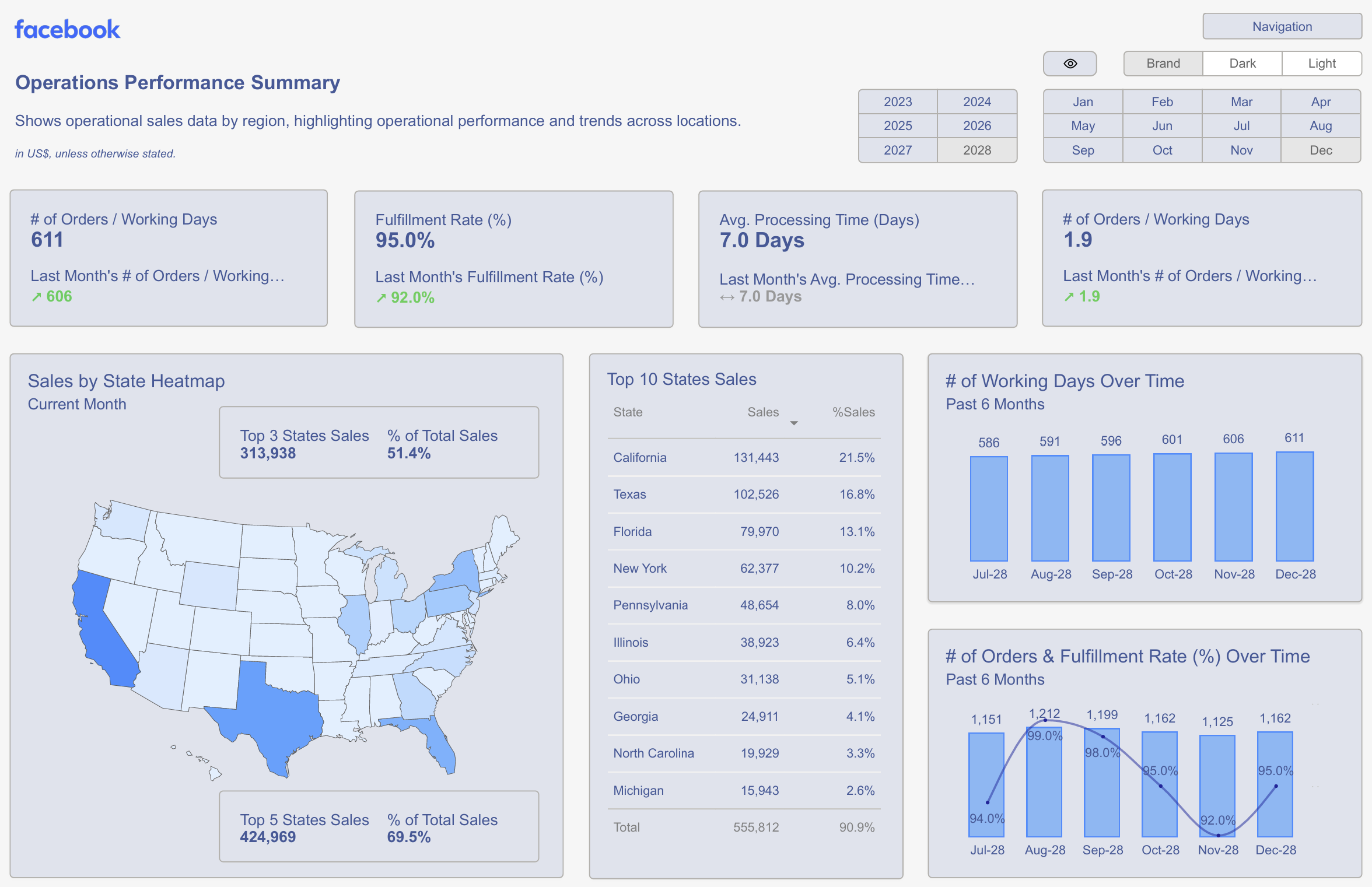
To name just one example, see how a sales dashboard might tackle questions like "Which products bring the highest profit margins?" or "Where do our sales teams perform best?" A marketing dashboard could focus on "Which campaigns give the best ROI?" or "How does our conversion funnel work across channels?"
Successful PowerBI dashboards focus on one main purpose rather than trying to answer every question. You might want to build separate dashboards for different business functions instead of a huge "master dashboard" that attempts everything at once.
On top of that, it helps to set clear metrics for the dashboard's success. You'll know your PowerBI dashboard works when meetings become more efficient, decisions happen faster, or you see specific outcomes like better conversion rates and lower costs.
Understand who will use the dashboard and how
Knowing your audience matters just as much - who needs this dashboard and how they'll use it. Users have different needs:
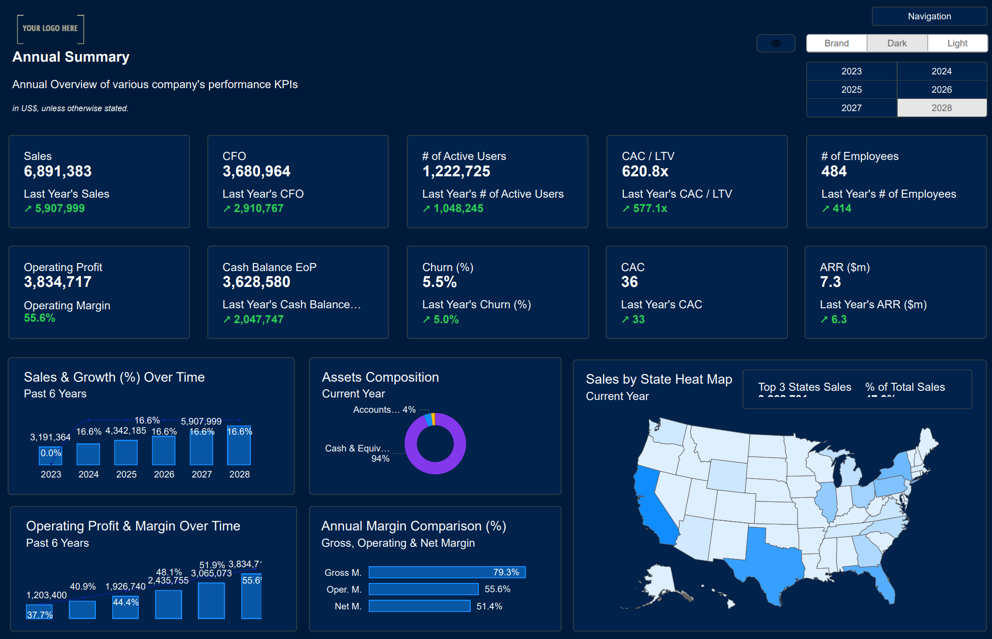
- Executives need high-level KPIs and summaries to spot trends quickly
- Department managers look for detailed metrics about their area
- Analysts must explore data deeply and investigate further
Getting end users involved early in planning makes them more likely to use the dashboard. Talk to typical users and ask:
- What data-driven decisions do you make often?
- What information would help your work?
- How do you get this information now?
Your audience's technical skills should shape your approach. Some users understand complex visuals easily, while others need simpler views. This affects your choice of visuals and how interactive you make the dashboard.
Think about where users will view your dashboard. Will they use desktop screens for deep analysis, or do they need mobile views for quick meeting checks? The best PowerBI dashboards account for these usage patterns.
Note that even beautiful dashboards fail when users can't get value from them. Keep checking your purpose and audience needs to ensure every element helps users do their job better.

Choose the Right Metrics and Data Sources
Relevant metrics and quality data create the foundation of an effective PowerBI dashboard. You need to choose the right measurements and verify their reliability after determining your dashboard's purpose.
Choose the Right Metrics and Data Sources
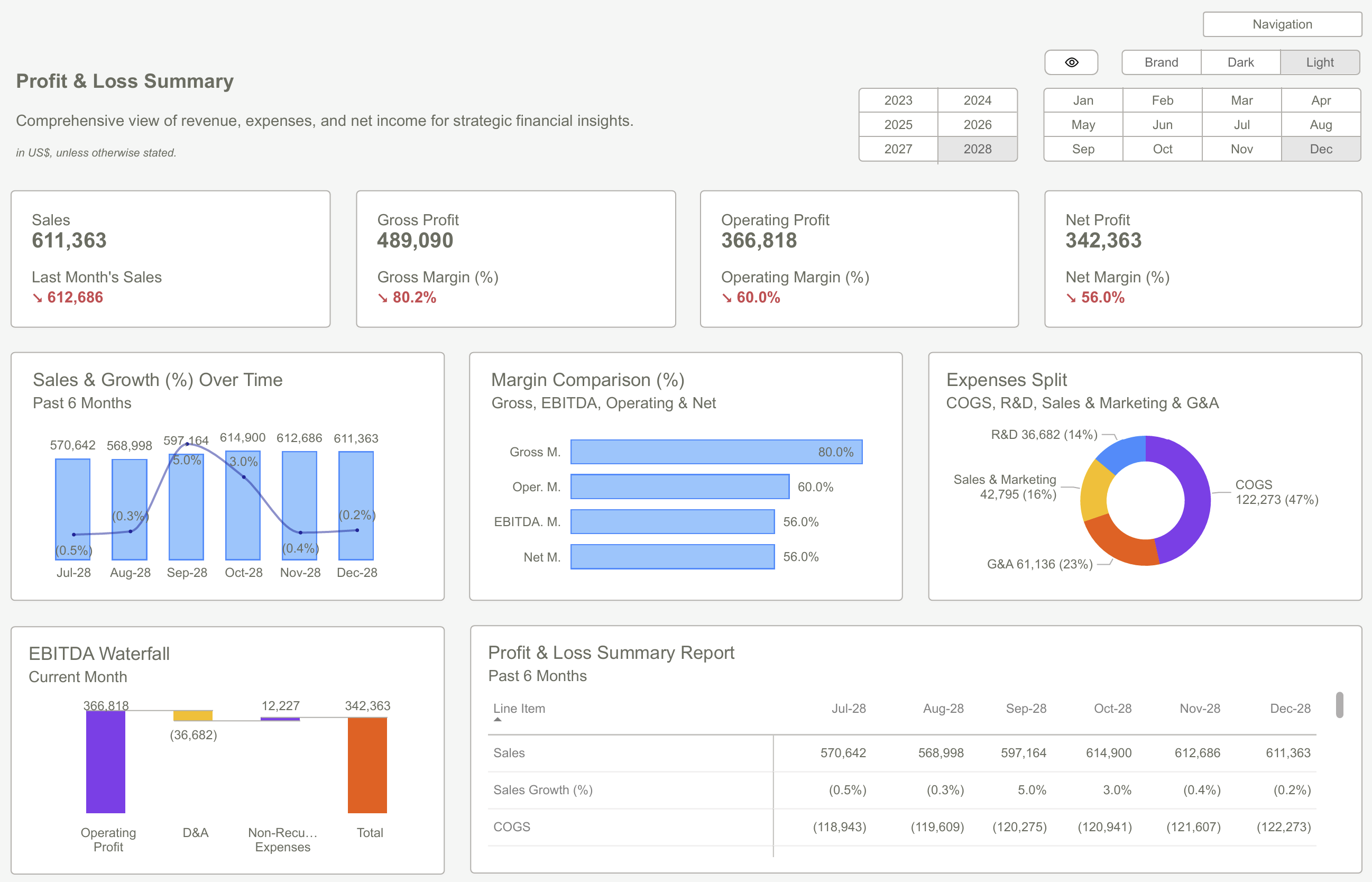
Select KPIs that line up with business goals
A PowerBI dashboard's strength comes from knowing how to communicate progress through carefully chosen Key Performance Indicators (KPIs). A KPI shows progress toward measurable goals visually [1]. KPIs excel at answering vital questions like "What am I ahead or behind on?" and "How far ahead or behind am I?" [1].
I make sure each KPI directly shows business objectives. Every KPI needs three key parts:
- A base measure that gives a value
- A target measure or value
- A threshold or goal [1]
To cite an instance, I might create a KPI that tracks monthly sales figures against quarterly targets if revenue growth is the main goal. This helps decision-makers quickly see if their sales team will meet their targets.
Your KPI's context plays a big role. Some metrics work better when higher (like earnings), while others work better when lower (such as wait times) [1]. Your dashboard should clearly show this difference to prevent confusion.
You can create a scorecard in PowerBI that shows goals and tracks them against key business targets in one view. Teams can stay accountable, aligned, and visible with this all-encompassing approach [2].
Ensure data quality and consistency
KPIs become useless when built on unreliable data. Data quality management needs attention at every analysis stage - from importing data to creating final reports [3].
Power BI has built-in tools that help monitor and boost data quality. I often use these tools in Power Query Editor:
- Column Quality – Shows the percentage of valid, error, and empty values in columns [4]
- Column Distribution – Shows how often different values appear and helps find outliers [4]
- Column Profile – Gives detailed stats like unique values count [4]
These tools help me spot problems like incomplete entries, formatting errors, or unusual values that could affect analysis. I can quickly find and fix issues if percentage columns show values outside the normal 0-100% range [3].
Bad data quality can cause serious problems. Companies might draw wrong conclusions, lose money, damage their reputation, and undervalue their efficiency [3]. Setting up strong data validation rules becomes vital.
A complete data validation process works best. I set up validation rules in Power BI to check data range, format, completeness, and uniqueness [5]. Regular quality checks ensure information meets standards before it goes into dashboards [5].
Power Query offers many ways to clean data that I use to:
- Fix typos or standardize names by replacing values
- Get rid of duplicates
- Keep data types consistent [3]
High data quality needs both good tools and a solid quality management system. Power Query, dataflows, and visualization features help me manage data quality throughout analysis. This creates PowerBI dashboards that drive accurate business decisions.

Design the Layout for Clarity and Flow
Your PowerBI dashboard's layout shapes how users interact with and understand your data. The arrangement of visuals comes first before adding complex features. This organization of elements defines how people see information.
Design the Layout for Clarity and Flow
Use a logical visual hierarchy (Z-pattern or F-pattern)
Your PowerBI dashboard elements should guide users naturally through the information. Two patterns stand out in dashboard design:
The Z-pattern matches how western readers scan content—from top left to top right, then diagonally down to the bottom left, and finally across to the bottom right. This pattern works great for dashboards that need clearly defined sections and sequential data relationships.
The F-pattern came from eye-tracking studies of web users. This approach suggests:
- Critical KPIs and headline figures belong in the top horizontal section
- Most valuable visualizations fit in the upper portion of the dashboard
- Important information stays away from the far right side
My dashboard creation experience shows the top-left quadrant gets the most attention. That's why your most critical metrics—revenue, sales, or profit figures—belong there.
Group related visuals together
Power BI lets you combine multiple visuals and handle them as a single object through its built-in grouping feature. You can group selected elements (using CTRL+click) through the Format menu. This makes moving, resizing, and working with layers in your report easier.
The organizational principles go beyond technical grouping:
- Proximity: Related metrics stay close to each other
- Similarity: Related elements connect through consistent colors, fonts, and styling
- Enclosure: Groups stand out with borders or background colors
Grouped visuals can hide or show together. This makes your dashboard more interactive without overwhelming users.
Avoid clutter and unnecessary visuals
PowerBI dashboards show important information quickly. The urge to include every possible metric or visualization should stay in check.
Ways to minimize clutter:
- Keep your dashboard on a single screen (no scroll bars)
- Charts should skip unnecessary data labels when values make visual sense
- Chart scales and dimension ordering stay consistent
- Whitespace creates visual breathing room
- Visual flow needs purpose rather than random chart placement
A good layout balances information density with clarity. Successful PowerBI dashboards show essential information first. They create paths to deeper analytical insights through drilldowns or tooltips instead of cramming everything onto one screen.
Select Visuals That Match the Data
Picking the right visualization types is a vital step to turn your data into practical insights. My experience building PowerBI dashboards over the last several years has taught me that matching visuals to your data type separates confusing reports from those that users understand right away.
Use bar and line charts for comparisons and trends
Bar and column charts sit at the top of our visual perception scale. They work best to compare values across different categories. People can accurately estimate values based on bar heights, especially with a common baseline. Bar charts give you the clearest picture when you need to compare products, regions, or departments.
Line charts shine at showing trends over time. They highlight the overall shape of value series and let decision-makers spot patterns, seasonality, and long-term trends quickly. You won't find a better option than line charts to display financial projections or track performance.
Sometimes you'll need to combine both types. Combo charts blend column and line visualizations to help compare different metrics faster. This works great when you want to show relationships between measures that have different value ranges, like sales quantity and profit margin.
Avoid overusing pie charts and gages
Pie charts remain controversial among data visualization experts, despite their popularity. Use them much of either and only with fewer than eight categories. Most people can't accurately estimate values in a pie chart, except those that make 90° angles or their multiples.
The same goes for gage charts - use them selectively. They look appealing to show progress toward specific goals or display percentile measures. However, they take up too much dashboard space to show limited information.
Use tooltips and labels to add context
Tooltips give you an elegant way to add contextual information without making your dashboard messy. PowerBI lets you customize tooltips to show additional data points when users hover over visualizations. This keeps your interface clean while still providing deeper insights.
You can create tooltip pages with multiple visualizations that appear when users hover over data points to add more context. These might include trend charts, demographic breakdowns, or top product listings that relate to the selected data.
Note that each visualization should support the business decisions you identified in your dashboard planning phase. A thoughtful match between visuals and data types creates PowerBI dashboards that drive real action.
Test, Iterate, and Validate with Users
PowerBI dashboard creation doesn't stop at the original design. The real work starts after building your first version. You need to perfect your dashboard through systematic testing and user validation.
Gather feedback from real users
Working with end-users to evaluate dashboards creates more useful designs and adoption rates increase by a lot increases solution adoption [6]. Microsoft documentation shows that users who take part in early development tend to endorse the solution and guide their community to use it effectively [6].
Several methods exist for collecting user feedback:
- Usage metrics reports provide one-click access to key metrics about how end users interact with your content [7]
- Power BI User Feedback Pro enables collecting ratings (1-5 stars) and detailed comments directly within dashboards [8]
- Structured user interviews let you observe users' dashboard interactions and note their difficulties [6]
The iterative dashboard development process enables users to build confidence and understanding naturally with each iteration [9].
Test on different devices and screen sizes
PowerBI dashboards must work well on different devices. Your testing should verify that visuals load quickly and navigation stays continuous on different screen sizes [10]. This becomes crucial when your audience uses mobile devices frequently to access dashboards.
In fact, usage metrics can help you decide if mobile layouts are worth building by showing the number of users who access your content through mobile apps versus web browsers [7].
Refine based on usability and business effect
The collected feedback helps improve your dashboard's effectiveness. Dashboards should adapt as business needs change [11]. You can justify your investments and focus on widely-used content by monitoring usage patterns regularly [7].
Usage metrics can be sliced by report page to find which sections provide the most value and which need redesign or removal [12]. The dashboard testing process works best as continuous improvement rather than a one-time task.
Note that effective dashboards help users make better decisions rather than just looking good. Your PowerBI dashboard will drive business decisions effectively when you gather feedback, test across platforms, and measure business effect consistently.
 Essential KPIs in Finance for Power BI Dashboards
PowerBI dashboards work as essential tools for analytical decision making that deliver results with thoughtful design. My experience shows successful dashboards follow core principles: a clear purpose, carefully chosen metrics, logical layouts, proper visualizations and continuous testing with users.
Building effective PowerBI dashboards needs more than just technical expertise. Your audience's decision-making requirements should shape the entire dashboard design process. On top of that, strict data quality standards and the right visualizations will give you practical insights you can trust.
Dashboard design works best as an ongoing process. Testing with real users and refining based on actual usage patterns helps create dashboards that influence business decisions. Clean visuals, logical information flow and focus on key metrics will align with your business objectives.
These design principles can turn your PowerBI dashboards from basic data displays into valuable decision-making tools. Well-designed dashboards help teams make quick, informed choices and bring measurable value to your organization.
Download Our Templates Now to Save Days of Design and Guessing Your KPIsGet Started >
Subscribe to our newsletter
Stay ahead with the latest insights, tips, and trends in PowerBI and data visualization.
Join the network that is unlocking the full potential of their data - one dashboard at a time.
Related posts
Explore more insights and tips with these related posts curated just for you.

Why Power BI Reporting Dashboards Are Key to Scaling Small Businesses?

Power BI Dashboard Examples: Essential Design Patterns That Users Love [2025 Guide]