Power BI Dashboard Examples: Essential Design Patterns That Users Love [2025 Guide]

A practical guide to dashboard types, features, and design patterns that make Power BI dashboards work in the real world.

Dori Fussmann
April 22, 2025

Companies that use interactive Power BI dashboards are 28% more likely to learn about timely insights than those using static reports. This explains why 60% of business users want dashboards they can customize and interact with.

Creating effective dashboards needs more than arranging charts and graphs. A well-laid-out dashboard helps users find insights faster and make better decisions. This piece will show you proven design patterns, interactive features, and real-life examples that make Power BI dashboards both powerful and easy to use.

Your dashboards can serve multiple purposes - from tracking operations to providing strategic insights. You'll learn layout techniques, customization options, and practices that help users locate information quickly.

Data Visualization Best Practices

Understanding Power BI Dashboards

A Power BI dashboard works like a digital canvas that turns complex data into applicable information. Power BI dashboards are different from other business intelligence tools because they tell a compelling data story on a single page [1]. This simple design helps you learn key information quickly without getting lost in details.

What makes Power BI dashboards unique

Power BI dashboards are different from regular reporting tools because they blend simplicity with power. These dashboards use just one page to show the key points of your data story [1]. This limit becomes an advantage as it makes creators focus on what matters most.

These dashboards do more than just display static information. They take data from on-premises and cloud sources to give you a combined view [1]. Organizations can now create a unified view of data that was previously scattered.

A Power BI dashboard is different from a report in several key ways:

  • Purpose: Dashboards track high-level metrics live, while reports help you analyze deeper [2]
  • Updates: Dashboards show live or near-live data updates to track metrics as they happen [2]
  • Interactivity: Dashboards keep things simple with limited interaction, while reports let you explore more [2]
  • Focus: Dashboards use charts, graphs, and cards to show KPIs at a glance [2]

This design makes dashboards perfect for quick analysis on computers, mobile devices, or presentation screens [2]. Creating intuitive visualizations becomes crucial during implementation.

How Power BI supports real-time and interactive data

Power BI excels at handling live data streams. Though it wasn't built for live analytics initially, it now offers advanced options for instant data updates [3].

Power BI gives you three types of live semantic models for real-time dashboards [4]:

  1. Push semantic model: Data goes into the Power BI service and stays stored. Reports using this model update their visuals live as data changes [4]
  2. Streaming semantic model: Data also goes to the service but stays briefly in cache. This works best when you need to see time-sensitive information quickly [4]
  3. PubNub streaming semantic model: This model reads existing data streams using the PubNub SDK to show live information faster [4]

The Automatic Page Refresh feature marks a big step forward. You can customize it to refresh data every second if needed [3]. Each report page can have its own refresh settings.

Power BI dashboards also let users explore data actively instead of just viewing it. Users can work with several interactive features:

  • Drill-downs to analyze specific data points
  • Filters to customize data views
  • Cross-highlighting to spot relationships between different data elements [5]

This interaction helps users spot trends and unusual patterns while exploring data in detail [5]. The platform's hover-over tooltips add context without cluttering the screen.

Power BI's live dashboard updates through streaming datasets remove the need to refresh manually [6]. Companies that need to react quickly to changes find this helpful, especially when monitoring IT systems, supply chains, or financial metrics.

Power BI dashboards are a great way to get insights for organizations looking to change how they make decisions. They connect data sources of all types and provide interactive, live visualizations.

Designing Power BI Reports with Figma

Understanding Power BI Dashboards

A Power BI dashboard works like a digital canvas that turns complex data into applicable information. Power BI dashboards are different from other business intelligence tools because they tell a compelling data story on a single page [1]. This simple design helps you learn key information quickly without getting lost in details.

What makes Power BI dashboards unique

Power BI dashboards are different from regular reporting tools because they blend simplicity with power. These dashboards use just one page to show the key points of your data story [1]. This limit becomes an advantage as it makes creators focus on what matters most.

These dashboards do more than just display static information. They take data from on-premises and cloud sources to give you a combined view [1]. Organizations can now create a unified view of data that was previously scattered.

A Power BI dashboard is different from a report in several key ways:

  • Purpose: Dashboards track high-level metrics live, while reports help you analyze deeper [2]
  • Updates: Dashboards show live or near-live data updates to track metrics as they happen [2]
  • Interactivity: Dashboards keep things simple with limited interaction, while reports let you explore more [2]
  • Focus: Dashboards use charts, graphs, and cards to show KPIs at a glance [2]

This design makes dashboards perfect for quick analysis on computers, mobile devices, or presentation screens [2]. Creating intuitive visualizations becomes crucial during implementation.

How Power BI supports real-time and interactive data

Power BI excels at handling live data streams. Though it wasn't built for live analytics initially, it now offers advanced options for instant data updates [3].

Power BI gives you three types of live semantic models for real-time dashboards [4]:

  1. Push semantic model: Data goes into the Power BI service and stays stored. Reports using this model update their visuals live as data changes [4]
  2. Streaming semantic model: Data also goes to the service but stays briefly in cache. This works best when you need to see time-sensitive information quickly [4]
  3. PubNub streaming semantic model: This model reads existing data streams using the PubNub SDK to show live information faster [4]

The Automatic Page Refresh feature marks a big step forward. You can customize it to refresh data every second if needed [3]. Each report page can have its own refresh settings.

Power BI dashboards also let users explore data actively instead of just viewing it. Users can work with several interactive features:

  • Drill-downs to analyze specific data points
  • Filters to customize data views
  • Cross-highlighting to spot relationships between different data elements [5]

This interaction helps users spot trends and unusual patterns while exploring data in detail [5]. The platform's hover-over tooltips add context without cluttering the screen.

Power BI's live dashboard updates through streaming datasets remove the need to refresh manually [6]. Companies that need to react quickly to changes find this helpful, especially when monitoring IT systems, supply chains, or financial metrics.

Power BI dashboards are a great way to get insights for organizations looking to change how they make decisions. They connect data sources of all types and provide interactive, live visualizations.

Types of Power BI Dashboards with Examples

Power BI dashboards come in different types. Each type serves specific business needs and user roles. Organizations can get the most value from their data visualization investments by knowing these dashboard varieties.

Operational dashboards for real-time monitoring

Operational dashboards excel when up-to-the-minute data analysis drives quick actions. Front-line workers and managers use these monitoring tools to maintain constant visibility of current operations [7].

These dashboards stand out because they refresh automatically with new data. Power BI's streaming features let these dashboards update almost instantly. The only delay comes from data processing and network transmission [7].

Power BI offers three streaming options for time-sensitive operations:

  1. Push semantic models that store data while updating visuals in real-time
  2. Streaming semantic models that minimize latency by using temporary caching
  3. PubNub streaming models optimized for displaying external data streams [7]

Ground applications include retail dashboards that track live sales and inventory. Manufacturing dashboards monitor production lines, while IT dashboards track system performance and network traffic [7]. These tools help prevent downtime, spot bottlenecks, and streamline processes.

![Operational Dashboard Example - Real-time Monitoring]

Strategic dashboards for executive insights

Strategic dashboards show high-level views of organizational performance against long-term goals. Executives use these tools to see the most relevant information quickly from large amounts of data [8].

These dashboards track the company's progress toward strategic objectives instead of daily operations. They highlight specific initiatives that help reach those goals and help executives make informed decisions about the company's strategic plan [8].

Good strategic dashboards start with a visual overview and let users dig deeper for context. Executives can quickly assess performance while accessing supporting details when needed [8].

Examples include financial dashboards that analyze company health, CEO dashboards that provide performance summaries, and market share dashboards that monitor industry position [8].

![Strategic Dashboard Example - Executive View]

Analytical dashboards for deep data exploration

Analytical dashboards help users find insights through interactive exploration. Users can answer their own questions by manipulating data, unlike operational or strategic dashboards.

Interactive features make these dashboards powerful. Users can explore underlying data through drill-downs, filter specific segments, and use cross-highlighting to see relationships between metrics [7].

Power BI's new Explore feature makes ad-hoc analysis easier. Users can build visualizations by dragging and dropping fields. The system automatically creates appropriate chart types based on the selected data [9].

Marketing teams use these dashboards to analyze campaign performance. Customer segmentation dashboards study behavior patterns, and sales analytics dashboards identify revenue trends [10].

![Analytical Dashboard Example - Data Exploration]

Tactical dashboards for team-level tracking

Tactical dashboards connect strategic vision with daily operations. Teams use these tools to monitor departmental performance and track progress toward medium-term goals [2].

These dashboards provide detailed views of specific projects or departments, unlike strategic dashboards that focus on long-term insights. Managers and team leaders use them to track progress against goals over weeks or months [2].

Key features of tactical dashboards include:

  • Performance comparison against standards and goals
  • Trend analysis showing patterns over time
  • Visual alerts highlighting target deviations
  • Segmentation by departments, business units, or teams [2]

Project managers use these dashboards to track timelines and budget variances. Marketing teams measure campaign effectiveness, and sales teams monitor quota progress [8].

![Tactical Dashboard Example - Team Performance]

Power BI delivers customized visualization experiences through these four dashboard types. Companies can monitor operations, guide strategy, explore data, and track team performance on one platform by choosing the right dashboard for each use case.

![Dashboard Types Comparison]

Design Patterns Behind Effective Dashboards

A well-laid-out design structure that leads users to insights sits at the heart of every successful Power BI dashboard. Professional designers don't just randomly place visuals on a canvas. They rely on time-tested frameworks and design principles. Let's get into two powerful design patterns that create dashboards users love.

Using the MAD (Monitor-Analyze-Detail) framework

The MAD framework offers a natural way to deliver information that matches how people interact with data. This top-down analysis model creates an interactive structure that delivers information on demand and optimizes both adoption and usability [6].

MAD represents a pyramid-shaped information hierarchy:

  • Monitor – The true "dashboard" level shows high-level KPIs at a glance, like in a car dashboard that quickly shows essential status information [11]
  • Analyze – The middle layer lets users explore deeper through multiple dimensions using filters to understand patterns and issues [12]
  • Detail – The granular level shows transaction-level data, typically in tables filtered down to specific data sets [12]

This framework's strength lies in how it mirrors human thinking. Users start with big-picture questions like "How are we performing?" They dig deeper when they spot anomalies or opportunities. Each MAD level expands the available dimensions, measures, and trends [6].

To name just one example, a sales dashboard might start with total revenue and growth rate visuals (Monitor). It then lets users filter by product categories and regions (Analyze). Users can drill down to individual transaction details when investigating specific issues (Detail). This structure gives users relevant information without overwhelming them [6].

Implementation experts emphasize showing all information levels with minimal clicks [6]. On top of that, KPIs flow from top to bottom while data combines from bottom to top, creating a unified system.

The MAD approach works especially well to create flexible dashboards that enable self-service analytics without increasing IT dependencies [6]. This intuitive information structure helps users confidently direct themselves from high-level metrics to granular details as their questions evolve.

Applying the rule of thirds for layout clarity

Dashboard designers use the rule of thirds to establish visual hierarchy and direct attention, much like photographers do with their images. This principle splits the screen into nine equal parts using two horizontal and two vertical lines [4].

The rule suggests placing key elements along these dividing lines or at their intersections. Visuals placed along these lines create more dynamic communication than centered layouts [4]. This approach controls how users' eyes move across the dashboard, creating a natural flow between elements.

Power BI's features support this design principle through gridlines, snap-to-grid, and smart guides that help line up visuals for clean, balanced compositions [3]. These tools make professional layouts substantially easier to create.

The rule of thirds works best when you:

  1. Put titles or key KPIs in the top-left corner where they get the most attention [4]
  2. Remember that eyes scan in a Z-pattern (top-left to right, then diagonally down left, then across right again)
  3. Place the main visual along one of the one-third lines [13]
  4. Distribute background visuals evenly in the remaining space [13]

This means placing your most important visual—the dashboard's main focus—along either the top or left one-third line. The choice depends on whether the visual needs more width or height [13]. Making this visual larger than others highlights its importance.

A financial dashboard might place a revenue trend chart along the top one-third line, making it larger and more prominent than supporting visuals. This shows the dashboard's main purpose while giving context through secondary visuals.

These two design patterns—the MAD framework for information hierarchy and the rule of thirds for visual composition—help create Power BI dashboards that look professional and guide users naturally through their data exploration trip.

Interactive Features That Users Expect

Interactive features change simple Power BI dashboards into powerful analysis tools that let users explore data on their own. A dashboard's structure might be well-laid-out, but without interactive elements, it stays a static display that users can't explore deeply.

Drill-downs and filters for self-service analysis

Self-service analysis capabilities are the foundations of Power BI's true value. Drill-down features let users move from high-level summaries to detailed information without creating new reports [1]. This works when visuals have explicit hierarchies (like year-quarter-month-day) or implicit relationships between data fields [1].

Users can spot drill-capable visuals by hovering over them. The visual supports hierarchy exploration if drill control options show up in the action bar [1]. Users can access these features in two main ways:

  1. Through the action bar that appears when hovering over a visualization
  2. By right-clicking a data point to see available options in a context menu [1]

The double-arrow drill-down icon takes users to the next hierarchy level and shows more detailed information [1]. The expand option adds another hierarchy level to the current view and keeps previous information while adding new context [1].

Drill-downs are valuable because they match how people naturally ask questions. Rather than overwhelming users with too much data, drill-downs provide relevant information as questions become more specific [5]. This creates an easy-to-use experience that helps users explore data deeply without needing technical skills.

Hover tooltips and dynamic visuals

Tooltips give context without cluttering the main visualization space. These hover-activated details turn simple charts into rich information displays that respond to user interest [14].

Power BI's tooltip customization options include:

  • Default tooltips show the data point's value and category automatically [15]
  • Custom tooltips can add extra fields from your semantic model [15]
  • Report tooltips let you create entire tooltip pages with visuals, images, and other elements [16]

Rich report tooltips completely change the user's experience. These tooltips appear filtered by specific datapoints when users hover over them [16]. They go beyond basic text to include full visualizations that provide context while keeping the main interface clean.

The new visual tooltips preview feature supports drill-down actions and matches report theme styling [16]. This helps users stay focused on their analysis without interruption as they explore data.

Cross-highlighting and slicers

Cross-highlighting stands out as one of Power BI's most user-friendly features. Selecting a data point in one visual makes related data light up across all other visuals on the page [17]. Users can quickly spot patterns and relationships through these visual connections.

Different visuals respond uniquely:

  • Column and bar charts dim unrelated data but keep it visible [17]
  • Line charts, scatter charts, and maps show only related data, similar to using a filter [17]

Slicers work alongside cross-highlighting by putting filter controls right on the report canvas [17]. Unlike the filters pane, slicers stay visible and encourage data interaction. They work as easy-to-use filters that help users segment information quickly while staying focused on their analysis.

These features create what experts call "drill down reports" - dashboards that encourage exploration instead of passive viewing [5]. User interaction becomes the main focus, and each click reveals new insights based on the user's interests.

![Interactive Dashboard Features Example]

Power BI dashboards become dynamic exploration tools when they include these interactive features. Users can work independently and follow their curiosity. They often find insights they might have missed in fixed views. This makes the difference between a dashboard users put up with and one they actively enjoy using.

Best Practices for Visual Hierarchy and Layout

The arrangement of visual elements in Power BI dashboards shapes how quickly users can extract meaningful insights. A clear visual hierarchy helps users naturally understand information and removes confusion.

Prioritizing key metrics with focal points

The strategic placement of key metrics determines whether users quickly learn what matters most. Research shows readers typically follow a Z-pattern when scanning content—starting at the top-left and moving across before zigzagging down [18]. This natural reading behavior suggests your most critical KPIs should appear in the top-left quadrant of your dashboard [18].

Card visualizations work best to highlight important numbers [7]. Your design should:

  • Feature the most important visualization larger than supporting elements
  • Use contrasting colors or bold text to draw attention
  • Include text and visualizations of different sizes to create visual differences [7]

Size variations work as powerful indicators of metric importance [18]. This principle applies throughout your dashboard—larger visualizations draw more attention and signal their significance in the data story.

A good dashboard gives context without overwhelming users. Each visualization needs clear titles, labels, and customizations to help readers understand [7]. The best approach creates breathing room by balancing white space with information density to prevent visual fatigue.

Chart scales on axes and dimension ordering should stay consistent to maintain cohesion [7]. Users can easily understand this visual language as they look through your dashboard.

Grouping related visuals for better scanning

Power BI Desktop's grouping capabilities remain one of its least used layout features. The Group option in the Format menu lets you handle related elements as a single object after selecting multiple visuals [19]. This feature optimizes how you move, resize, and work with layers.

Dashboards with logical visual groupings optimize task efficiency by up to 20% [20]. Here's how to create these visual relationships:

  1. Hold CTRL while clicking each element to select visuals
  2. Find grouping in the Format menu
  3. Manage groups in the Selection pane
  4. Add background colors to strengthen visual relationships [19]

Background colors play a crucial role. Design experts call it "common region" or "enclosure" when applied to grouped visuals [21]. Users instantly understand related elements without needing explicit instructions.

Nested groups add more organizational power to complex dashboards. The Selection pane shows these hierarchies clearly and lets creators expand or collapse groups as needed [19]. This feature helps design multi-level information hierarchies effectively.

Your dashboard layout should follow these organizational principles:

  • Detailed breakdowns of primary metrics belong in the middle-left section [18]
  • Supporting analytics work best in the middle-right area [18]
  • Time-series data or complete historical performance fits well at the bottom [18]

These grouping practices and thoughtful focal points create accessible dashboards. The raw data becomes a guided experience when you direct attention properly and organize information logically.

![Visual Hierarchy Example Dashboard]

Customizing Dashboards for Different Roles

Role-specific Power BI dashboards give users exactly the information they need. Yes, it is true that dashboards can't be one-size-fits-all. Each dashboard must match the specific needs of different organizational roles.

Tailoring views for executives vs. analysts

The needs of executives differ vastly from analysts. This difference shapes how role-based Power BI solutions are designed. Executives need dashboards that show critical information quickly [8]. Microsoft's Windows and Devices Group supports 50 dashboards with thousands of users. They maintain specific dashboards just for executives [8].

Executive dashboards should focus on:

  • 20-30 key metrics that drive business performance [8]
  • Regional breakdowns of critical data points
  • Simple colors without unnecessary details [8]
  • Clear formats that users understand at first glance

Microsoft's CDnA team found that "Executive expectations for dashboards are very different compared to the average business user. They don't have a lot of time, so they need most of their information in a single glance" [8]. Their method helps teams discuss insights during meetings instead of needing follow-up analysis.

Analyst dashboards need more exploration features. These include advanced filtering, detailed data tables, and complete visual options. Analysts typically need to create reports from scratch by connecting directly to data sources [22].

Using row-level security and bookmarks

Row-level security (RLS) lets you control what data different users can access within the same dashboard [23]. RLS restricts data access at the row level. Users see only the information that matches their role [23].

Power BI has two ways to implement RLS:

  1. Static RLS: Security roles and rules are defined directly within the Power BI Desktop file [24]
  2. Dynamic RLS: Uses DAX functions like USERNAME() or USERPRINCIPALNAME() to create filters based on the logged-in user's identity [24]

RLS works well when organizations need to protect sensitive information. A sales dashboard can show regional managers their territory data only. Executives can still see all regions [25].

Bookmarks enhance role-based customization. They save the state of a report page, including current filters, slicers, visual selections, and visible objects [9]. Bookmarks help you:

  • Create views for specific roles [26]
  • Let users switch between different viewpoints easily [26]
  • Guide different users through analysis [9]

You can use bookmarks to show executives summary information while keeping detailed views for analysts in the same report [27]. This method makes maintenance easier by keeping multiple role-based reports in one file with different bookmarked states.

James Phillips, CVP of Microsoft Business Applications Group, noted these practices helped make "Power BI an enterprise grade solution" [8]. Microsoft uses these customization techniques successfully in their internal dashboards.

Real-World Power BI Dashboard Examples

Looking at ground Power BI dashboard examples shows how good design principles work in business solutions. These examples demonstrate how organizations of all types use visual data to make decisions.

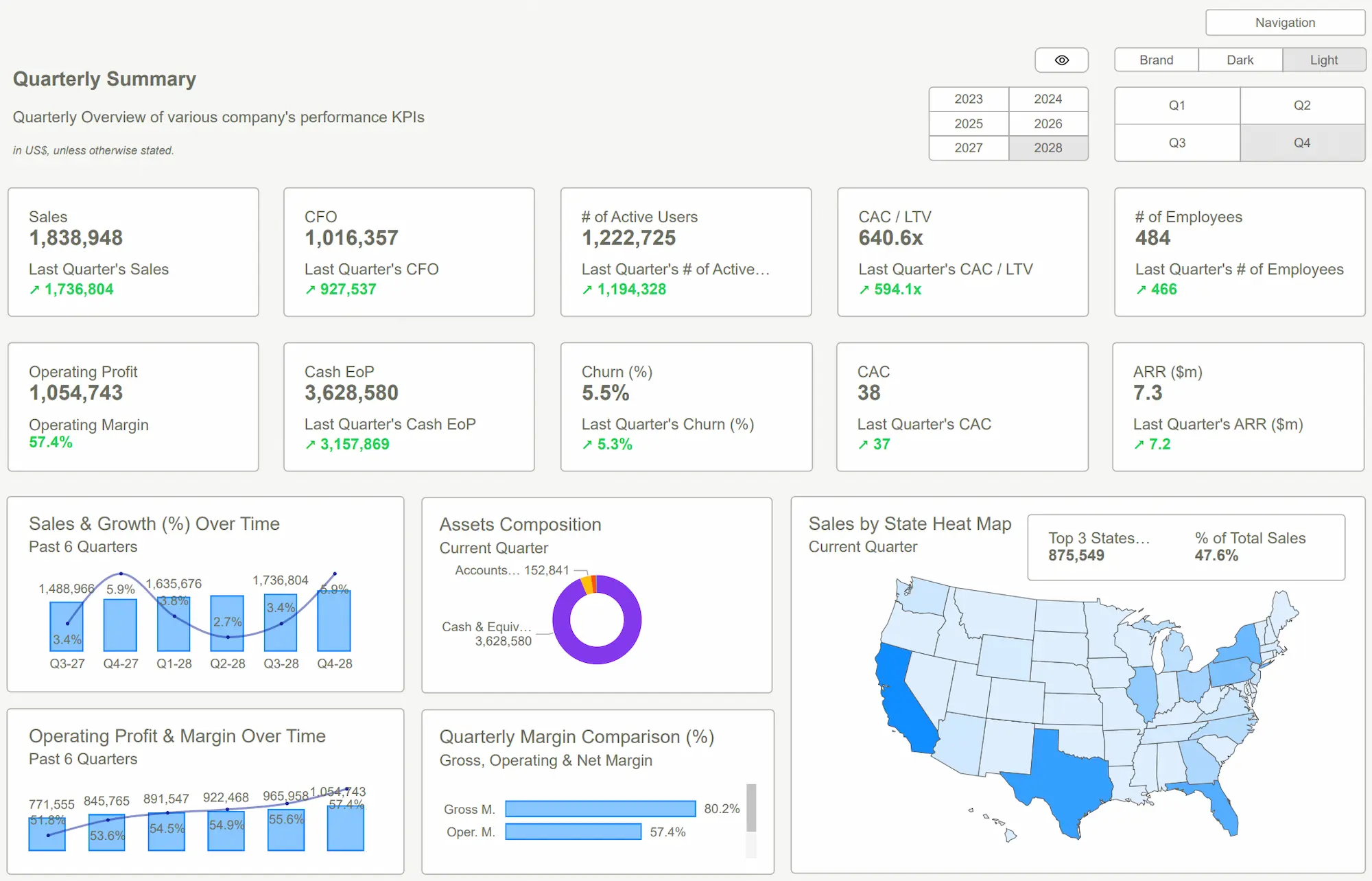
Sales performance dashboard

Sales performance dashboards give quick insights into key revenue metrics. A well-laid-out sales dashboard helps teams track quotas, market opportunities, and conversion rates immediately. The most useful sales dashboards include:

  • Monthly sales figures showing total revenue generated within specific timeframes
  • Sales by region showing geographic distribution of customer demand
  • Sales by product showing which offerings bring the most revenue
  • Sales growth rate comparing expansion rates to previous periods
  • Conversion rates showing how many prospects complete desired actions

Sales dashboards use bar charts to show trends, geographic heat maps to display regional distribution, and funnel charts to illustrate conversion processes. Teams can spot trends and fix issues early.

Financial KPI dashboard

Financial dashboards turn complex financial data into clear insights that help make informed decisions. These dashboards track ratios like Return on Equity (ROE), Current Ratio, and Debt-to-Equity. The visualizations help executives monitor financial health through automated updates.

Finance teams get unified views of company health through KPI dashboards with customizable visualizations that include performance indicators and status markers. Updates happen automatically as targets or data sources change because teams build dashboards with the same tools used to define KPIs.

Customer support dashboard

Customer service dashboards let support teams track performance metrics like service level agreement (SLA) compliance, customer satisfaction scores, and quality assurance results. Managers can find operational bottlenecks and make their teams more efficient.

These dashboards track open, in-progress, and closed case volumes and monitor resolution times for different case types and priorities. They help identify top performers and team members who might need more support.

Marketing campaign dashboard

Marketing campaign dashboards combine metrics from multiple platforms like Google Ads, Meta Ads, and other channels. Like other dashboard types, they show campaign effectiveness and ROI while tracking specific KPIs including CTR, conversion rates, ROAS, and cost-per-lead.

These visual tools help marketers compare performance across channels with standardized metrics and analyze customer experience data from initial awareness through conversion. Marketing teams can optimize budgets by finding successful campaigns worth expanding.

Improving Dashboards Over Time

Creating effective Power BI dashboards is an ongoing process that continues well after deployment. The best dashboards grow better over time as teams think over refinements based on real-life usage patterns. These tools become more valuable when they adapt to user needs.

Collecting user feedback for iteration

User feedback is the life-blood of dashboard improvement. Usage metrics show what happens, but user input reveals the why behind those patterns. Microsoft's implementation planning guidance states that "iterative delivery encourages early validation and feedback that can reduce change requests, promote solution adoption, and realize benefits before production release" [28].

These feedback collection methods work well:

  • Interactive prototyping sessions where subject matter experts give immediate feedback during development [29]
  • Short calls with the core team to watch how they use dashboards in real time [28]
  • Dedicated feedback visuals built right into dashboards using tools like Power BI User Feedback Pro [30]

Feedback only matters when it leads to action. Quick responses to user input show people their opinions count. Microsoft's guidance points out that "if the project team takes too long to address feedback, users might quickly lose motivation to provide it" [28].

Using usage metrics to refine layout and visuals

Power BI's built-in usage metrics reports are a great way to get data for dashboard optimization. These reports help you see exactly how users work with your content and show which elements strike a chord.

The improved usage metrics report tracks these key performance indicators:

  • Report views that track dashboard access frequency [2]
  • Typical report opening time matching the 50th percentile of load times [2]
  • Platform usage data showing web or mobile device access [31]
  • Page-level metrics identifying most viewed dashboard sections [31]

Evidence-based design decisions become possible with these insights. To name just one example, see "wondering which pages of your report are most useful, and which ones you should phase out? Slice by Report page to find out" [31]. Mobile usage data helps you decide if mobile-optimized layouts deserve investment.

Performance optimization remains significant throughout the dashboard lifecycle. Usage data often highlights areas needing load time improvements. Microsoft recommends "limiting widget visuals to eight per report page and grids to one per page. Limit tiles to 10 per dashboard" [32] to keep performance optimal while maintaining user experience.

Keep in mind that "usage metrics are a powerful ally as you work to deploy and maintain Power BI dashboards and reports" [31]. Your dashboards will consistently meet changing user needs by creating a continuous feedback loop of collection, analysis and implementation.

Designing Power BI Reports with Figma

Conclusion

Power BI dashboards serve as key tools for modern business intelligence that turn complex data into practical insights. Organizations create dashboards users want to explore by implementing design patterns like MAD framework and rule of thirds.

A good dashboard combines visual hierarchy, interactive features, and role-specific customization. These dashboards guide users from high-level metrics to detailed insights without overwhelming them. Users can explore data on their own through smart features like drill-downs, cross-highlighting, and custom tooltips.

Dashboards become more effective through constant improvements based on user feedback and usage metrics. Companies that ask for user input and study interaction patterns create valuable tools that adapt to business needs.

Power BI's adaptability lets you create many dashboard types - from operational monitoring to strategic decision-making. Each type has its purpose while following the basic rules of clear visual communication and easy-to-use experience.

You can start creating better data visualizations today. Your focus should be on user needs, proven design patterns, and continuous improvements based on real-life usage when building your first dashboard or improving existing ones. Note that great dashboards grow with your organization and become valuable decision-making tools over time.

Need Power BI Templates and Save Days of Work? Click Here.
Get Started >
Share this post

Subscribe to our newsletter

Stay ahead with the latest insights, tips, and trends in PowerBI and data visualization.
Join the network that is unlocking the full potential of their data - one dashboard at a time.

By clicking Sign Up you're confirming that you agree with our Terms and Conditions.
Thank you! Your submission has been received!
Oops! Something went wrong while submitting the form.

Related posts

Explore more insights and tips with these related posts curated just for you.