
Power BI Dashboard Examples: What Separates the Pros from the Amateurs (And How to Instantly Join the Pros)

1. Introduction: The Chasm Between "Meh" and Mind-Blowing Power BI Dashboards
Let's be brutally honest. You're here because you've seen Power BI dashboards. Maybe you've even tried to build a few. And if you're like most, you've probably stared at a tangled mess of visuals wondering, "Is this it? Is this the 'insight' everyone raves about?"
The truth? There's a Grand Canyon-sized difference between the slapped-together, "good enough" dashboards most people wrestle with and the sleek, powerful, professional Power BI dashboards that actually drive decisions and make executives sit up and take notice. It's not just a difference; it's day and night. We're talking the difference between a kid's crayon drawing and a Da Vinci.
So, what is possible with professional Power BI Dashboard Examples when you're not fumbling in the dark like an amateur? Imagine:
- Crystal-clear insights that jump off the screen.
- Actionable intelligence that tells you exactly what to do next.
- Time saved – hours, days, even weeks – not spent wrestling with DAX or pixel-pushing.
- Admiration from your boss (and maybe even a little envy from colleagues).
This isn't a fantasy. This is what happens when you ditch the DIY disaster waiting to happen and embrace professionally designed, technically excellent, and operationally seamless solutions.

2. The Ugly Truth: Why Your DIY Power BI Dashboards Are Probably Sabotaging You
Alright, let's rip off the band-aid. That Power BI dashboard you poured your blood, sweat, and probably too much coffee into? It might be doing more harm than good. "But I followed a tutorial!" you cry. Bless your heart. Tutorials are great for learning the buttons, not for mastering the art and science of effective data visualization that actually persuades and informs.
Here's the grim reality of most amateur dashboards:
- They're Ugly as Sin: Let's face it, most data people aren't graphic designers. The result? Cluttered layouts, clashing colors, and visuals that make your eyes bleed. This isn't just an aesthetic problem; ugly dashboards are hard to read and undermine credibility.
- Technically Flawed: Incorrect DAX measures? Poorly structured data models? Relationships that make no sense? These are the silent killers that lead to wrong numbers and disastrous decisions. You might not even know they're there until it's too late.
- Time Vampires: The hours spent "just tweaking this one visual" or "trying to get this filter to work" add up. Fast. That's time you're not spending on actual analysis or, you know, having a life.
- Insight-Free Zones: A dashboard crammed with charts isn't insightful. It's just noisy. Professionals know how to tell a story with data, guiding the user to what matters. Amateurs often just throw everything at the wall and hope something sticks.
Think about it: you wouldn't try to build your own Large Hadron Collider in the garage, would you? Some things are best left to those who've already mastered the complexities.

3. The Professional Revelation: What Elite Power BI Dashboards Actually Deliver
Now, let's step into the light. What does a professional Power BI dashboard bring to the table? It's more than just pretty charts; it's a finely tuned instrument for business intelligence. These aren't just "reports"; they are strategic assets.
A professional dashboard, often built from high-quality PowerBI Templates, delivers:
- Design Excellence:
- Clarity and Intuition: Information is presented logically. Users don't need a manual to understand what they're looking at. Think Apple-level simplicity applied to your data.
- Aesthetic Appeal: Clean lines, purposeful color schemes, and visually engaging layouts that draw the eye to key insights. It looks like it was designed by someone who actually knows Power BI Dashboard Design.
- Visual Hierarchy: The most important information stands out. Supporting details are available but don't clutter the main view.
- Technical Excellence:
- Optimized Performance: Dashboards load quickly, even with large datasets. Queries are efficient, DAX measures are elegant and correct.
- Robust Data Modeling: The backbone of any great dashboard. Professional templates often come with well-structured data models that are scalable and easy to connect your data to.
- Accuracy and Reliability: You can trust the numbers. Period. This is non-negotiable.
- Operational Excellence:
- Speed to Insight: Get answers, fast. No more digging through spreadsheets or waiting for IT to run a report.
- Ease of Use: Filters, slicers, and drill-downs are intuitive. Even non-technical users can explore the data confidently.
- Scalability and Maintainability: Built to grow with your business and adapt to changing needs without a complete overhaul.
- Strategic Impact:
- Data-Driven Decisions: Empowers everyone, from analysts to executives, to make smarter choices based on real-time data.
- Proactive Problem Solving: Highlights trends, outliers, and potential issues before they become major crises.
- Enhanced Credibility: When you present a polished, professional dashboard, you look like you know your stuff. Because, well, you do (or at least your dashboard does).

4. Amateur Hour vs. Pro Play: The Stark Difference That Defines Your Power BI Destiny
Let's be blunt, because your time is valuable. The chasm between an amateur attempt at a Power BI dashboard and a professionally crafted one isn't just a gap; it's what separates the amateurs from the seasoned professionals.
The Amateur's Agony:
- Endless Tinkering: Spends 80% of their time wrestling with Power Query, DAX formulas that look like ancient hieroglyphics, and trying to align visuals "just so." The actual data analysis? That's an afterthought.
- "Colorful Vomit" Design: Thinks more colors and more chart types equal more insight. The result is often a confusing, overwhelming mess that gives stakeholders a headache.
- Questionable Accuracy: "Hmm, this number looks weird. Did I filter that right? Is this DAX measure actually calculating what I think it is?" Doubt creeps in. Confidence plummets.
- One-Off Wonders (That Break): Creates a dashboard for a specific request. When the data changes or a new question arises, the whole thing needs a painful rebuild.
The Professional's Power:
- Strategic Focus: Spends 80% of their time interpreting data and extracting actionable insights because the dashboard structure, design, and calculations are already rock-solid.
- Purposeful Design: Understands that Power BI Dashboard Design is about clarity and communication. Every element serves a purpose, guiding the user to understanding. Visuals are clean, intuitive, and impactful.
- Unshakeable Confidence: Knows the data is accurate, the calculations are vetted, and the insights are reliable. Presents with authority.
- Scalable & Adaptable Systems: Uses robust PowerBI Templates and methodologies that can be easily updated, customized, and rolled out across different datasets or departments.
Choosing to muddle through the amateur path isn't just inefficient; it's a career-limiting move in a data-driven world.

5. The Shortcut to Genius: How Professional Power BI Templates Make You Look Like a Rockstar
So, you're tired of the dashboard drudgery. You want the "Pro Play" without the years of "Amateur Agony." Good news: there's a ridiculously smart shortcut. It's called using professional PowerBI Templates, like the ones meticulously crafted at PowerBI Kit.
Think of it as an architectural blueprint for your data. The foundation is laid, the structural engineering is sound, and the aesthetic vision is already in place. All you need to do is bring your data and watch the magic happen.
Stop Reinventing the Wheel – Grab a Pre-Forged Masterpiece
Why spend countless hours trying to design layouts, pick color palettes, develop complex DAX measures, and structure data models when it's already been done – and done better – by experts? Our templates are the culmination of thousands of hours of design, development, and refinement. They incorporate:
- Industry Best Practices: Visualizations that are proven to be effective.
- Advanced Calculations: Pre-built DAX for common (and not-so-common) KPIs.
- Optimized Performance: Designed to handle your data efficiently.
Purchasing a template isn't admitting defeat; it's making a strategic investment. You get to skip the painful learning curve and jump straight to delivering high-impact dashboards.
Customize Like a Pro, Present Like a Visionary
"But my data is unique! My boss wants our logo!" We hear you. Professional templates aren't rigid prisons; they're springboards.
- Easy Customization: Change colors, fonts, and logos to match your brand. Swap out visuals if needed. Our templates are designed for flexibility.
- Connect Your Data Sources: Clear instructions and well-structured templates make it straightforward to plug in your own data.
- Look Like a Genius: When you present a sleek, insightful dashboard that you "put together" in a fraction of the expected time, people will be impressed. We won't tell them your secret (unless you want to).
You get the credit for delivering professional-grade insights, and we do the heavy lifting in the background. It's the ultimate win-win.
Unleash Your Inner Data Guru: Focus on Insights, Not Infuriating Setups
The single biggest benefit? Time. Time to think. Time to analyze. Time to find those "aha!" moments in your data that actually drive business value.
Instead of fighting with:
- Which chart type should I use?
- Why is this DAX formula returning an error?
- How do I make this look less like a 1990s GeoCities page?
You can focus on:
- What trends are emerging?
- Where are the biggest opportunities?
- What critical questions does this data answer?
Professional Power BI templates shift your effort from tedious construction to valuable interpretation. That's where the real magic, and the real career advancement, happens. Stop being a dashboard janitor and start being a data strategist.

6. Jaw-Dropping Power BI Dashboard Examples the Pros Swear By
Enough talk. Let's see what these professional Power BI Dashboard Examples look like in action. These aren't just theoretical concepts; these are battle-tested designs that deliver clarity and impact across various business functions.
Finance Power BI Dashboard Examples: Your Financial X-Ray
Finance isn't just about spreadsheets and calculators anymore. It's about strategic insight. Why would you attempt to build your own financial reporting from scratch when the core components – Income Statements, Balance Sheets, Cash Flow analyses – are already tried-and-true structures?
- Income Statement Dashboard: Visualize revenue, costs, and profitability with dynamic drill-downs.
- Cash Flow Dashboard: Track inflows, outflows, and net cash position with predictive capabilities.
- Balance Sheet Dashboard: Get an interactive snapshot of assets, liabilities, and equity.
- Budget vs. Actual Dashboard: Monitor performance against targets in real-time and identify variances instantly.
A Power BI Dashboard for Finance built from a professional template ensures accuracy, compliance (with standard financial layouts), and immediate usability for your CFO and finance team.
Sales Power BI Dashboard Examples: From Quota Anxiety to Sales Domination
Your sales team thrives on data: leads, opportunities, conversions, revenue. A clunky or inaccurate dashboard is a one-way ticket to missed quotas and frustrated reps.
- Sales Performance Dashboard: Track KPIs like sales growth, win rates, average deal size, and performance by rep or region.
A professional Power BI Dashboard for Sales provides a single source of truth, motivates the team, and helps sales leaders make data-backed coaching and strategy decisions.
Marketing Power BI Dashboard Examples: Turning Campaign Chaos into Clear Wins
Marketers are drowning in data from a dozen different platforms. A well-designed dashboard brings sanity to the chaos.
- Performance Marketing Dashboard: Consolidate metrics from Google Ads, Facebook Ads, LinkedIn Ads, etc. Track CPL, CPA, ROAS, and conversion rates across campaigns.
With a Power BI Dashboard for Marketing, you can optimize spend, prove ROI, and finally show everyone how your campaigns are moving the needle.
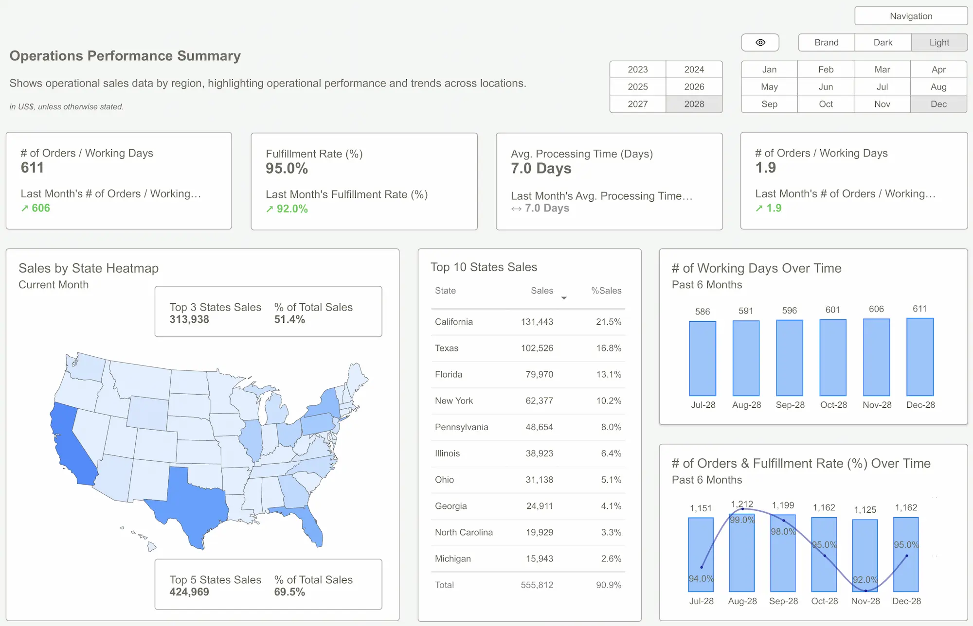
Operations & HR Power BI Dashboard Examples: Efficiency, Engagement, Excellence
Smooth operations and an engaged workforce are critical. Dashboards here provide visibility into complex processes and human capital.
- Operations Dashboard: Monitor production efficiency, supply chain logistics, inventory levels, quality control metrics, and more.
- Logistics Dashboard: Track shipments, delivery times, transportation costs, and carrier performance.
- Human Resources Dashboard: Analyze headcount, turnover rates, recruitment funnels, employee satisfaction, and training effectiveness.
A Power BI Dashboard for Operations or a Power BI Dashboard for Human Resources helps identify bottlenecks, optimize resource allocation, and improve overall organizational health.
SaaS & eCommerce Power BI Dashboard Examples: The Pulse of Your Digital Empire
For online businesses, data is the business. Understanding user behavior, subscription metrics, and sales funnels is paramount.
- SaaS Metrics Dashboard: Track MRR, ARR, churn rate, customer lifetime value (CLTV), customer acquisition cost (CAC), and feature adoption.
- eCommerce Dashboard: Monitor sales, conversion rates, average order value (AOV), cart abandonment rates, and customer segmentation.
A Power BI Dashboard for SaaS or a Power BI Dashboard for eCommerce gives you the critical insights to grow revenue and improve customer experience.
Strategic & Executive Power BI Dashboard Examples: Clarity from 30,000 Feet
Executives need a high-level, consolidated view of business health. No time for sifting through granular data.
- Executive Summary Dashboard: A holistic overview of key performance indicators across all major departments – finance, sales, marketing, operations.
- Annual/Quarterly Summary Dashboards: Compare performance over time, track progress against strategic goals, and identify long-term trends.
These dashboards cut through the noise, providing the C-suite with the concise, critical information they need for strategic planning and governance.
7. How to Instantly Upgrade Your Reporting: A Simple Path to Professional Power BI Dashboards
Feeling overwhelmed by the thought of reaching "Pro Level"? Don't be. With PowerBI Kit templates, it's a surprisingly straightforward process:
- Step 1: Stop the DIY Madness. Seriously. Close that half-finished PBIX file that's been mocking you for weeks. Acknowledge that your time is better spent elsewhere.
- Step 2: Browse Professionally Designed PowerBI Templates. Head over to www.powerbikit.com and explore our curated collection. Filter by department (Finance, Sales, Operations, etc.) or business need. Find a template that resonates with your requirements.
- Step 3: One-Click Purchase & Instant Download. No lengthy procurement processes. Choose your template, complete the secure checkout, and download the .PBIT file immediately.
- Step 4: Connect Your Data. Open the template in Power BI Desktop. Our templates are designed for easy data connection. Follow the simple instructions to point the template to your data sources (Excel, SQL Server, cloud services, etc.). The pre-built data model and queries will do most of the heavy lifting.
- Step 5: Minor Customizations (If You Want). Change the color scheme to match your brand? Add your company logo? Tweak a specific visual? Our templates are flexible. Make it yours in minutes.
- Step 6: Publish & Impress. Publish your new, professional-looking dashboard to the Power BI service. Share it with your colleagues and bask in the glow of their admiration. You just went from data-struggler to data-superstar.
This isn't rocket science; it's just working smarter, not harder. The goal is to get you from data chaos to data clarity as quickly and painlessly as possible.
8. Conclusion: Stop Struggling with Dashboards. Get Professional. Get Results.
Let's cut the crap. You have a choice. You can continue down the path of DIY dashboard despair – spending your precious time wrestling with DAX, fighting with alignments, and producing something that's… okay-ish, maybe. Or, you can make the smart, strategic decision to leverage professional expertise and hit the ground running.
Using pre-built, professional Power BI Dashboard Examples and PowerBI Templates from PowerBI Kit isn't about cutting corners; it's about catapulting yourself and your organization to a higher level of data maturity, instantly. It's about:
- Saving insane amounts of time and effort.
- Avoiding costly mistakes and redesigns.
- Delivering visually stunning, technically sound, and incredibly insightful dashboards.
- Focusing on what truly matters: analyzing data and driving business decisions.
- Looking like an absolute rockstar to your boss and colleagues.
Stop tinkering. Stop struggling. Stop wasting your life on tasks that have already been perfected by experts.
It's time to elevate your Power BI game from amateur hour to professional powerhouse.
Your next step? Browse our collection of premium Power BI Templates at www.powerbikit.com. Find the dashboard that fits your needs, connect your data, and start experiencing the Power BI life you've only dreamed of.
Stop dreaming. Start doing. Get your PowerBI Kit template today and transform your data into your most powerful asset.

Frequently Asked Questions (FAQ) About Power BI Dashboards
Yes! Beginners get a head start with a professional build. Advanced users save huge amounts of development time.
Our templates are a fraction of the cost of a custom solution and deliver immediate value. It's an investment with a massive ROI in time saved and insights gained.
Our templates provide the optimal dashboard structure and visualization. Connecting data is your step, but the template gives you a clear target for what the data should look like.
Potentially within minutes of downloading, depending on the cleanliness and accessibility of your data. If your data is ready, connecting it is usually straightforward.
Learning is great! Use free resources for that. But when you need a reliable, professional, and fast solution for your business, DIY is often a slow, painful, and suboptimal path.
Each template comes with documentation to help you get started and connect your data. For more complex issues or customization requests, PowerBI Kit offers support options.
Yes! Many of our core dashboards like Finance, Sales, and Operations are universally applicable across industries and company sizes.
Ready to unlock the full Power BI Kit?
Explore our pricing and pick the plan that fits your workflow.