Let’s be honest. You’ve sat in meetings staring at a Power BI Dashboard that was technically impressive but functionally useless. It’s a wall of charts, a rainbow of clashing colors, and a dozen slicers that don’t seem to do anything intuitive. Everyone nods along, but nobody actually understands what they’re supposed to do with the information.
This is the most common trap in business intelligence: confusing data decoration with data-driven decision-making. The goal isn’t to cram every possible metric onto a single screen. The goal is to answer critical business questions quickly and clearly.
Most guides will give you generic advice like "know your audience" or "keep it simple." We're going to go deeper. This article is about avoiding the subtle-but-deadly mistakes that turn a promising dashboard into a glorified spreadsheet. We’ll show you how to build reports that your colleagues will actually use and respect.
But before we dive into the specific design sins you need to avoid, let’s make sure we're all on the same page. A great report starts with a solid foundation. If you need a refresher on the fundamental components and capabilities, our cornerstone guide on the Power BI Dashboard is the perfect place to start. It covers the core concepts you'll need to build upon.
Mistake #1: Treating Your Dashboard Like a Data Dump
The single biggest misconception is that more data equals more insight. This is how you end up with dashboards that look like an instrument panel for a nuclear reactor—overwhelming and impossible to interpret. Stakeholders ask for "everything," and junior analysts, eager to please, deliver exactly that. The result is a cluttered mess that answers no one's questions.
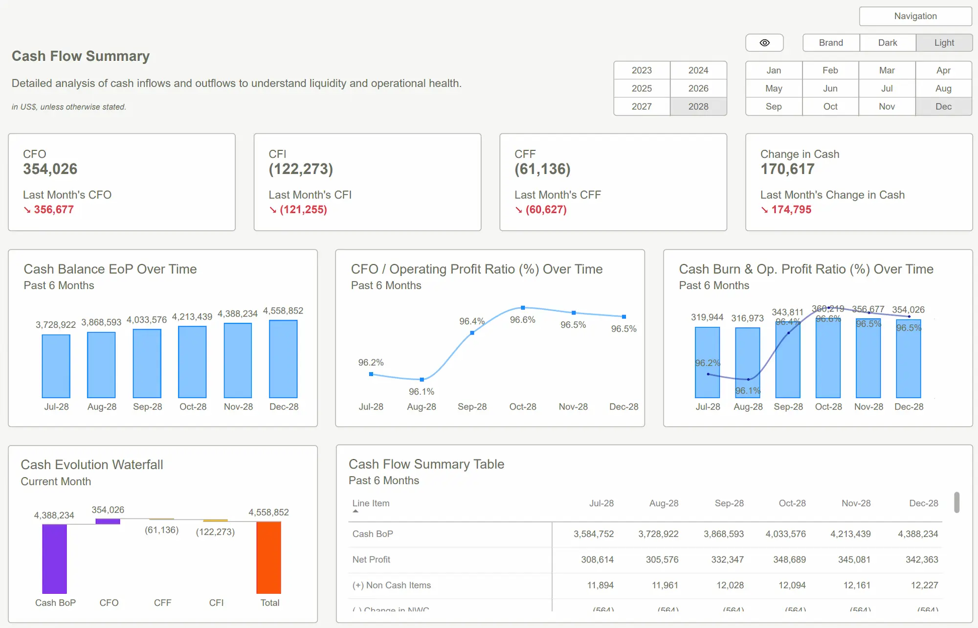
This is especially dangerous when creating a Power BI Dashboard for Finance. The finance world runs on precision, not volume. Your CFO doesn’t need to see every single transaction from the last five years on the summary page. They need to see P&L trends, cash flow forecasts, and budget vs. actuals at a glance.
Instead of adding another visual, ask a better question: "What decision will this chart help someone make?" If you don't have a crisp, clear answer, that chart doesn't belong on the main view. The goal is to guide the user's attention, not test their ability to find a needle in a data haystack. A great finance dashboard is an opinionated summary, not an exhaustive ledger. The details can always be a click away in a drill-through page, but they shouldn't be the main event.
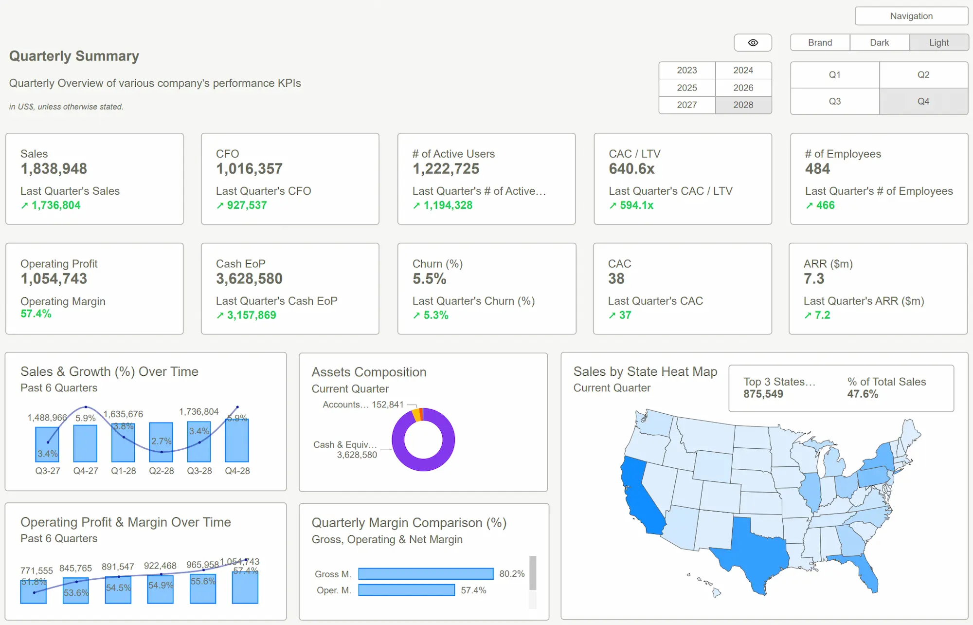
 Power BI Dashboard
The Cure: Ruthless Prioritization and Usability Patterns
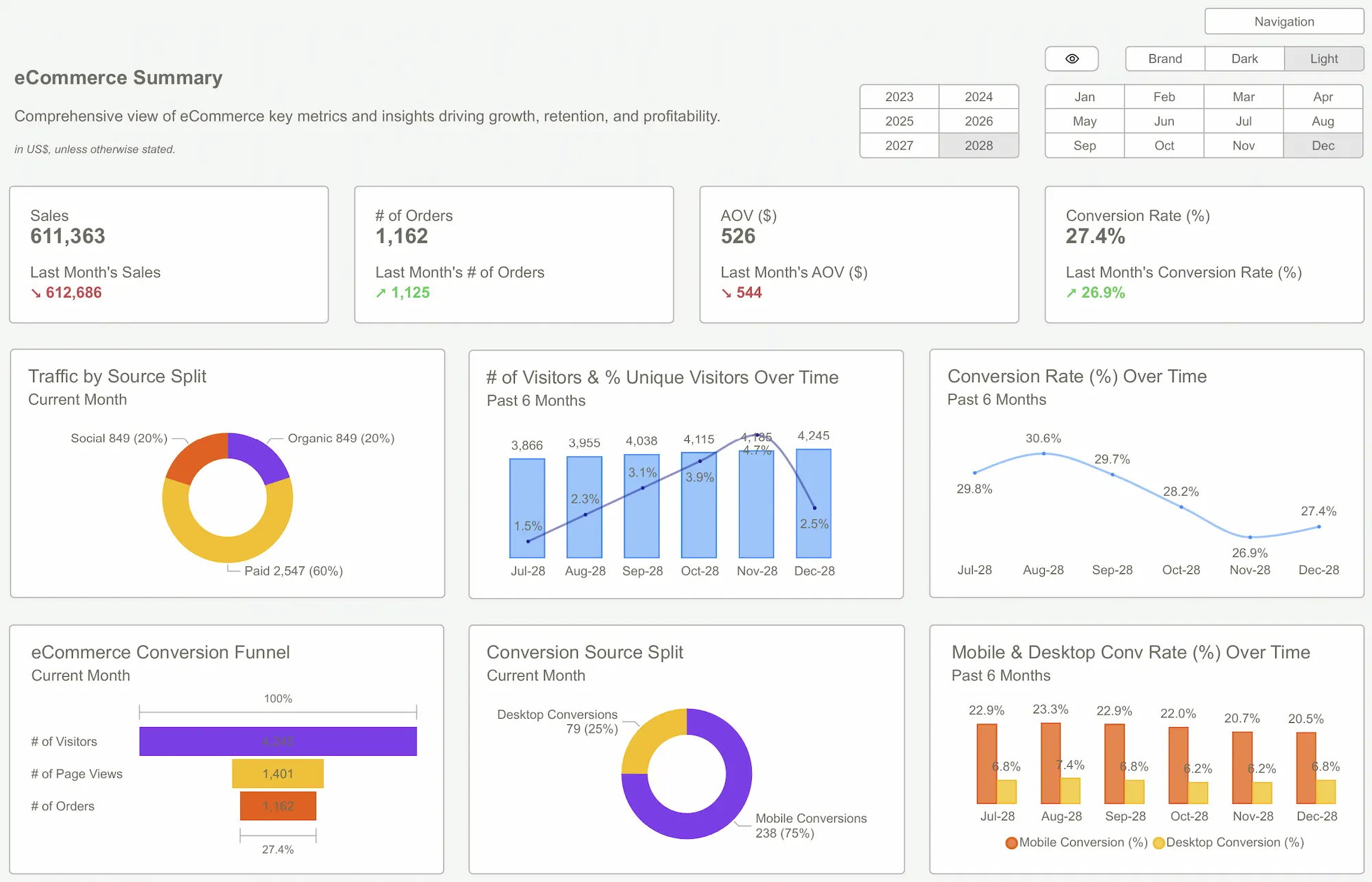
Now that you’ve committed to stop hoarding visuals, how do you decide what stays? Focus on speed-to-insight. A user should be able to answer their top 3 questions in under 10 seconds. For a Power BI Dashboard for Sales, this is non-negotiable. Sales managers are busy and need answers now.
Here are some practical design patterns that actually work:
- KPIs First, Always: Place 3-5 key performance indicators (KPIs) in large, impossible-to-miss cards at the top-left of your canvas. This is where the eye naturally goes. For sales, this means "Revenue vs. Target," "Win Rate," and "Sales Cycle Length."
- Embrace the "Inverted Pyramid": Show the most important, high-level summary at the top. As the user scrolls down (or clicks through), provide progressively more detail. The initial view should be the executive summary; the deeper sections are for the analysts.
- Use Visuals for Comparison, Not Just Display: Don't just show a bar chart of sales by rep. Show a bar chart of sales by rep compared to their individual quota. Context is everything. A simple number is data; a number compared to a target is an insight.
- One Idea Per Visual: A single chart should not try to show revenue, profit margin, and unit count all at once. Let one chart master one concept. This prevents visual clutter and cognitive overload.
The takeaway: A great dashboard is an exercise in ruthless editing. Your job is to make the choices for the user, presenting the most critical information first.
Escaping the Layout Trap: Blank Space is Your Best Friend
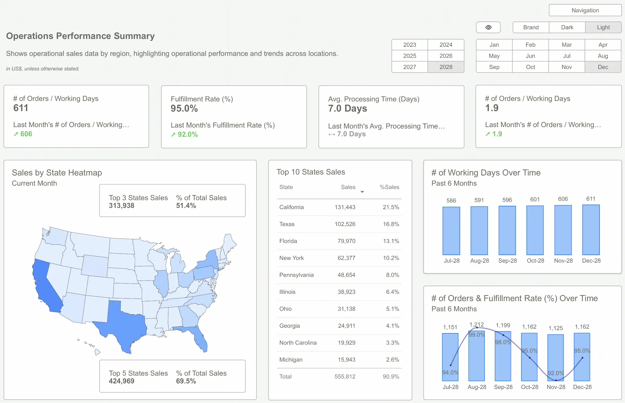
Another classic mistake is filling every pixel of the canvas. The fear of white space leads to dashboards where charts are crammed together with no visual hierarchy or breathing room. This is a critical error in a Power BI Dashboard for Marketing, where you're often trying to tell a story about the customer journey or campaign effectiveness. A cluttered layout makes that story impossible to follow.
Your users, like all humans, scan screens in a predictable pattern (often a 'Z' or 'F' shape). Use this to your advantage. Place your most important element (like your main KPIs) in the top-left. Place secondary, supporting information to the right, and detailed breakdowns or tables toward the bottom.
To avoid data overload, learn about cognitive load—the mental effort required to process information. Every unnecessary visual, color, or label adds to that load. As Microsoft's own data visualization best practices guide suggests, simplicity and clarity are paramount. Don’t make your users burn mental calories just trying to figure out what they’re looking at. Use grid alignment, consistent spacing, and visual grouping (like light gray background boxes) to create a clean, professional structure that guides the eye effortlessly.
Interactive Features That Actually Save Time
Interactivity is powerful, but only when it has a purpose. Adding a dozen slicers just because you can is a recipe for confusion. The best interactive features are those that anticipate the user's next question and provide a seamless way to answer it.
This is about saving clicks and mental energy. For example:
- Bookmarks are not for decoration. They are for creating curated views for different audiences. Create a "CEO View" bookmark that filters for high-level summaries and an "Analyst View" that shows granular data. This saves everyone from having to re-apply the same five filters every time they open the report.
- Drill-throughs are your secret weapon. Instead of linking to a whole other report, a drill-through provides context-sensitive details on a specific data point. Right-clicking on "East Region" and drilling through to a "Regional Details" page is infinitely faster and more intuitive than navigating a complex menu.
- Slicers should be global, not personal. Use slicers for universal filters like Date, Region, or Product Category. Avoid slicers for obscure attributes that only one person on the team cares about.
Tactical Tips:
- Use the Chiclet Slicer for a more modern, button-like feel.
- Pre-configure bookmarks to hide/show different visuals, not just apply filters.
- Add a "Clear All Filters" button to give users an easy reset option.
These features, when used thoughtfully, transform a static report into a dynamic analytical tool.
What Separates a Great Dashboard from a Good One
At the end of the day, the difference between a good dashboard and a great one is clarity of purpose. A good dashboard displays metrics. A great dashboard drives action.
Consider these two Power BI Dashboard Examples. One is for a startup and is visually stunning—it has custom graphics, slick animations, and a dozen charts showing website traffic, social media followers, and app downloads. It’s impressive, but what does it tell you to do? Not much.
The second example is for the same startup but is far simpler. It has three main visuals: Customer Acquisition Cost (CAC), Customer Lifetime Value (LTV), and the ratio between the two (LTV:CAC), filtered by marketing channel. Immediately, the CEO can see that "Paid Search" has a fantastic 4:1 LTV:CAC ratio, while "Display Ads" are struggling at 0.8:1.
The decision is obvious: reallocate budget from Display to Paid Search. The second dashboard, while less flashy, is infinitely more valuable because it was built to answer a specific, high-stakes business question. A great dashboard has an opinion. It guides you toward a conclusion. It doesn't just present data; it frames it in a way that makes the next step obvious.
 Power BI Dashboard Examples
Stop Decorating, Start Communicating
We've covered a lot of ground, but the core theme is simple: a Power BI Dashboard is a communication tool, not a data art project. Its value is measured not by the number of visuals it contains, but by the quality of the decisions it enables.
By avoiding the common traps of data-dumping, cluttered layouts, and pointless interactivity, you can elevate your work. You'll build reports that are not only respected but actively used to drive the business forward. The real benefits are fewer confused questions in your inbox, shorter and more productive meetings, and the reputation as someone who delivers clarity, not just charts.
Ultimately, a well-designed dashboard saves your most valuable resource: time. It saves time for the executive who needs a quick summary, for the analyst who needs to dig into the details, and for you, the creator, who can focus on finding the next great insight instead of endlessly tweaking a broken report.
Tired of building from a blank slate? Stop wasting hours wrestling with layouts and DAX. Our professional-grade Power BI templates give you an instant head start. Get the insights you need, faster.Get Started >
Subscribe to our newsletter
Stay ahead with the latest insights, tips, and trends in PowerBI and data visualization.
Join the network that is unlocking the full potential of their data - one dashboard at a time.
Related posts
Explore more insights and tips with these related posts curated just for you.
7 Must-Have Power BI Templates for Small Businesses

Top 10 Power BI Dashboard Examples to Boost Business Insights