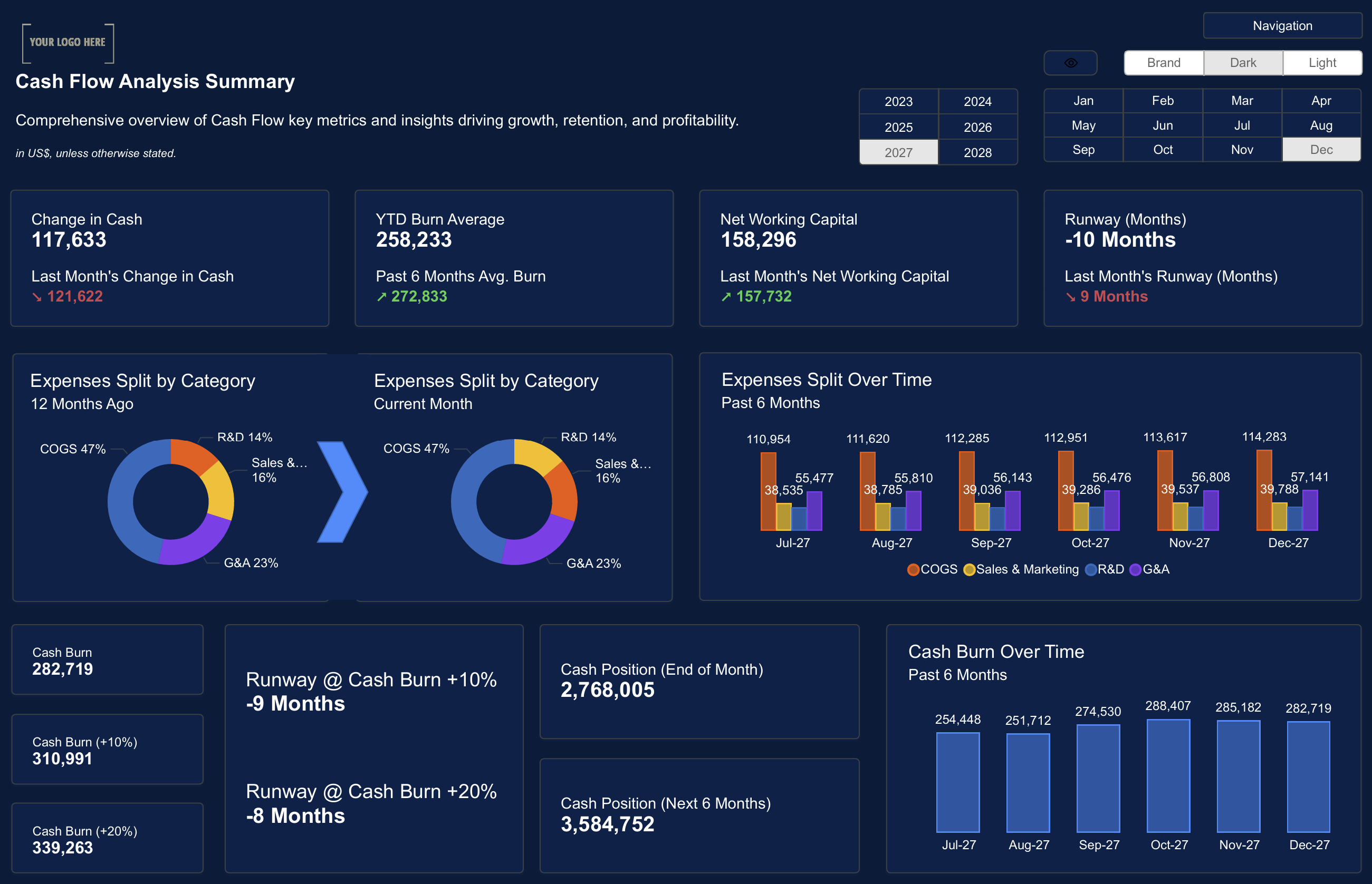
Designing an effective Power BI dashboard isn’t just about gathering data — it’s about presenting it in a way that’s clear, actionable, and easy to understand.
By following visual best practices, you can improve your dashboards to enhance decision-making, reduce confusion, and boost user engagement.
In this guide, we’ll explore the essential visual best practices for creating Power BI dashboards that are both visually appealing and informative.
Keep It Simple and Focused
A common mistake in dashboard design is trying to fit too much information into a single view. This can overwhelm users and reduce the effectiveness of your dashboard.
Best Practices for Simplicity:
- Limit the number of visuals on a single page.
- Focus on key metrics that matter most to your audience.
- Use filters and slicers to let users drill down into the data if needed.
 Power BI Data Modeling: Best Practices
Use Consistent Colors and Fonts
Consistency in your dashboard’s color scheme and font choices is essential for creating a professional and cohesive look.
Tips for Consistency:
- Stick to a limited color palette.
- Use color to highlight important data points, not for decoration.
- Choose easy-to-read fonts and use them consistently across your dashboard.

Make Your Dashboards Interactive
Interactive dashboards allow users to explore data in a way that’s meaningful to them. This improves user engagement and helps users find the insights they need.
Interactive Features to Include:
- Drill-through pages for detailed data views.
- Filters and slicers to customize the dashboard.
- Tooltips to provide additional context when hovering over visuals.

Ensure Your Dashboard Is Mobile-Friendly
In today’s world, users often access dashboards from mobile devices. A dashboard that looks great on a desktop but doesn’t work well on mobile will frustrate users.
Mobile-Friendly Design Tips:
- Use responsive layouts that adapt to different screen sizes.
- Avoid tiny fonts and overcrowded visuals.
- Test your dashboard on multiple devices before publishing.

Prioritize Performance
A beautiful dashboard is useless if it takes forever to load. Performance optimization is a crucial part of visual best practices.
Performance Tips:
- Limit the number of visuals per page.
- Optimize DAX queries for faster calculations.
- Use aggregated tables for large datasets.
 Why You Need a Design System for Power BI Dashboards
Following Power BI visual best practices can dramatically improve the effectiveness of your dashboards. By keeping them simple, consistent, interactive, mobile-friendly, and optimized for performance, you’ll create dashboards that engage users and drive better decisions.
Ready to take your dashboards to the next level? Download our Power BI templates to get started!
Download our Power BI Templates now and start improving your dashboard design with best practices.Get Started >
Subscribe to our newsletter
Stay ahead with the latest insights, tips, and trends in PowerBI and data visualization.
Join the network that is unlocking the full potential of their data - one dashboard at a time.


