
Building a Power BI dashboard isn’t just about displaying data — it’s about communicating insights clearly. Yet many Power BI users overlook design principles, resulting in confusing reports, inconsistent visuals, and reduced trust in data.
This is where a Power BI design system comes in. By implementing a design system, you can reduce design debt, improve user experience, and ensure consistent branding across all your dashboards.
What Is Design Debt in Power BI?
Design debt refers to the accumulation of design issues over time when reports are created without a consistent style or structure. It’s a common problem in Power BI, where analysts focus on data accuracy but overlook visual design.
Common Signs of Design Debt:
- Inconsistent color schemes and fonts across dashboards
- Cluttered layouts that confuse users
- Reports that are hard to navigate or understand
Over time, design debt can make your Power BI reports feel disjointed and unprofessional, reducing trust in your data.
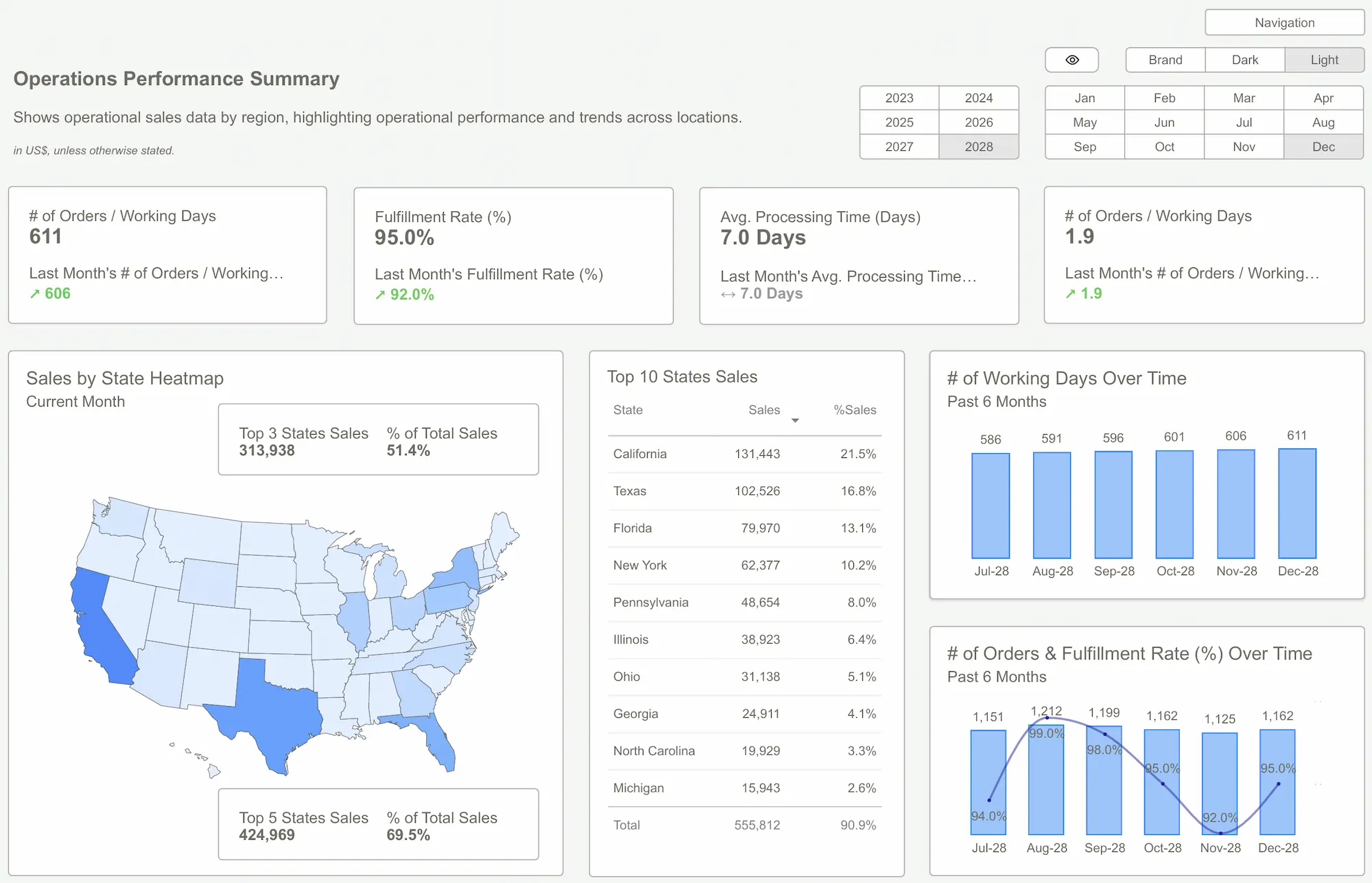 Power BI Dashboard
What Is a Power BI Design System?
A design system is a set of guidelines, components, and best practices that ensure all your dashboards have a consistent and professional look. It’s like a style guide for your Power BI reports.
Key Components of a Power BI Design System:
- Design Principles: Guidelines for creating clear and effective visuals.
- Style Guide: Predefined color palettes, fonts, and icons.
- UI Components: Reusable buttons, modals, and navigation elements.
- Design Tokens: Variables for colors, fonts, and spacing.
- Pattern Libraries: Prebuilt layouts for common dashboard needs.

Benefits of Using a Design System in Power BI
Implementing a design system for Power BI dashboards can bring several benefits:
Key Benefits:
- Consistency: Ensures all dashboards look and feel the same.
- Efficiency: Saves time by reusing components and templates.
- Scalability: Makes it easy to manage multiple dashboards.
- Accessibility: Improves readability for all users.
By reducing design debt, a design system also improves the user experience and increases trust in your reports.

How to Build a Power BI Design System
You don’t need to be a graphic designer to build a Power BI design system. Here are some steps to get started:
- Create a Style Guide: Define your colors, fonts, and icons.
- Build UI Components: Use buttons, filters, and navigation elements.
- Use Design Tokens: Store color variables and spacing values for consistency.
- Document Everything: Provide clear guidelines for your team to follow.
Tools to Simplify Design in Power BI
While you can build a design system from scratch, tools like Power UI can help simplify the process by providing predefined UI components and a style guide directly within Power BI.
Why Use a Tool Like Power UI?
- Seamless Integration: Works directly in Power BI.
- Predefined Components: Buttons, navigation bars, and more.
- Style Guide: Built-in themes for consistency.
These tools make it easier to maintain consistency and reduce design debt without needing advanced design skills.
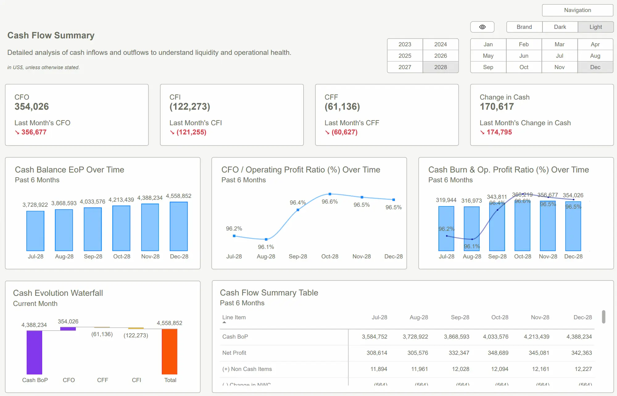
 Power BI Templates
Using a design system in Power BI can help reduce design debt, improve user experience, and ensure consistency across all your dashboards. By following best practices and leveraging tools like Power UI, you can build professional, scalable reports that users trust.
Ready to improve your dashboard design? Download our Power BI templates to get started!
Download our Power BI Templates now and start improving your dashboard design with a consistent design system.Get Started >
Subscribe to our newsletter
Stay ahead with the latest insights, tips, and trends in PowerBI and data visualization.
Join the network that is unlocking the full potential of their data - one dashboard at a time.
Related posts
Explore more insights and tips with these related posts curated just for you.

Top 10 Power BI Dashboard Examples to Boost Business Insights

Mastering the Power BI Dashboard: Essential Tips for Effective Design
