

Power BI dashboards turn raw data into clarity. But building a dashboard from scratch—choosing the right layout, metrics, and visuals—can be overwhelming.
In this post, we’ll show you 5 real Power BI dashboard examples across core business functions. Each example includes a short breakdown, a sample view, and a link to explore or download the full version.
Whether you’re building for finance, cash flow, performance, or executive insights—this guide will help you get inspired and build faster.
Finance Overview Dashboard
When to Use: Monthly or quarterly review of overall business performance
Designed For: Founders, CFOs, financial analysts
This dashboard gives you a clean, high-level overview of profit, loss, and margin trends. It’s ideal for fast reviews in meetings and investor updates.
Key KPIs shown:
- Net Revenue vs. COGS
- Gross Profit Margin
- EBITDA
- Monthly Trends (Bar + Line visual)
 Essential KPIs in Finance for Power BI Dashboards
Cash Flow Dashboard
When to Use: Weekly or monthly tracking of incoming and outgoing cash
Designed For: Finance teams, operations managers, startup founders
Cash flow tells the real story behind your business health. This dashboard tracks inflows, outflows, and net cash over time—helping you avoid surprises and plan ahead.
Key KPIs shown:
- Total Inflows / Outflows
- Net Cash Position
- Burn Rate
- Months of Runway Remaining
Balance Sheet Dashboard
When to Use: Quarterly reviews or monthly close
Designed For: CFOs, controllers, accountants
This dashboard breaks down your assets, liabilities, and equity to give a snapshot of your company’s financial position. It’s designed for clarity and quick diagnostics—especially useful during board meetings or financial reporting.
Key KPIs shown:
- Total Assets
- Liabilities Breakdown
- Equity Position
- Debt-to-Equity Ratio
- Working Capital

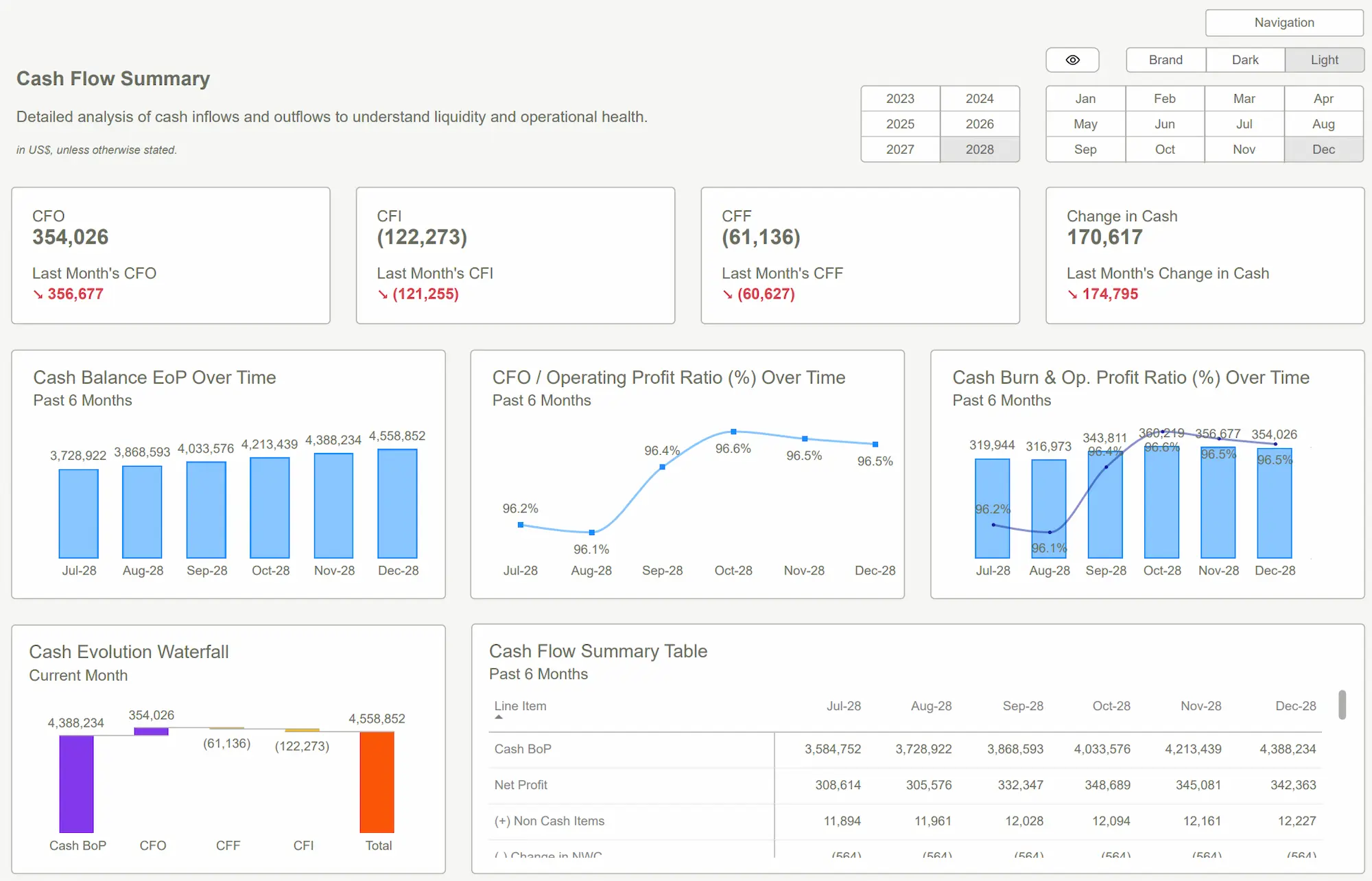
Cash Flow Analysis Dashboard
When to Use: Deeper review of cash drivers and trends
Designed For: CFOs, FP&A teams, strategic advisors
Beyond basic cash flow, this dashboard gives a layered view of what’s actually driving the numbers—whether it's receivables, payables, or operational inefficiencies. Ideal for analysis, planning, and decision-making.
Key KPIs shown:
- Cash from Operations vs. Financing vs. Investing
- Change in Working Capital
- Key Cash Drivers
- Rolling 6-Month Cash Trend

Budget vs Actuals Dashboard
When to Use: Monthly budget tracking and variance analysis
Designed For: Department heads, CFOs, business operators
This dashboard helps you monitor how closely your spending and revenue align with the budget. It highlights where you’re overspending or underperforming—so you can take action quickly.
Key KPIs shown:
- Budget vs Actual Revenue
- Budget vs Actual Expenses (by category)
- Variance Analysis
- Cumulative Forecast vs Actual
 Power BI Dashboard Design: Design Smart, Engaging, and Insightful Dashboards
Conclusion
Great dashboards do more than look good—they help teams make better decisions, faster. The five examples above show real use cases, real KPIs, and layouts that actually work in the field.
Whether you're reporting to investors, managing cash flow, or keeping your team aligned on targets, using a proven Power BI dashboard template can save you hours—and eliminate guesswork.
Want These Dashboards? Get instant access to these and other templates - ready to use, fully editable, and beautifully designed for performance.Get Started >
Subscribe to our newsletter
Stay ahead with the latest insights, tips, and trends in PowerBI and data visualization.
Join the network that is unlocking the full potential of their data - one dashboard at a time.
Related posts
Explore more insights and tips with these related posts curated just for you.

Top 10 Power BI Dashboard Examples to Boost Business Insights
Mastering the Power BI Dashboard: Essential Tips for Effective Design
