
Dashboards in the BI tools are responsible for speeding up the way decisions are made in businesses by converting the intricate data into key actionable insights. Since a well-designed dashboard forms the handy resource, a poorly crafted one appears easily misunderstood and confusing.
In our post today we are going to focus on these key points:
- Explore the top practices regarding Power BI dashboard design
- Importing the themes to create outstanding reports
- Customizing charts to reach the top-level using your visualizations
A recent study conducted by BARC found that data visualization is one of the biggest trends in BI as of 2019. The main delivery mode for data visualization is creating the perfect BI dashboards. BI dashboards visualize intricate raw data, making it effortless for users to gain a complete overview of the essential data and process it promptly. In our post today, we will highlight the main practices revolving around Power BI dashboard design that keep your presentations outstanding.
Let us find out what a BI dashboard does for you!
What Is a BI Dashboard, and Why Use One?
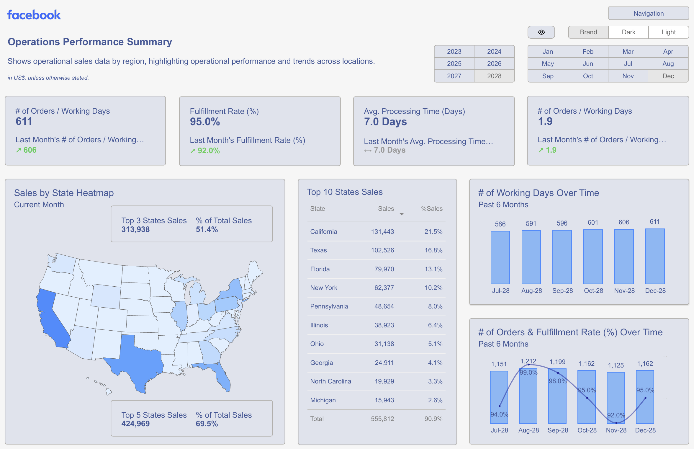
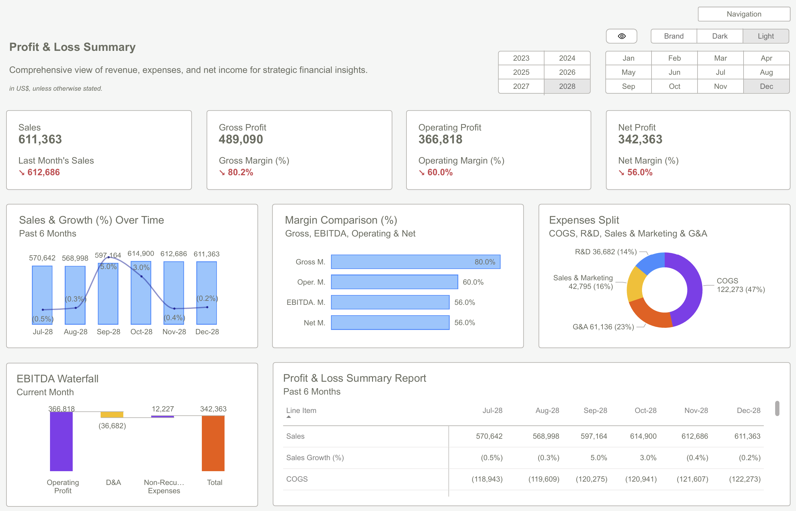
A dashboard forms a unified data view that aims to answer businesses' common queries by projecting key performance indicators (KPIs) for complete analysis data. A dashboard is specifically based on needs, such as showing the sales funneled by city for the past six months.
You can pull data out of the reports for sales and marketing to reveal the real conversion metrics sorted by channels, the cost incurred, and the revenue earned out of each channel. Power BI designs for the dashboard are for your view onto the consolidated data. So what is so great about them?
It includes the easy-to-understand graphs and charts offering better interactivity, real-time connectivity, and the different options for customizations.
A thoroughly crafted BI dashboard is the one that:
- Proves meaningful with demonstration of the real underlying meaning behind the data
- Narrating a transparent narrative regarding data
- Showcasing the next big steps towards the entire decision-making process
- Saving time, money, and efforts
- Seamlessly decipherable and scanning in just five seconds
- Creating accessible data available to all
Business Intelligence Best Practices
Considering the notable perks behind an impactful Power BI Dashboard Design to make meaningful business investment. Today we are going to share a few of the best practices to derive the perks of designing BI dashboards. Let us now explore more and find out how we can implement them right at your place of work.
Identify Requirements
The real importance of focusing on an effective Power BI design is to offer the key details answering a query right from the start to the end. The initial move relies on recognizing what data you wish to include in it.
Here are a couple of questions you can ask yourself to lay out the perfect design:
- What data do you wish to include in this dashboard?
- What issues are you planning to resolve?
- What kind of data do you need to land on a decision?
- What type of device will your viewers use for accessing this dashboard?
- What are the existing reports you already have?
- What types of actions can you take on the basis of these critical insights?
A dashboard forms a snapshot of important data, not a complete report from each source. Every KPI on the dashboard should offer the best details to address your queries. It should also offer the main decision support and a prompt view of the metrics you need. So, it is important to recognize the metrics that matter for best practices in Power BI dashboard design.
 Power BI Templates – Let's Enhance Your Data Visualization
Target Your Audience
The top-of-the-line dashboards generally originate from their intended audience. Also, consider the audience and ask what they would need from dashboard design.
If you lack knowledge about your audience, then you can start focusing on their priorities and preferences.
As one of the best practices behind Power BI Designs, craft separate dashboards that focus on your target audience, analyze the data important for every audience, and the decisions that they should make on a regular basis.
- Investors and executives wish to find the dashboards summarizing the KPIs over time with the help of time-series analysis.
- The entire marketing department aims to determine the entire ROI behind their marketing campaigns.
- A salesperson should have a couple of seconds to find the KPI that stands relevant to their work.
- Customization is yet another main feature across our numerous BI solutions, and it is seamless to know what your audience wants.
Accentuate the Most Important Information
The highly effective Power BI dashboard designs revolve around telling a story and not just what a journalist is putting the vital data in the first paragraph. Your dashboard should initiate by highlighting the highly relevant data insights. A best practice behind
- Power BI Designs is its inverted pyramid following the concept that arrived out of journalism.
- A dashboard should strike a deal and offer users their primary takeaways right from the start. This helps accomplish the objective of saving the user time.
- To offer more knowledge, place the significant data and core details right on top. Then, finish with the granular background data that can help the reader dig deeper.
- Eye-tracking studies even note that web users spend more time viewing the left half of the page than the right.
- People read from left to right and top to bottom. Here, you can use the top left, the most-viewed spot, to gain insights into the reports.
The BI reports are packed with data and numbers, making them tough to digest. However, this does not need to be the case with the Power BI Design. Being equipped with the right tools can help you highlight the vital points using visual cues such as color palette or positioning.

Provide Context
Displaying a single metric is never enough. Contextual data about whether it shows a positive or negative trend should be added. Users often fail to understand the real meaning behind the data, the type of action they need to take, and whether it is required without any context.
Knowledge about the number of leads generated in a year is ideal, but did you consider the last year's numbers? How is the number compared to the target you had this year? Is there a room for improvement or is it a rising trend?
The inclusion of historical data is an effortless way to answer these queries. Note important milestone dates or compare those numbers with earlier time frames, making these trends self-evident.
Pro Tip: Labeling the columns, axes, rows, and legends with the right titles and descriptions conveys the entire scale and significant of the numbers presented.
Accurate, contextual data can analyze whether a dashboard supports the business's decisions and workflows. This is the perfect best practice for an effective Power BI design that contributes to the highest level of decision support.
Add Interactivity
Any boring presentations and inaccurate analyst reports are a thing of the past. These days, interactivity remains important to deliver the critical insights in the digital space we are in, with interactive dashboard software being the tools that major enterprises opt for.
Let us now check out some of the ideal interactive features included into the Power BI dashboard design:
- Click for filtering for data dissection
- Drilling down to reveal additional data
- Inclusion of time interval widgets
- Charts for zooming in and out
- Showing or hiding the charts
- Real-time metrics

Mobile or Web Responsiveness
These are the main features that positively engage the end-users as active users in the data store instead of consuming passive data. Starting with the highest level of overview, users can start drilling down at their will for distinctive details.
The data deserves more than a generic dashboard design; it deserves expertise. Some experts specialize in transforming data into visually appealing, intuitive Power BI dashboard designs that are streamlined to meet your business requirements.
 Why You Need a Design System for Power BI Dashboards
Conclusion
Dashboards save time by providing complex insights and crucial decision support. An effective Power BI dashboard design enables users to analyze business-critical information and decide on the next steps. Setting up a compelling dashboard for critical decision-making insights is one big feature you should look for when considering a BI tool.
Other essential features include the tool's abilities in big data management, KPI provision, and data integration. These business intelligence best practices become part of every organization’s data culture as they scramble to keep pace with changing trends and have limited time to market.
Frequently Asked Questions (FAQs)
What Should a Power BI Dashboard Design Contain?
The Power BI Dashboard design should include the following major elements:
- Intuitive and scannable graphics, KPI tiles, and charts
- Interpreting the underlying reason or meaning behind data
- A transparent part towards making effective business decisions.
How Do I Optimize My Power BI Dashboard?
If you plan to optimize the Power BI designs, remove any unwanted elements, optimize the data types, and use the performance analyzer. Then, you can start optimizing the queries, using incremental refresh, and monitoring DAX calculations.
What Slows Down Power BI?
Power BI's architecture does not align with the cloud's distributed nature. This often leads to inefficient practices, such as importing large datasets for processing through analysis. This causes a mountain of networks to become bottlenecks right before decision-making times, when every minute is critical.
Download our Power BI dashboard design now and create customized dashboards that deliver actionable insightsGet Started >
Subscribe to our newsletter
Stay ahead with the latest insights, tips, and trends in PowerBI and data visualization.
Join the network that is unlocking the full potential of their data - one dashboard at a time.
Related posts
Explore more insights and tips with these related posts curated just for you.

Why Power BI Reporting Dashboards Are Key to Scaling Small Businesses?

Power BI Dashboard Examples: Essential Design Patterns That Users Love [2025 Guide]
