
Imagine your client entering a messy office where papers are scattered everywhere. Striking a business deal can be come a nightmare. Now, picture a neatly organized space that appears professional. You will make a strong impression on your client and take a stepcloser to striking a deal. The same principle applies to data – if it is cleanand well-organized, it tells a story. Raw numbers and spreadsheets can feel overwhelming and tire your target audience. Right visualization makes complex insights clear, actionable, and engaging. That's where Power BI templates comein. They transform raw data into stunning, interactive dashboards that make decision-making effortless.
At Power BI Kit, we believe your data deserves all the attention and deep analysis. We let you present your data in an engaging manner that grabs eyeballs and helps you achieve the intended results.Whether presenting your sales performance to potential investors or analyzing customer trends to improve your business process, the right power BI template ensures that your data tells a compelling story. How do Power BI templates enhance your data visualization? Let's dive deep into this topic.
Why Isn’t Visualization Negotiable Anymore?
Gone are the days when simple Power Point presentations or bar and pie charts in Excel were enough to grab attention. In today's digitally driven world, where people consume tons of imagery every day across platforms, the presentation of data is as important as the data itself. Clear, concise, and data-driven insights are critical for decision-making. Visualization enhances understanding,improves retention, and turns raw data into a story. AI-powered analytics, 3D modelling, and real-time dashboards make complex data easier to understand andact upon. Visual storytelling boosts engagement as the human brain processes visuals 60,000 times faster than text.
Microsoft Power BI is a leading business analytics tool that helps you transform raw datainto insightful reports and dashboards. One of the most useful features for businesses looking to streamline the reporting process is using Power BI templates. These templates provide a foundation that saves time and ensures that your reports areengaging and deliver the message in a powerful and easily comprehensible way. These templates come with predefined layouts, themes, and data models, allowing youto focus on data analysis rather than report design.
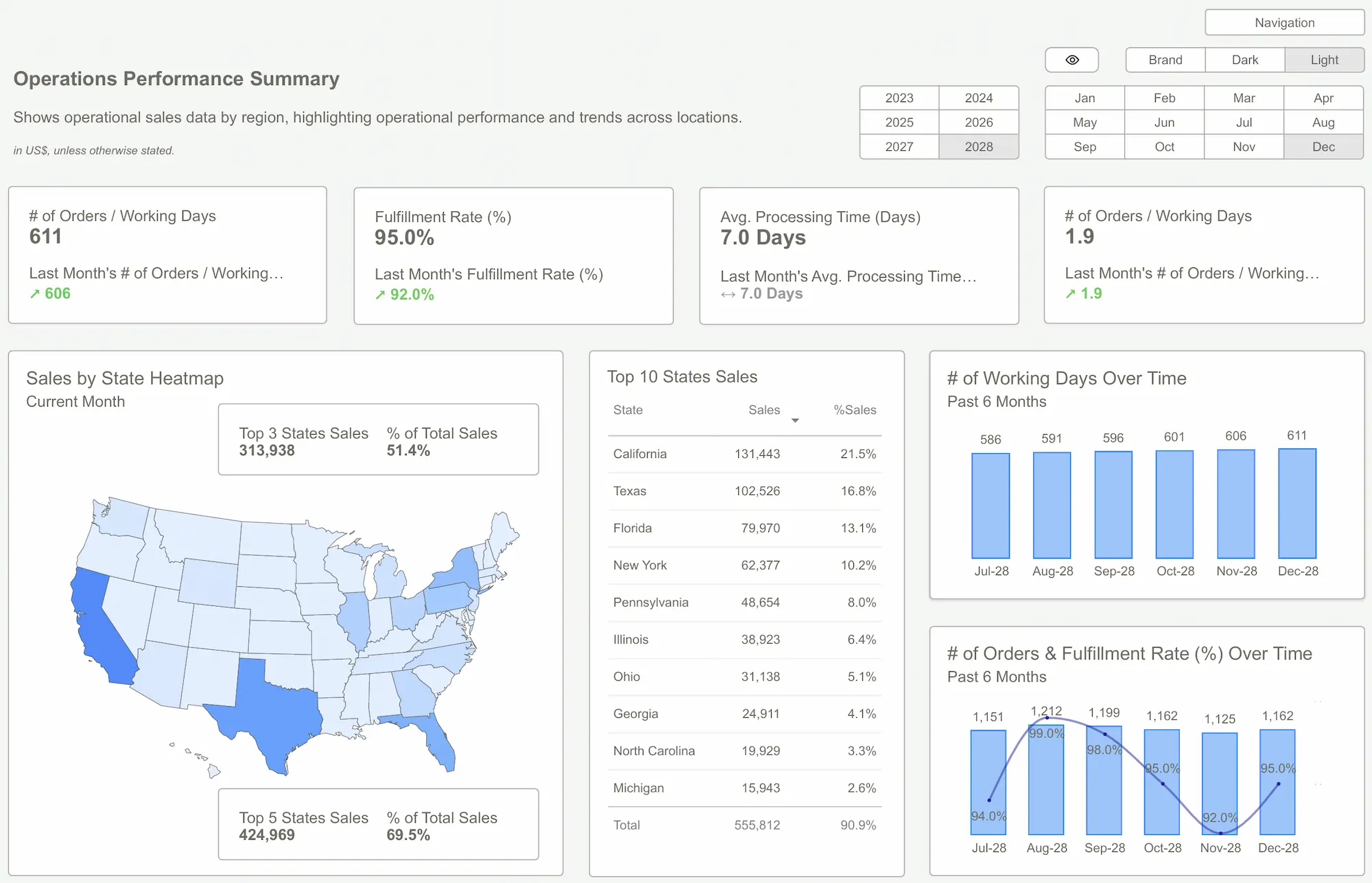 Power BI Templates
Benefits of Using Power BI Templates
Saves Valuable Time
Why spend unnecessary time reinventing the wheel when? One of the most significant advantages of using Power BI templates is the time saved on designing and formatting reports. A Power BI template provides a ready-made structure that you can customize with a few mouse clicks and focus on data analysis instead of spending time on the design elements of your final dashboard.
Consistency Across Reports
Data analysis and reporting isn't a one-time gig but a continuous process. You will have to create reports regularly and across different business verticals. Templates help maintain consistency across multiple reports. Using a standardized layout and design ensures that all your reports have a uniform appearance, which iscrucial for maintaining a professional image. It also helps your target audience understand the reports better and retain the knowledge.

Ease of Use
Power BI templates are user-friendly and easily adapted to suit data sets and reporting needs. It makes them accessible to users of all skill levels, from beginners to advanced analysts. A young member of your team can easily createthe most powerful dashboards using these templates.
Professional Design
As mentioned earlier, your dashboards and reports must be visually impressive and have insights. Templates designed by experts ensure that your reports look professional and convey the intended message. It can enhance the credibility ofyour data and make it more engaging for your audience.
Branding
While templates provide a predefined structure, you can easily customize them to reflect yourbrand and specific reporting requirements. You can modify colors, fonts, andlayouts to align with your organization's style guide.

How To Use Power BI Templates Effectively?
Power BI templates can help you create high-quality reports and dashboards quickly. Let us look athow you can create the most stunning reports using these templates.
Use High-Quality Templates
A well-designed Power BI template provides a structured foundation for reports and dashboards. Youneed to choose templates that align with your goals. The templates must have pre defined layouts for visuals and tables. Ensure the templates have consistent color schemes matching your brand's guidelines to make them stand out and grab attention.
Optimize Data Models and Relationships
Leverage awell-organized data model to enhance performance and usability. Creating relationships between tables using a star schema ensures efficient queries.Avoid unnecessary data loads by filtering data at the source to keep reports responsive. Avoid cluttering the reports to too many data sets as they divert attention and prevent your reports and dashboards from achieving the intended results.
Design for User Experience (UX) andClarity
Use clear and concise labels for charts and KPIs to make dashboards intuitive and actionable.Arrange visuals in a logical order following a left-to-right, top-to-bottom reading pattern. To improve usability, incorporate interactive elements such asslicers, drill-through pages, and tooltips.

Automate and Standardize Reports
To improve efficiency and consistency across reports, set up template themes with predefined fonts, colors, and styles. Use dynamic titles and filters to personalize reports based on user selection. Implement refresh schedules to keep reports up to date with real-time data,ensuring decision-makers always have access to the latest insights.
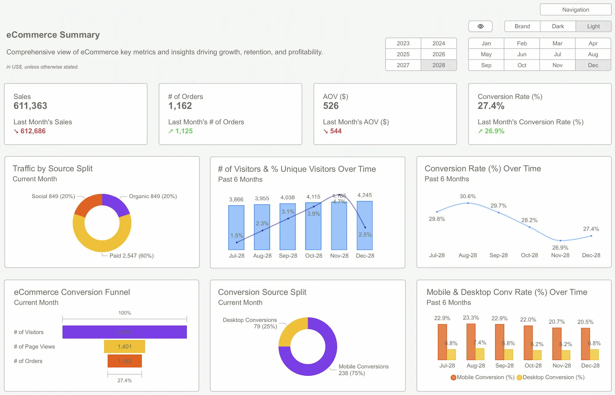 Power BI Dashboard
Final Thoughts
Power BI templates are a powerful tool for streamlining the report creation process and ensuring that your reports strongly impact your target audience. Whetheryou run a startup or an established business, Power BI templates can help youcreate impactful reports that drive data-driven decision-making. So why wait? Start exploring the best Power BI templates and dashboards from Power BI Kit.
We offera wide selection of prebuilt Power BI templates that let you tell your story with impact. Explore our extensive templates and dashboards catering to different roles and industries. Visualization matters in today's digitally driven world. Let us take care of the designs as you work on the data to create the most impactful reports.
So, are you ready to start? Download our templates today to revolutionize your business reporting process!Get Started >
Subscribe to our newsletter
Stay ahead with the latest insights, tips, and trends in PowerBI and data visualization.
Join the network that is unlocking the full potential of their data - one dashboard at a time.
Related posts
Explore more insights and tips with these related posts curated just for you.

Top 10 Power BI Dashboard Examples to Boost Business Insights

Mastering the Power BI Dashboard: Essential Tips for Effective Design
