
Power BI reporting dashboards turn complex data into compelling single-page stories through visualizations. Ron George created Power BI in 2010, and it has grown into a robust business intelligence tool that unites cloud and on-premises data into one complete view.
The process needs careful planning and understanding whether you use Power BI templates or build custom Power BI dashboards from scratch. Power BI dashboard templates can speed up your trip, but you need a Pro or Premium Per User license to create these interactive visualizations in workspaces. In this piece, we will show you the steps to build your first dashboard from planning to implementation.
Planning Your Power BI Dashboard
Your success with Power BI starts well before you create your first visualization. A solid plan builds the foundation you need for a Power BI reporting dashboard that delivers true value. Let's explore the crucial planning steps before we dive into design elements.
Identifying Key Business Questions
The best dashboards answer specific business questions rather than just show available data. You should collect the exact questions your stakeholders need answered. Rather than building a vague "sales dashboard," you'll want to focus on targeted questions like "Which products are under performing against forecast?" or "Where are our customer service bottlenecks?"
Clear questions lead to better designs. You can:
- Turn "I need visibility into our supply chain" into specific questions about bottlenecks, supplier quality issues, and regional lead time variations
- Change "Create a marketing dashboard" into questions about conversion rates and campaign effectiveness
These questions will guide your visual choices and shape your dashboard's structure. They help turn raw data into useful information that drives decisions.
Determining Your Target Audience
Each role needs a unique view of the same data. Executives need high-level KPIs and trend indicators that show the big picture quickly, usually focusing on just 4-5 key metrics with year-over-year comparisons. Department managers need more operational detail with both summary views and ways to explore problem areas deeper. Analysts and specialists prefer rich, interactive dashboards with filtering options and detailed exploration tools.
Your planning should account for these audience factors:
- What learned or cultural assumptions might shape design choices?
- The display environment matters - larger monitors allow more content than tablets
- The report's role in decision-making processes
Dashboards that match specific roles boost adoption rates and help your Power BI templates give maximum value to each user group.
 How to Create Stunning Power BI Reports Using Templates
Selecting Appropriate Metrics and KPIs
A Key Performance Indicator (KPI) shows progress toward a measurable goal visually. Good KPIs track progress and distance to goals by answering "What am I ahead or behind on?" and "How far ahead or behind am I?"
Your metrics should match business objectives directly. To name just one example, if you aim to increase customer satisfaction, relevant KPIs might include customer satisfaction scores and net promoter scores. Simple dashboards work best - limit them to 5-7 KPIs to avoid overwhelming users.
Note that Power BI needs a base measure that gives a value, a target measure or value, and a threshold or goal to create effective KPI visualizations. Your semantic model must have these goal values or you'll need to add them through Excel.
Exploring Power BI Dashboard Templates
Power BI templates are a great way to speed up your work. power BI dashboard templates give you ready-made frameworks that you can adapt right away instead of starting from scratch.
Finding and Downloading Power BI Dashboard Templates
The Power BI service comes packed with template sources for different scenarios. You'll find built-in samples in the Learning center that load directly into your workspace. The Microsoft Power BI gallery lets you download template files (.PBIT format) that are much smaller than regular .PBIX files because they only contain metadata without actual data.
Microsoft's collection is just the start. Templates cover many business areas:
- Financial dashboards that track cash flow and profits
- Marketing templates to analyze campaigns and monitor social media
- HR dashboards that show employee data and turnover rates
Customizing Templates to Match Your Needs
The real power of templates shows up during customization. Your power BI templates become truly yours when you pick one that fits your business area and use View > Themes to match your brand colors. You can then add your key metrics with DAX formulas to track the KPIs that matter to your business.
The template keeps everything from the original setup except the data. You get all the report pages, visuals, data model schema, relationships, measures, and query elements.
When to Use Templates vs. Building From Scratch
Templates shine in specific situations but aren't always your best choice. They work great when deadlines are tight because they cut down setup time. Teams that create regular reports like monthly financials love templates because they keep everything consistent and save time on repeat work.
Building from scratch makes more sense when you work with specialized data or unique metrics that templates can't handle. Your reporting needs might grow by a lot, so starting fresh gives you the freedom to change reports as your business evolves.

Designing an Effective Dashboard Layout
Your dashboard's visual presentation determines how well your data tells its story. A thoughtful design will give your power BI reporting dashboard insights quickly without needing deep analysis.
Dashboard Design Principles
The best dashboards show everything without scrolling because scrolling breaks data flow and overview. Your most vital information belongs in the top-left quadrant. This follows the natural Z-pattern or F-pattern that people use to read. Such placement helps viewers learn key metrics before they look at supporting details.
Dashboards should display important information instantly. You need to remove extra data labels and keep chart scales consistent on axes. Large and small measures should not mix on the same scale. The principles of proximity, similarity, and enclosure help group related elements naturally. This creates an intuitive experience through visual organization.
Color Schemes and Visual Hierarchy
Colors substantially affect how well dashboards work. Power BI dashboards are more readable with lighter backgrounds that reduce eye strain. The 60-30-10 rule works best - 60% dominant color, 30% secondary color, and 10% accent color creates balance.
Size, color, and positioning create visual hierarchy that guides users to important information first. Power BI themes give a structured way to keep all visuals consistent and save hours of formatting. Key elements stand out better with contrasting colors. You should use no more than six colors in a visual.
Mobile-Friendly Dashboard Considerations
Business users need mobility, so power BI dashboard templates must work well on phones. Power BI service lets you create custom views specifically for portrait mode. The mobile layout view has a detailed grid that helps position visuals effectively.
The auto-create mobile layout feature helps with complex reports. It creates a mobile-optimized view automatically by looking at position, size, type, and visual order from your desktop layout. Note that opening your report in Mobile Layout View changes tile sizes and shapes slightly on phones.
Implementing Interactive Features
Interactive features turn static visualizations into dynamic tools that users can explore easily. A power BI reporting dashboard becomes more engaging when users interact with data and learn deeper insights.

Creating Drill-Through Actions
Drill-through makes interactivity better by letting users right-click data points to see detailed information about specific areas. The setup process starts with creating a destination target page that focuses on entities like suppliers or products. The next step needs you to select "Build visual" in the Visualizations pane. Under "Drill through," enable "Keep all filters" and add your chosen drill fields.
Users can right-click data points to access drill-through features. Adding drill-through buttons makes more sense than expecting users to find the right-click option naturally. These buttons show users clearly that they can access more information.
Setting Up Bookmarks For Different Views
Bookmarks in power BI dashboards save the current state of report pages. This includes filters, slicers, and visual selections. They work as storytelling tools that help users navigate through data sections. The setup process works like this:
- Set up your report page to match your desired "snapshot" view
- Click Bookmarks under the View tab and select Add
- Create navigation links between bookmarks using buttons or images
Users can switch between different data visualizations with this feature. The result is a dynamic experience that doesn't need multiple pages.
Adding Q&A Features For User Exploration
The Q&A feature in power BI templates lets users explore data through natural language questions. This tool understands questions and creates visualizations automatically. You can add either a Q&A visual or button to your report.
Users see a question field and suggested questions in the Q&A visual to help them start. Power BI helps complete questions as users type and shows visual feedback. The system picks the right visual type based on questions. Users can also specify their preferred chart types in their queries.
These interactive elements turn your power BI dashboard templates into exploration tools that go beyond simple data presentation.
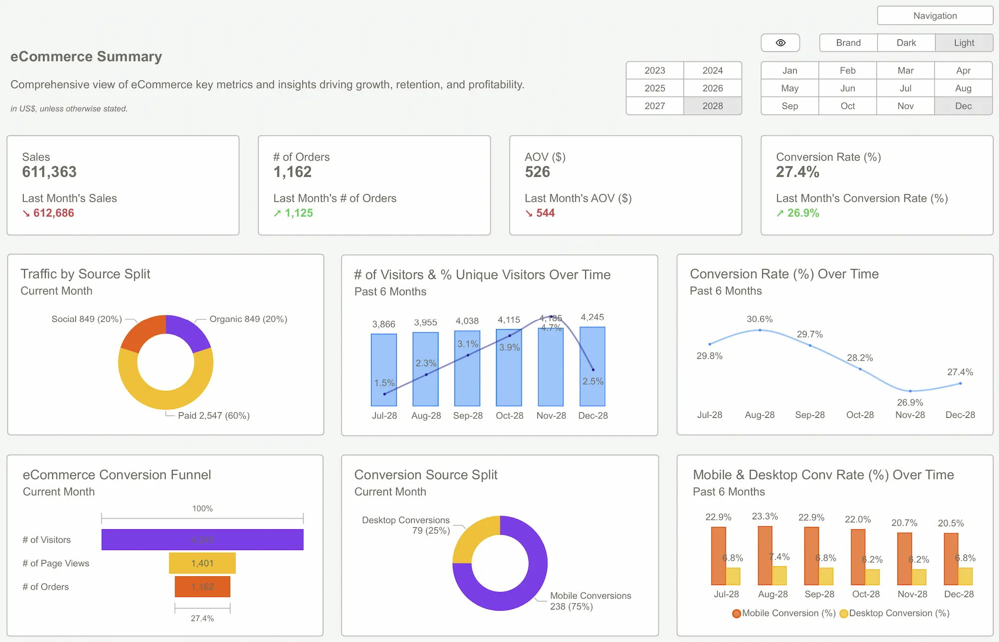
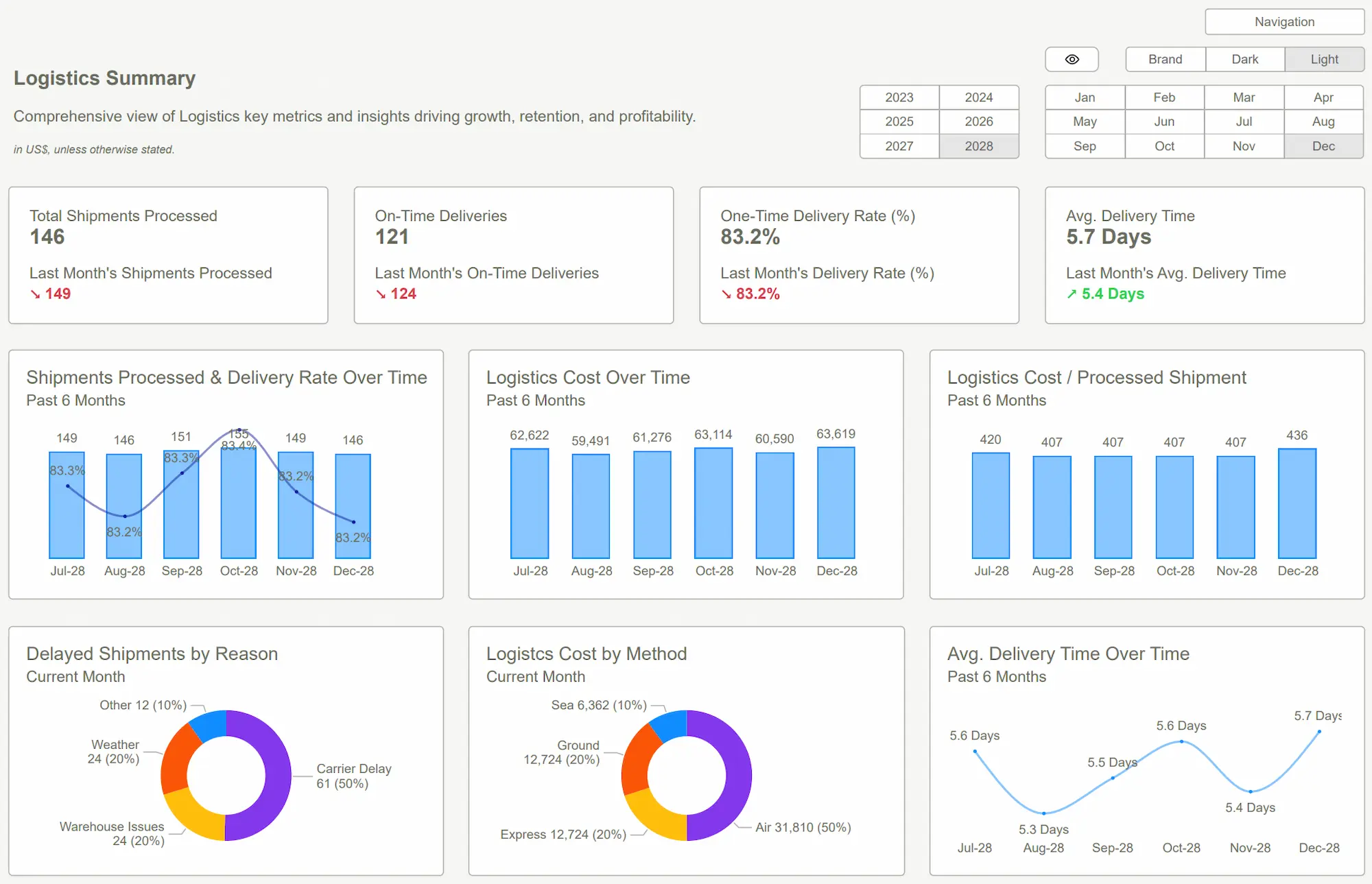 PowerBI Kit
Conclusion
A well-planned approach makes building your first Power BI dashboard easier. The process becomes manageable when you break it down into simple steps that work for everyone - from beginners to experts.
Your dashboard's success depends on asking the right business questions and knowing your audience well. Time constraints? Templates are a great place to start. You can learn about Power BI templates and ways to create better data visualizations in this piece at PowerBI Kit.
The best dashboards strike a perfect balance between looks and function. Your dashboard should be available on all devices with smart color choices and a strategic layout. On top of that, it needs interactive features like drill-through actions, bookmarks, and Q&A capabilities. These features turn basic reports into powerful tools that lead to smarter decisions.
Keep things simple while adding value. Don't overwhelm users with too much data. Create clear visualizations that answer specific business questions instead. Once you're comfortable with these basics, you'll be ready to build complex dashboards that grow with your organization's needs.
FAQs
Q1. How do I start creating a Power BI dashboard as a beginner?
Begin by identifying key business questions and your target audience. Then, select appropriate metrics and KPIs. Use the "Get Data" option to import your data, choose relevant visualizations, and arrange them on your dashboard. Remember to keep it simple and focus on answering specific business questions.
Q2. What are some best practices for designing an effective Power BI dashboard?
Use a light background for better readability, apply the 60-30-10 color rule, and limit your color palette to six colors max. Position crucial information in the top-left quadrant, avoid 3D charts and circular chart types, and ensure consistency in chart scales and dimensions. Also, optimize your dashboard for mobile viewing.
Q3. How can I make my Power BI dashboard more interactive?
Implement drill-through actions to allow users to access detailed information about specific data points. Set up bookmarks to capture different views of your data. Add Q&A features to enable natural language queries. These interactive elements transform static visualizations into dynamic tools for data exploration.
Q4. Should I use a Power BI dashboard template or build from scratch?
Use templates when facing tight deadlines or for regular reports like monthly financials. They can save time and maintain consistency. However, build from scratch when dealing with specialized data, niche metrics, or if your reporting needs are likely to evolve substantially. This provides more flexibility to modify reports as your business grows.
Q5. How can I ensure my Power BI dashboard is mobile-friendly?
Use the mobile layout view in Power BI service to create customized views for portrait mode. Leverage the auto-create mobile layout feature as a starting point, which generates a mobile-optimized view based on your desktop layout. Remember that the size and shape of tiles may change slightly when viewed on a phone.
Ready to build smarter reports? Start your first Power BI reporting dashboard today and turn your data into decisions.Get Started >
Subscribe to our newsletter
Stay ahead with the latest insights, tips, and trends in PowerBI and data visualization.
Join the network that is unlocking the full potential of their data - one dashboard at a time.
Related posts
Explore more insights and tips with these related posts curated just for you.

Top 10 Power BI Dashboard Examples to Boost Business Insights

Mastering the Power BI Dashboard: Essential Tips for Effective Design
