In today’s data-driven world, businesses rely on clear, insightful data to make informed decisions. A Power BI interactive dashboard helps by transforming complex datasets into easy-to-understand visuals. However, with more users spending long hours analyzing reports, the need for a visually comfortable and engaging interface has become more important than ever. This is where dark mode comes in—not just as a trendy feature but as a way to improve both the user experience and the clarity of data.
Why Dark Mode is Gaining Popularity in Power BI Interactive Dashboards
1. Reduces Eye Strain During Long Data Analysis Sessions
Staring at a bright screen for extended periods can cause eye fatigue, especially in low-light environments. Dark mode alleviates this strain by using a darker background, which reduces glare and makes it easier for the eyes to focus. This helps users stay engaged and productive for longer periods without discomfort.
2. Enhances Contrast and Highlights Key Insights
Dark mode improves visual contrast, making bright charts, graphs, and text pop against the darker background. This heightened contrast makes it easier for users to identify trends and spot important insights quickly, which is particularly useful when analyzing complex data sets.
3. Gives Your Dashboard a Modern, Professional Look
A Power BI interactive dashboard in dark mode instantly looks more polished and contemporary. This sleek, professional design not only appeals to modern users but also adds a layer of sophistication to your reports. When presenting data to clients or stakeholders, a well-designed dark mode dashboard can leave a lasting impression.
4. Minimizes Distractions and Keeps Users Focused
Bright interfaces can sometimes be visually distracting, especially when users are trying to concentrate on complex data. Dark mode reduces these distractions by toning down background brightness, allowing users to focus more effectively on the information presented. This helps improve overall data comprehension and decision-making.
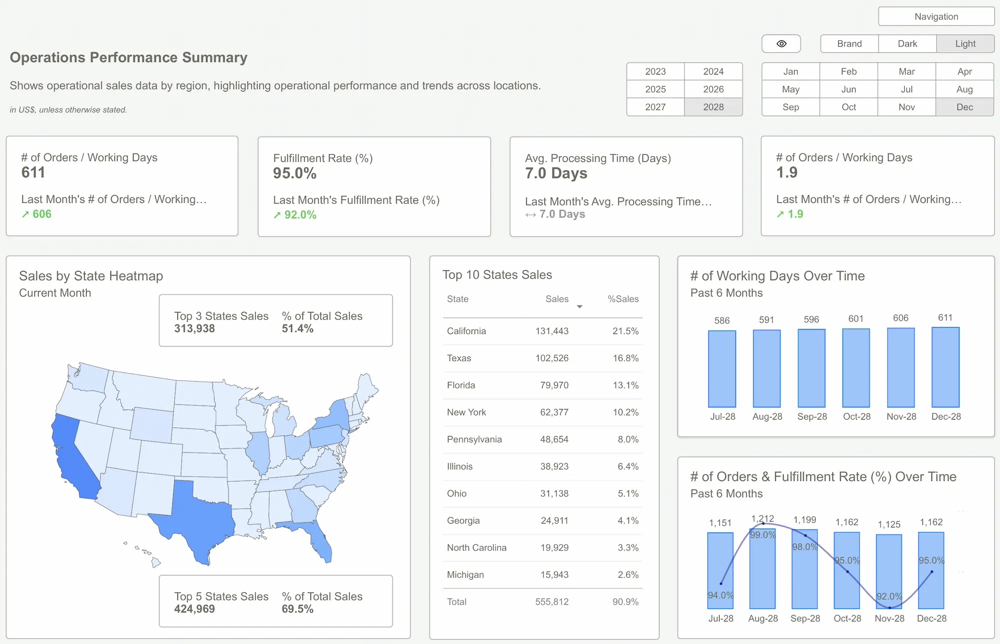 Power BI Templates – Boost Your Business Reporting
How to Implement Dark Mode Effectively in a Power BI Interactive Dashboard
1. Choose the Right Color Palette
A successful dark mode design starts with selecting the right colors. Avoid using pure black as the background, as it can create harsh contrasts that strain the eyes. Instead, opt for deep shades of gray, navy, or charcoal, which provide a softer and more comfortable viewing experience. Pair these with light gray or off-white text to ensure that content remains readable. Use vibrant accent colors sparingly to draw attention to important data points without overwhelming the design.
2. Adjust Charts and Visual Elements for Better Visibility
Colors that look great in a light theme may lose their impact in dark mode. To maintain visual clarity, adjust the hues, contrast levels, and saturation of charts and graphs to ensure that they stand out effectively. Pay close attention to text labels and data points, making sure they remain easy to read in all conditions.
3. Use Power BI’s Custom Theme Feature for Consistency
Power BI allows users to create custom themes using JSON files, which makes it easy to maintain a consistent look and feel across all dashboards. By defining color schemes, fonts, and visual styles in advance, you can create a cohesive dark mode experience that feels intuitive and familiar to users.
4. Test Across Different Devices and Screens
Dark mode can appear differently depending on the device or screen being used. It’s essential to test your Power BI interactive dashboard across desktops, tablets, and mobile devices to ensure that visual elements remain clear and consistent. Gathering user feedback during this phase can also help identify potential issues and refine the dark mode experience.
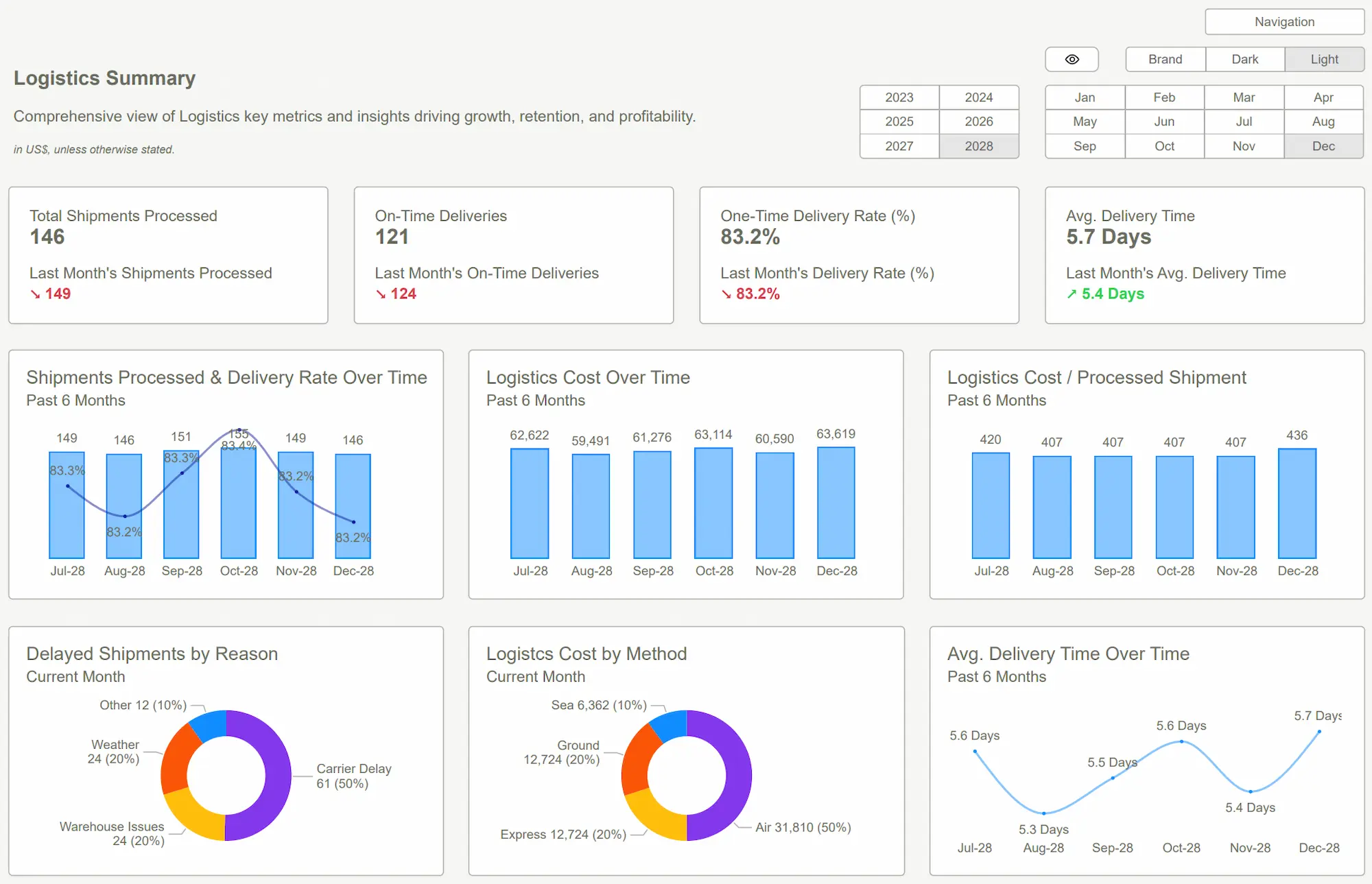
Challenges of Using Dark Mode in Power BI
1. Accessibility Concerns for All Users
Not all users prefer dark mode, and some individuals, particularly those with visual impairments, may find it difficult to read text or interpret charts in a darker interface. To ensure inclusivity, consider offering a toggle that allows users to switch between light and dark modes based on their preferences.
2. Integrating Dark Mode with Existing Reports
If your organization already has established visual standards for Power BI dashboards, introducing dark mode may require adjustments to ensure consistency. It’s important to align dark mode themes with your existing brand guidelines to create a seamless experience for users.
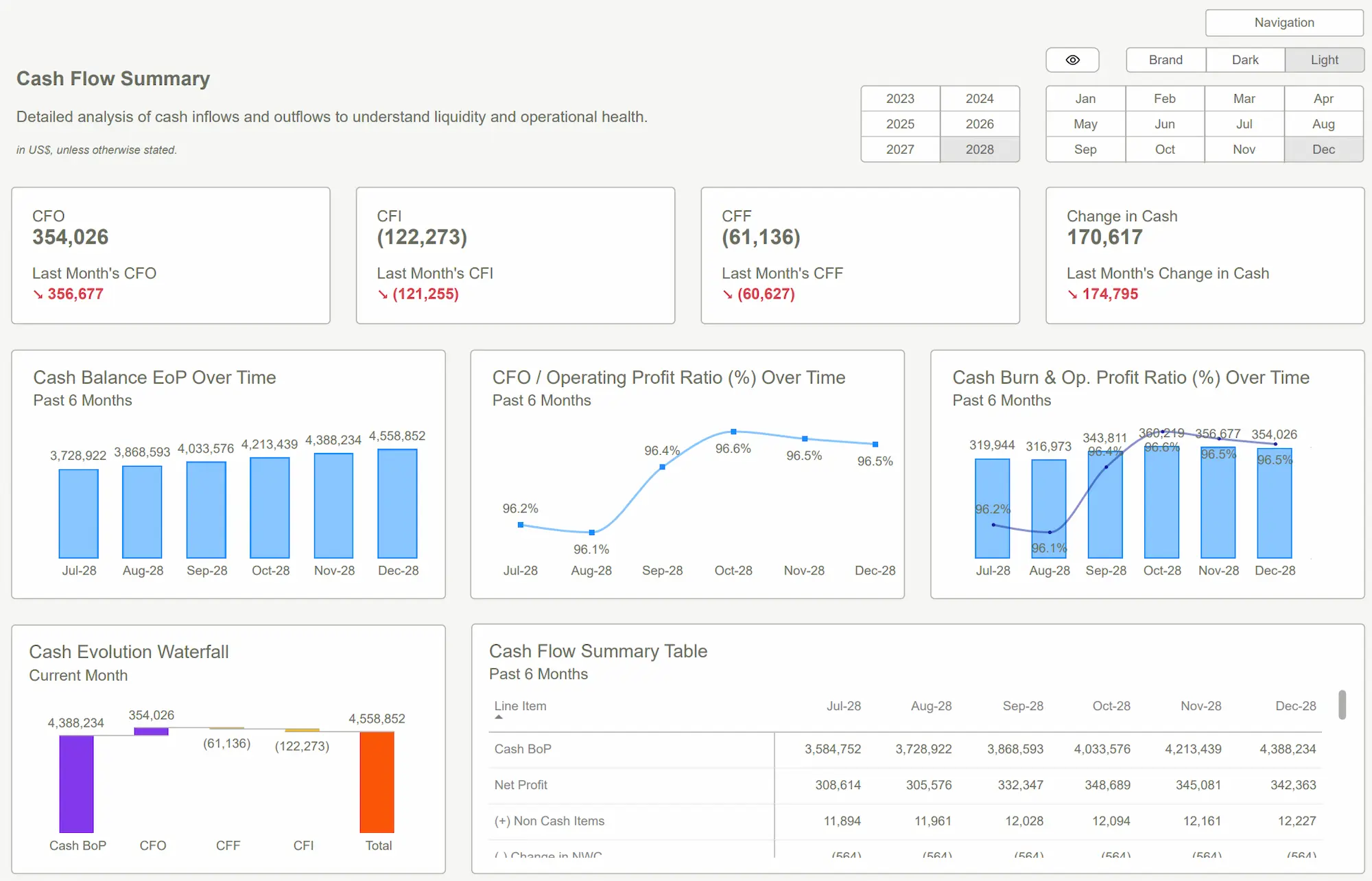
Best Practices for Designing a Dark Mode Power BI Interactive Dashboard
To create a visually appealing and functional dark mode dashboard, follow these best practices:
- Maintain High Contrast for Readability – Make sure that text, charts, and visual elements maintain sufficient contrast against the background to remain clear and legible.
- Use Bright Accent Colors Sparingly – Highlight key data points with vibrant accent colors, but avoid overusing them to maintain a clean and balanced design.
- Ensure Consistency Across Themes – Standardize colors, fonts, and styles across all dashboards to create a cohesive and intuitive user experience.
- Offer a Light Mode Option – Give users the flexibility to switch between light and dark modes to accommodate different preferences.
- Test Across Devices and Screen Types – Validate the appearance of dark mode on various devices to ensure a consistent and high-quality experience.
Conclusion
A well-designed Power BI interactive dashboard in dark mode can significantly improve the user experience by reducing eye strain, enhancing data clarity, and giving your reports a modern, professional look. However, implementing dark mode effectively requires careful attention to color contrast, visual hierarchy, and accessibility.
For businesses looking to optimize their Power BI dashboards with an expertly designed dark mode, Powerbikit offers powerful tools and guidance to create high-quality, interactive reports.
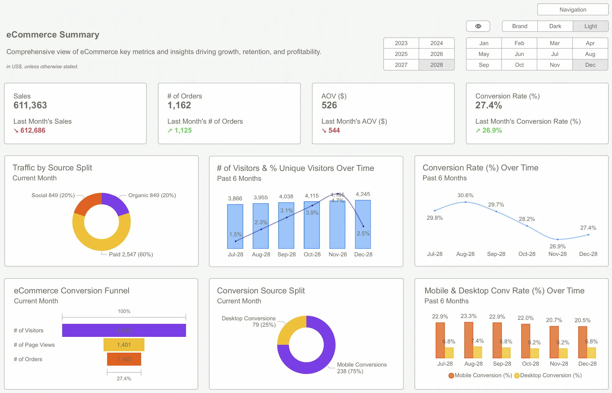 Power BI Dashboards for Business Growth
FAQs
1. How do I enable dark mode in Power BI?
Power BI doesn’t have a built-in dark mode, but you can create a custom theme using a JSON file. Define background, text, and visual element colors to create a consistent dark mode experience.
2. Does dark mode improve dashboard performance in Power BI?
Dark mode doesn’t directly affect performance, but it enhances user comfort and focus, allowing users to analyze data more effectively for longer periods.
3. Can I switch between light and dark mode in Power BI?
Power BI doesn’t offer a native toggle for switching between themes, but you can create multiple themes and use bookmarks or buttons to let users switch between light and dark modes.
Get our Power BI Interactive Dashboard today to improve reporting with actionable insights.Get Started >
Subscribe to our newsletter
Stay ahead with the latest insights, tips, and trends in PowerBI and data visualization.
Join the network that is unlocking the full potential of their data - one dashboard at a time.


