Your team launched the new dashboard. There was a kick-off meeting, maybe even some polite applause. A week later? Crickets. Two weeks later, you see Dave from Finance exporting a CSV to build his real report in Excel. The dashboard sits unused, a digital ghost town.
Sound familiar?
Most teams blame the wrong thing. They blame user habits ("people just love their spreadsheets"), the data ("it's always a mess"), or even Power BI itself. They’re all wrong. The excitement died because the tool failed them.
The real culprit is almost always the template's foundation. It’s the hidden mess of tangled data relationships, sluggish DAX measures, and a nonsensical data model that makes the report slow, unreliable, or both. You don’t have a user adoption problem. You have an architecture problem.
Reveal the Real Problem
Smart people make this mistake constantly. They get seduced by aesthetics. They spend weeks agonizing over color palettes, chart types, and logo placement, assuming a beautiful dashboard is a useful one. It isn't.
This is the fundamental blind spot for teams graduating from Excel. A pivot table doesn’t care if your data model is a disaster; it will dutifully chug along and spit out a number. That number might be dead wrong, but it will be fast. Power BI is different. It’s more powerful, but it’s also less tolerant of chaos. When you connect it to a poorly structured data source, it exposes every flaw.
The symptoms are always the same:
- Glacial Load Times: The dashboard takes 30 seconds or more to load. No one has that kind of patience. They’ll close the tab and go back to what they know.
- Broken Visuals: Someone clicks a filter—say, to isolate a specific sales region—and half the charts go blank or show an error. Trust is immediately destroyed.
- Mismatched Numbers: The revenue figure on the dashboard doesn't match the P&L from accounting. Game over. Your dashboard is now officially "that report with the wrong numbers."
When your team can't trust the tool, they abandon it. And you’re left flying blind, making critical decisions about cash runway and burn rate based on gut feelings and outdated spreadsheets. That’s not just inefficient; it’s dangerous.
 Power BI Templates
Reframe the Thinking
To fix this, you have to stop thinking about your dashboard as a "report" and start thinking about it as a product.
A good product just works. It’s intuitive, reliable, and does the job it was designed for. You don’t need a manual to use a hammer. Likewise, you shouldn’t need a therapy session to figure out your monthly recurring revenue. The goal of a great dashboard is to become a background utility—an extension of your own thinking.
This requires a mindset shift from visualizer to architect. The value of a powerful Power BI dashboard isn’t in the donut chart; it's in the clean, optimized star-schema data model working silently in the background. It’s in the elegant DAX measures that calculate your key metrics instantly and accurately, every single time.
Your team is smart. They can smell a faulty number a mile away. A report that isn't trusted is just expensive art.
This is where professionally engineered Power BI Templates change the game. They aren't just collections of pre-designed charts. They are pre-built data products. The architecture is already solved. The performance is optimized. The data models are clean and logical, designed by people who have spent thousands of hours fixing the very problems you’re facing now. You’re not buying a paint job; you’re buying a finely tuned engine.
 Power BI Dashboard vs. Report: What’s the Difference?
What Good Looks Like
When the foundation is solid, the magic happens. Instead of troubleshooting, your team spends its time making decisions. That’s the entire point.
A well-built template from Power BI Kit is the shortcut to that outcome. We’ve already done the hard architectural work so you can get straight to the insights.
Here’s what that looks like in practice:
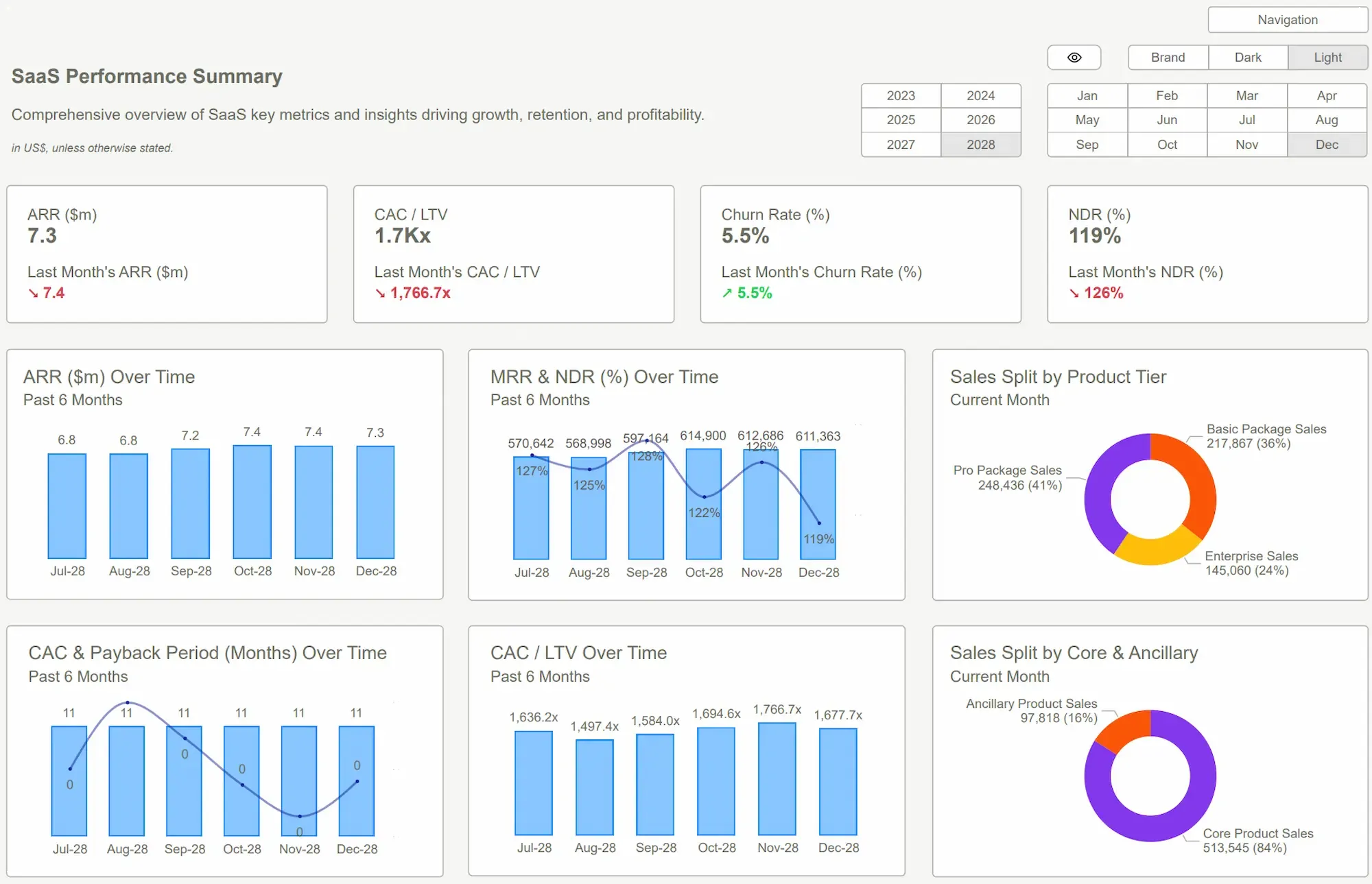
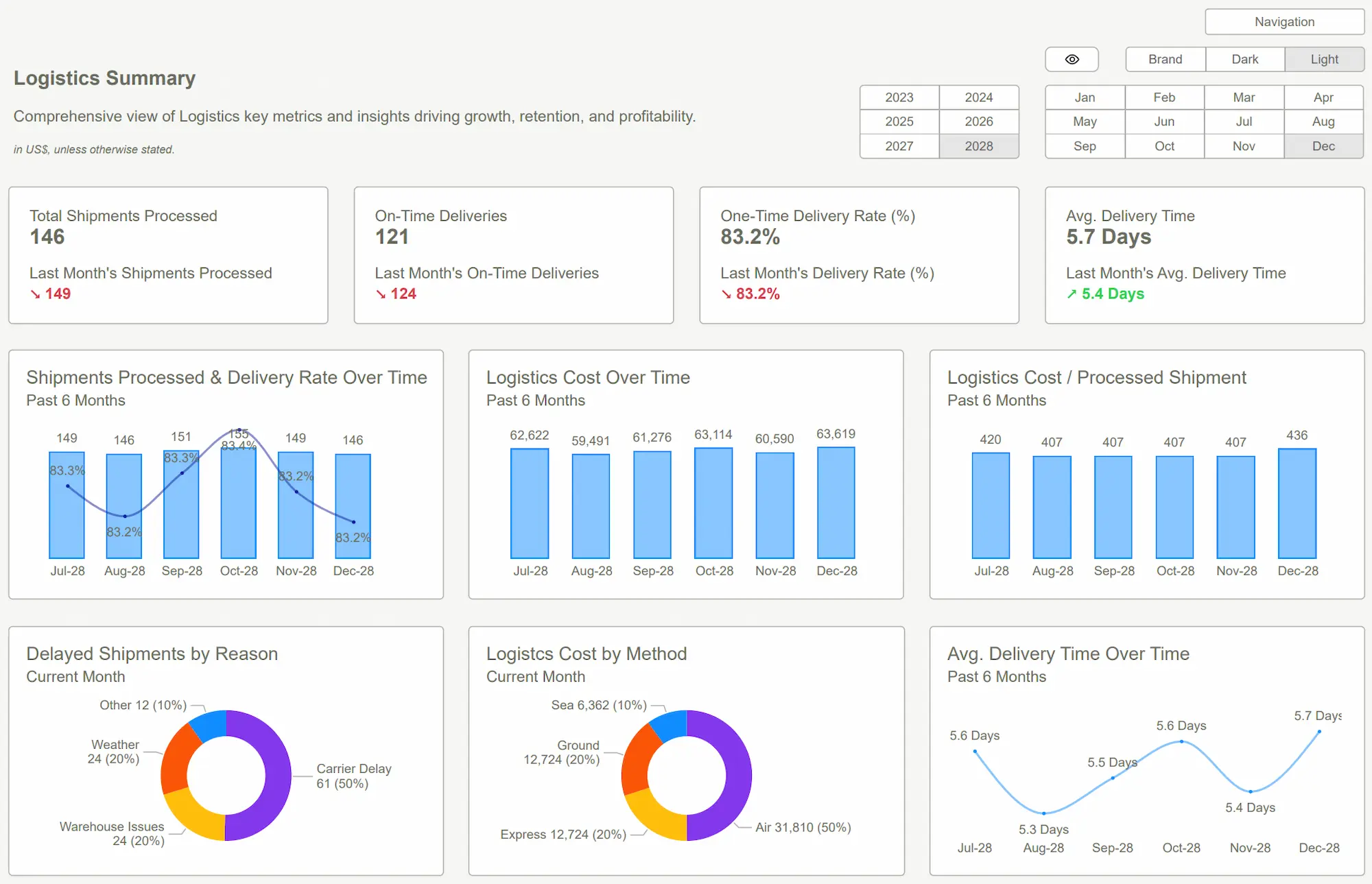
- For Finance: Forget waiting for a report to load your cash flow analysis. Our Financial Consolidation Template connects directly to your P&L, Balance Sheet, and Cash Flow statements. You get an immediate, trustworthy view of your financial health, from cash runway down to department-level burn rate. No lag, no errors.
- For Marketing: Your team needs to connect ad spend to actual revenue. Our templates are built with the right relationships to bridge that gap. They can filter by campaign, channel, or creative and see the ROI in seconds, without begging a data analyst to fix a broken join.
- For Founders & Ops: You need the 30,000-foot view, but you also need to trust the details. Our templates allow you to drill down from a high-level KPI to the underlying transactions with two clicks. You can trust the numbers because the model is built for integrity.
The ROI isn't just in the time saved building reports. It's in the quality of the decisions you make. It's the confidence that comes from knowing the data is right. Adopting our Power BI templates is simple: connect your data, and the insights are there. It's the clarity you thought you were getting in the first place.
 DAX GuidePower BI Dashboard
Conclusion
Let’s be direct. If your team isn’t using your dashboard, the dashboard is the problem, not the team. You’ve been trying to fix the wrong thing. Stop tweaking the colors and start fixing the engine.
The fastest way to do that is to stop building from scratch. The shift from struggling with broken reports to leveraging a high-performance data product is the single most impactful change you can make to your analytics culture. A world-class financial model or operational overview is no longer a six-month project.
With the right Power BI Templates, it can be done in an afternoon.
Stop wasting your most valuable resources—your team’s time and your company’s capital—on tools that don't work. The cost of indecision, or worse, decisions based on bad data, is a tax your business can’t afford to pay. Get the clarity you need.
Stop letting bad reports dictate your decisions. Our templates are built to work, so you can get back to work. Find your Power BI Kit template now and start seeing the truth in your data.Get Started >
Subscribe to our newsletter
Stay ahead with the latest insights, tips, and trends in PowerBI and data visualization.
Join the network that is unlocking the full potential of their data - one dashboard at a time.
Related posts
Explore more insights and tips with these related posts curated just for you.

What Makes a Good Power BI Dashboard? Design Principles and Examples

Power BI Dashboard Examples That Save Time, Impress Leadership, and Actually Work