Some dashboards are beautiful. Just one problem: no one knows what they’re looking at.
Every week, teams share dashboards that sparkle with design but collapse under scrutiny. The colors pop. The charts spin. But ask three people what the dashboard is saying — and you’ll get three different answers.
The misconception? That a good dashboard is about creativity or completeness.
The truth: A good dashboard is about instant clarity.
This post breaks down the common design flaws we see in Power BI dashboard examples — and shows how the best templates strip away the noise, align the story, and sharpen decisions.
Why Most Dashboards Fail
Here’s what trips most people up: they confuse data visibility with data usability.
More charts doesn’t mean more clarity. More KPIs doesn’t mean more insight. Most Power BI dashboards fail because they overwhelm the eye and underwhelm the mind.
Common flaws we see again and again:
- Color Chaos: Every category has a new hue. Heatmaps fry the brain.
- KPI Soup: 19 metrics, all bold, none prioritized.
- Broken Flow: No visual hierarchy. The eye bounces around like a pinball.
- Misleading Visuals: Bar charts where lines make more sense. Pie charts doing things they were never meant to do.
- Filter Fiascos: Click anything and the whole page changes — in unpredictable ways.
These dashboards look impressive. But they hide the story instead of telling it.
Worse? They waste attention. Users spend time decoding instead of deciding.
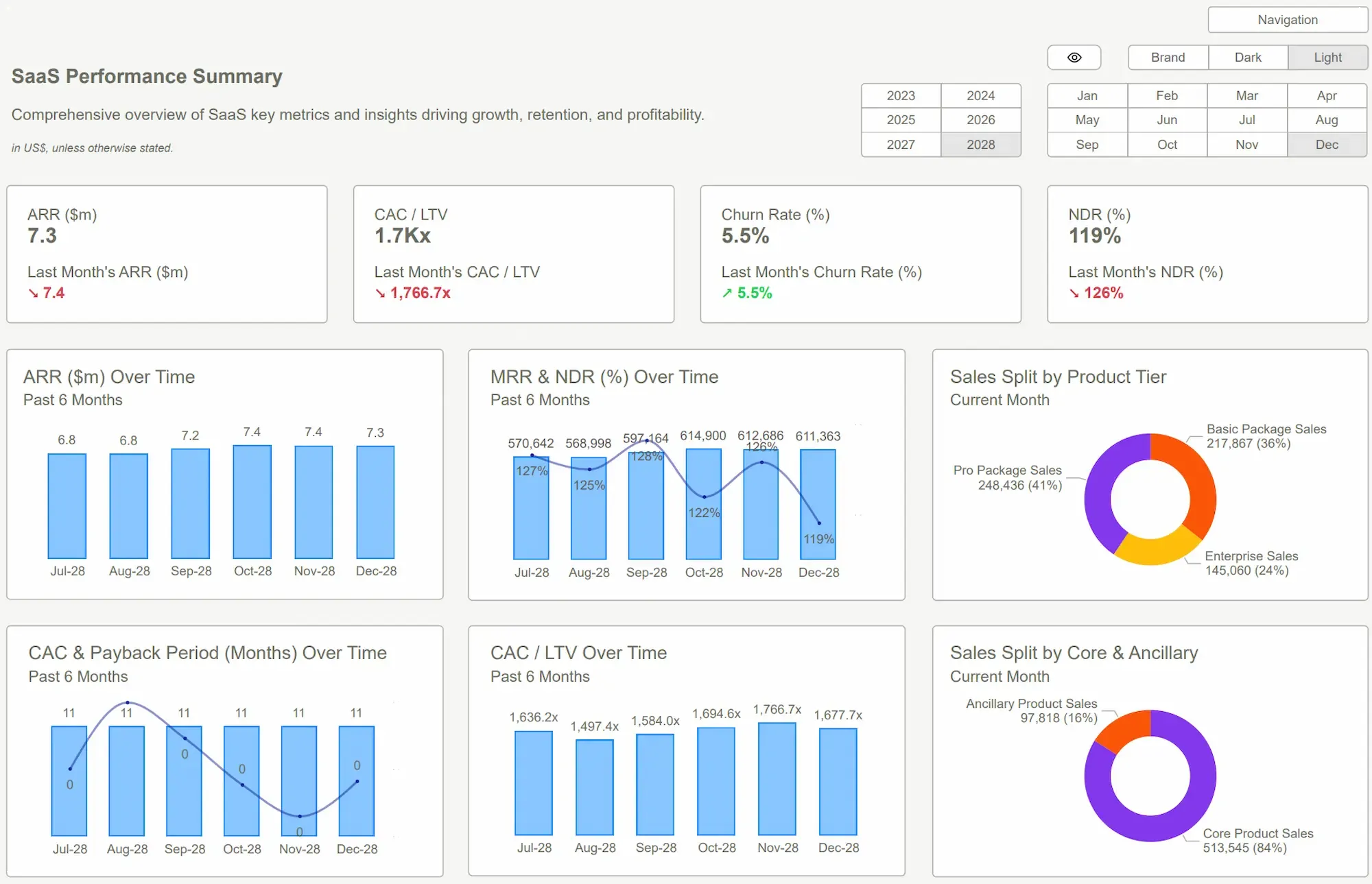
 Power BI Dashboard Examples
Reframe It — From Flash to Function
Here’s the shift: treat your dashboard like a tool, not a trophy.
The best Power BI dashboard templates do one thing well — they impose creative constraints. And that’s what makes them powerful.
Templates force discipline:
- Pre-defined layouts prevent chaos
- Curated KPIs eliminate vanity metrics
- Standard interactions reduce user confusion
- Embedded tooltips and titles guide interpretation
Suddenly, you’re not reinventing structure each time. You’re focused on what matters: what does the data say — and what should we do about it?
Templates don't just make design easier. They make it harder to design badly.
Sharp Insight:
"If your dashboard needs a presentation to make sense, it's not a dashboard — it's just a pitch deck in disguise."
7 Must-Have Power BI Templates for Small BusinessesWhat Good Looks Like
What does a decision-ready dashboard actually look like?
It’s not flashy. It’s focused.
Before (The Chaos Dashboard):
- Ten chart types, no clear question being answered
- Metrics that update but don’t connect
- Filters that users are scared to touch
After (Template-Driven Clarity):
- Top-left: one key number, bold and labeled (“Revenue MTD”)
- Center: trend line over time, with clear targets
- Bottom: action levers (e.g., by product, by region, by channel)
- Tooltips explain terms; titles tell you what you’re looking at
Good dashboards don’t just report. They guide.They reduce friction, spotlight anomalies, and let teams move faster with more confidence.
And when they’re built on templates, they stay clean — no matter who updates them.
 Tableau Dashboards Best PracticesPower BI Dashboard
Conclusion
Most Power BI dashboard examples look the part — but fail the test.
They confuse aesthetics with effectiveness. They show everything, but say nothing.
Templates flip the script. By enforcing structure and guiding design, they make dashboards intuitive, readable, and above all — useful.
If your team can’t tell what to do next after glancing at the dashboard, it’s not a dashboard. It’s a distraction.
Stop guessing. Start seeing. Explore Power BI Kit’s pre-built templates — made for clarity, speed, and confident decisions.Get Started >
Subscribe to our newsletter
Stay ahead with the latest insights, tips, and trends in PowerBI and data visualization.
Join the network that is unlocking the full potential of their data - one dashboard at a time.
Related posts
Explore more insights and tips with these related posts curated just for you.

What Makes a Good Power BI Dashboard? Design Principles and Examples

Power BI Dashboard Examples That Save Time, Impress Leadership, and Actually Work