Let’s be blunt. Most financial reporting is a colossal waste of time. You spend the first week of the month wrangling data from six different systems. You wrestle it into a spreadsheet with 37 tabs. You email the 12MB file to the leadership team, who either ignore it or reply with, “Can you show this by region?”
The core misconception is that more data leads to more clarity. It doesn’t. It leads to more noise, more questions, and more follow-up work. Your job isn’t to be a data janitor, exporting CSVs and updating pivot tables until your eyes glaze over. Your job is to find the signal in the noise.
This isn’t about building prettier charts. It’s about building a machine for understanding financial reality. We’re going to break down the specific Power BI dashboards and metrics that separate a high-functioning finance team from one that’s perpetually stuck in the weeds of last month’s numbers.
Reveal the Real Problem
The smartest finance teams I know still get this wrong. They’re brilliant people, armed with advanced degrees and a black belt in VLOOKUP. But they are trapped. Trapped by tools and habits built for a different era.
Your spreadsheet isn’t the answer. It’s the problem.
A spreadsheet is a static snapshot of a world that stopped existing the moment you hit “save.” It’s brittle—one bad formula, one copy-paste error, and your entire forecast is fiction. It’s a dead end for curiosity. When the CEO asks, “What happens to our cash runway if we delay this hire by two months and sales miss their target by 10%?” your spreadsheet just stares back, silent and useless. Answering that question means another three hours of modeling. By then, the decision has already been made on a gut feeling.
This isn't a minor inconvenience. It’s a high-cost blind spot. It’s the reason companies run out of cash unexpectedly. It’s why you’re overspending on one department while starving another. The symptom is that dreaded monthly budget review where everyone defends their turf, nobody trusts the numbers, and the entire conversation is about why the report is confusing. You’re not having a strategic discussion; you’re debugging a document in real-time.
 Power BI Dashboard Examples
Reframe the Thinking
The solution isn't a more complex spreadsheet. It’s a fundamental shift in mindset: from reporting data to communicating insight. You need to stop delivering a phone book of numbers and start telling a story. A financial story.
It’s a simple narrative with three acts:
- Here is what happened. (P&L, variance analysis)
- Here is why it happened. (Drill down into departmental spend, revenue by product)
- Here is what we should do next. (Cash runway scenarios, forecast modeling)
Spreadsheets are terrible at this. They’re built for calculation, not communication. Power BI, on the other hand, is built for exactly this kind of interactive storytelling. But just having the tool isn’t enough. You can make an unreadable, useless dashboard in Power BI just as easily as you can in Excel. The key is knowing what good looks like.
This is where most teams stumble. They try to replicate their old, bloated spreadsheets in a new tool, cluttering the screen with dozens of disconnected charts. The most expensive meeting is the one you hold to explain the report you just sent. A truly effective dashboard explains itself. It anticipates the next question and provides the answer with a single click. The fastest way to get there is to stop guessing and start learning from battle-tested Power BI dashboard examples that are already optimized for clarity and impact.
 Why Your Power BI Template Isn't Working (And How to Fix It)
What Good Looks Like
This is where theory meets reality. A well-designed Power BI dashboard doesn't just present data; it guides a decision. Instead of a flat P&L report, you get an interactive financial summary.
What does that look like in practice?
- P&L Variance Analysis: Imagine a dashboard where your P&L is displayed with clear variance-to-budget visuals. You see Operating Expenses are 15% over budget. You don’t need to ask why. You click on "OpEx," and a waterfall chart instantly shows you that the marketing department’s event spending is the culprit. One more click, and you see the spend broken down by specific campaigns. The conversation shifts from "Why are we over budget?" to "Was the ROI on that event worth it?"
- Cash Runway & Burn Rate: Stop updating your cash forecast manually. A dynamic Power BI dashboard connects to your bank data and financial model. It shows your current cash, net burn, and runway in months. More importantly, it includes slicers and inputs. What if we increase ARR by 5%? What if we hire three new engineers? You can model scenarios live in the meeting, turning a backward-looking report into a forward-looking strategic tool.
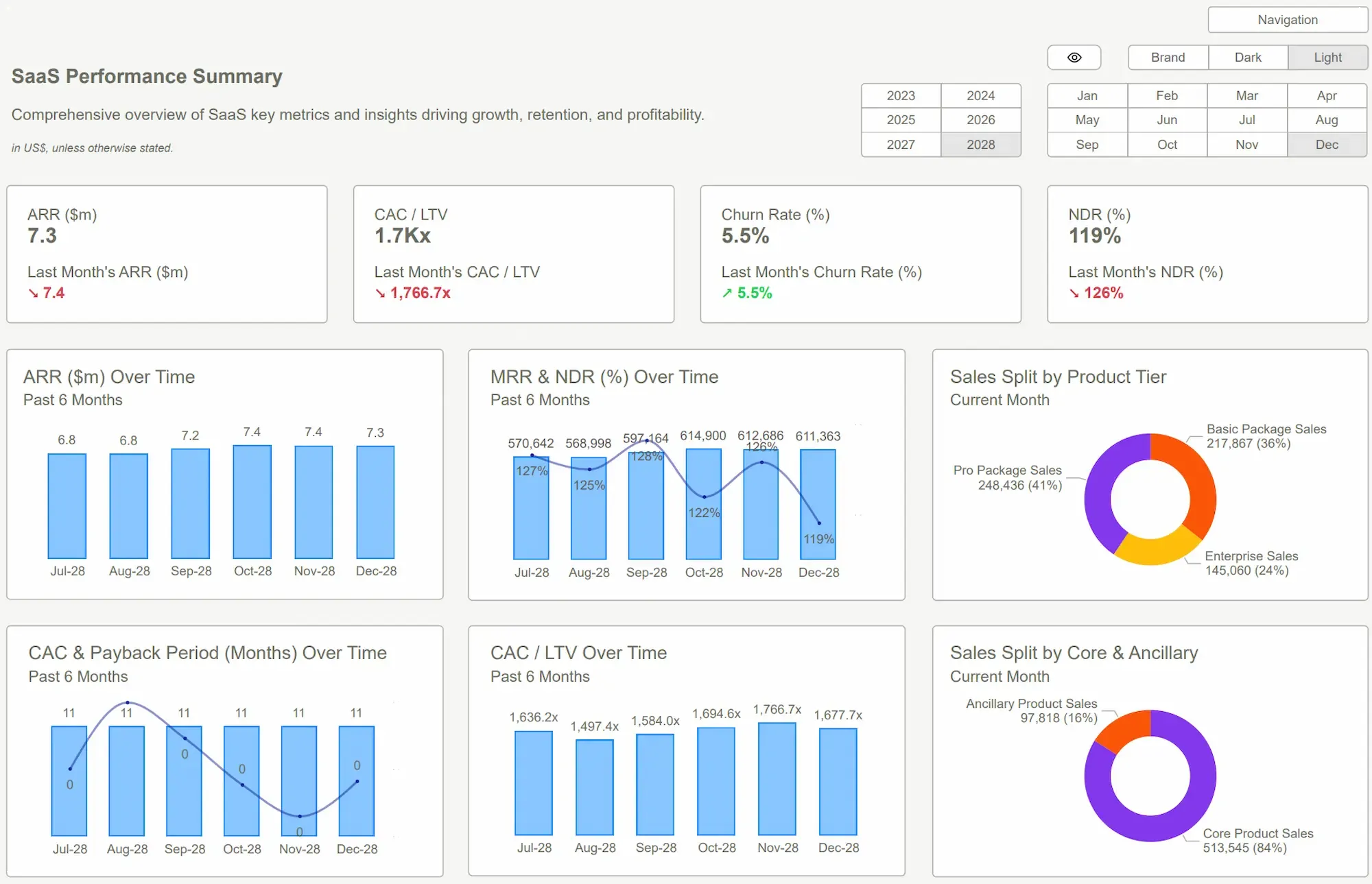
- SaaS Metrics That Matter: For a SaaS business, a generic financial dashboard is useless. You need to track MRR movements, Cohort Retention, LTV:CAC, and Payback Period. Our templates have these built-in. You’re not just seeing revenue; you’re seeing the underlying health of your customer base and business model.
This isn't about starting from scratch. That's a six-month project with a 50% chance of failure. This is about leveraging pre-built, expert-designed Power BI templates. You connect your data, and within hours, you have a sophisticated financial intelligence engine. The ROI is obvious: you reclaim dozens of hours a month, eliminate costly errors, and finally equip your leadership team to make decisions based on reality, not gut feelings.
 DAX GuidePower BI Dashboard
Conclusion
Let’s circle back. The goal was never to get better at making spreadsheets. The goal is to give your business the financial nervous system it needs to survive and thrive. That requires a shift from being a data reporter to becoming a storyteller who uses numbers to reveal the truth.
Stop building reports that need a translator. Start building dashboards that spark decisive action. The patterns for doing this well are already established. You don't need to reinvent the wheel; you just need to stop choosing the square one.
Studying the right Power BI dashboard examples is the first step. Implementing a proven template is the leap forward that separates the teams who talk about data from the ones who profit from it. Don't let another month-end close be a frantic, low-value exercise in data entry. The clarity you're looking for is closer than you think.
Stop wrestling with spreadsheets. Get the financial clarity your business deserves. Explore our Power BI templates now and see your data clearly for the first time. It's time to stop guessing and start seeing.Get Started >
Subscribe to our newsletter
Stay ahead with the latest insights, tips, and trends in PowerBI and data visualization.
Join the network that is unlocking the full potential of their data - one dashboard at a time.
Related posts
Explore more insights and tips with these related posts curated just for you.

What Makes a Good Power BI Dashboard? Design Principles and Examples
Power BI Dashboard Examples That Save Time, Impress Leadership, and Actually Work