Most companies are sitting on a mountain of data. And most companies are still making critical decisions based on gut feelings, stale spreadsheets, and whatever anecdote the loudest person shared in the last meeting. It’s a quiet disaster happening in thousands of businesses every day.
The common fix? “We need a dashboard.”
So, you open up Power BI, drag in some data, and create a few pie charts. Everyone pats themselves on the back. The problem is, this solves nothing. The misconception is that the goal is to visualize data. It’s not.
The goal is to build a tool that forces uncomfortable, profitable conversations. This isn’t a guide on which color to make your bar charts. This is a step-by-step walkthrough of how to build your first Power BI Dashboard that does its one true job: revealing the truth, even when it’s inconvenient.
Reveal the Real Problem
Let’s be direct. Even smart teams build terrible dashboards. I’ve seen it a hundred times. They get excited about the technology and completely miss the point.
The first mistake is focusing on aesthetics over utility. They create a beautiful, symmetrical, company-branded screen full of charts that is utterly useless. It’s the business equivalent of a sports car with no engine. Looks great, goes nowhere. They cram every metric they can think of onto one screen, a phenomenon I call “data vomit.” The result is a canvas of noise that communicates nothing. No one knows where to look, so they look away.
The second mistake is treating the dashboard like a static report. They build it, present it once in a quarterly meeting where everyone politely nods, and then it’s never looked at again. Why? Because old-school tools trained us to think of data as a snapshot, a PDF or Excel file that’s dead on arrival. It’s a record of what happened, not a tool for influencing what happens next.
This leads to high-cost blind spots. You’re celebrating a low cost-per-lead from a new marketing campaign while that channel’s customers churn at 3x the average rate. You’re looking at a healthy top-line revenue number while your cash runway is secretly shrinking due to delayed invoice payments. These aren't minor oversights. They’re the kind of hidden icebergs that sink companies. The symptoms are endless debates about whose numbers are “right” instead of what the numbers mean for the business.
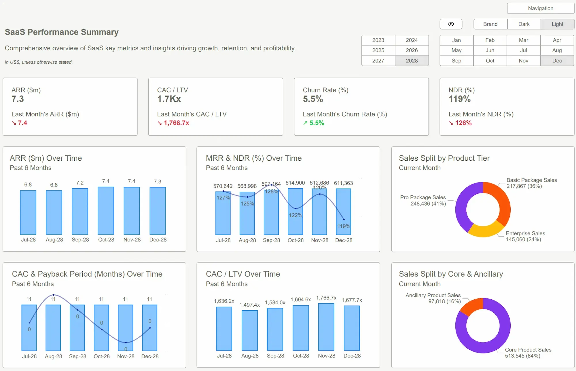
 Power BI Dashboard
Reframe the Thinking
If you want to build a useful Power BI Dashboard, you have to stop thinking about data. Stop thinking about charts. Stop thinking about the tool.
Instead, start with one thing: a critical business question.
This is the “Question-First” framework. Don’t start by asking, “What data can we show?” Start by asking, “What decision do we need to make?” or “What risk do we need to understand?”
- Instead of "Let's show sales data," ask, "Which of our salespeople are selling the most, and which are the most profitable?" They are rarely the same person.
- Instead of "Let's show website traffic," ask, "Which marketing channel delivers customers with the highest lifetime value?"
- Instead of "Let's show our expenses," ask, "What is our true, all-in burn rate, and what is our exact cash runway in weeks?"
This approach changes everything. It forces you to be ruthlessly selective. It transforms the dashboard from a passive reporting screen into an active diagnostic tool. It’s not for looking at; it’s for looking into. It’s for drilling down, filtering, and interrogating reality.
Data that doesn't challenge a decision is just expensive decoration.
A dashboard built around a core question doesn’t just present information—it demands a response. This is where Power BI shines. It’s designed to connect your disparate data sources (your accounting software, your CRM, your ad platforms) and let you build these interactive, question-driven views. It’s the machine that lets you run this new, more effective operating system for your business.
 Which Dashboard Type Fits Your Business? 5 Examples Compared
What Good Looks Like
You could spend the next six months learning DAX, studying design principles, and wrestling with data models to build a proper, question-driven dashboard from scratch. Or you can get 95% of the way there in about 15 minutes.
This is why we built Power BI Kit.
Our templates are the Question-First framework, materialized. We’ve already done the excruciatingly hard work of structuring the data models, embedding the right calculations, and designing for ultimate clarity. We’ve built the dashboards around the questions we know every founder, finance lead, and operator should be asking.
You aren’t buying a design. You’re buying a pre-built engine for insight.
- A founder connects our Financial Overview Template to their Xero or QuickBooks account. In minutes, they see their cash runway isn’t 12 months like they thought; it’s 7. They see a dangerous trend in accounts receivable, tighten up collection policies, and avert a crisis.
- A marketing manager plugs their data into our Marketing Analytics Template. They instantly see that their highest-volume lead channel has a garbage conversion rate. They reallocate $20,0.00 in monthly spend to a smaller but more efficient channel and double their ROI.
- An HR lead uses our Headcount & Payroll Template to realize that employee turnover is concentrated in a single department, prompting an investigation that uncovers a management problem.
The ROI isn’t saving a few hours for your analyst. The ROI is the discovery you make that saves the quarter. It’s the simplicity of connecting your data and immediately seeing your business with a clarity you’ve never had before. No data scientists or six-figure consultants required.
 Coursera: What Is Power BI? What It Is, How It’s Used, and MorePower BI Dashboard Examples
Conclusion
Building your first Power BI Dashboard is a rite of passage. But it’s not a technical test; it's a strategic one. The goal isn't to prove you can use the software. It's to fundamentally change how your team interacts with the truth.
The mindset shift is simple but profound: move from passively reviewing what happened to actively interrogating what’s happening now. A dashboard’s job is to put the right data in front of the right people to spark the right action. If it isn’t doing that, it’s just clutter.
Stop managing your business from a rearview mirror. The cost of your blind spots—the risks you don’t see, the opportunities you miss—is exponentially higher than the investment in a proper tool. Your smartest competitors are already operating with this level of clarity. The only question is how much longer you can afford not to.
You're flying blind. It's time to get a cockpit view of your business. Stop guessing and start seeing what's really going on. Explore our Power BI templates and find the clarity you've been missing.Get Started >
Subscribe to our newsletter
Stay ahead with the latest insights, tips, and trends in PowerBI and data visualization.
Join the network that is unlocking the full potential of their data - one dashboard at a time.
Related posts
Explore more insights and tips with these related posts curated just for you.

What Makes a Good Power BI Dashboard? Design Principles and Examples

Power BI Dashboard Examples That Save Time, Impress Leadership, and Actually Work