Everyone wants a dashboard. Almost no one knows what kind of dashboard they actually need. The result is a mess of beautiful, expensive charts that tell you nothing. We’ve been conditioned to believe that one magical screen will solve all our problems — a single source of truth that will align the entire company.
That’s a fantasy.
The truth is that dashboards are specialized tools, not one-size-fits-all solutions. A dashboard built for a CEO to track high-level strategy is fundamentally different from one a sales manager needs to run their weekly stand-up. Using the wrong one is like trying to turn a screw with a hammer. It’s messy, ineffective, and you’ll probably break something important.
This isn’t about finding a single perfect dashboard. It's about understanding the job you need done and choosing the right tool for it. Let's break down the types so you can stop wasting time and start making decisions.
Reveal the Real Problem
The biggest mistake smart teams make is confusing data visualization with business intelligence. They get seduced by the aesthetics of a chart and forget to ask the only question that matters: “So what?”
This leads to the creation of "data graveyards"—stunningly designed dashboards that get presented once in a quarterly meeting and are never looked at again. They are monuments to data, not engines for decisions. Why does this happen even to sharp operators?
It's a failure of purpose, fueled by bad habits.
- You're Drowning in Options: The sheer flexibility of a tool like Power BI can be a trap. Without a clear objective, you end up with a dozen charts measuring everything and influencing nothing. It's the "show me all the data" approach, which is a request, not a strategy.
- Legacy Tool Hangover: Your team is still thinking in Excel. The dashboard becomes a prettier, more complicated spreadsheet. It’s used for monthly “reporting,” not daily guidance. It’s static, brittle, and encourages data hoarding instead of insight generation.
- The "Accountability" Theater: The dashboard becomes a prop in a performance of accountability. Teams present charts to prove they were busy, not to debate what to do next. The meeting becomes about defending the data's integrity instead of acting on its message.
A report tells you what happened; a dashboard should tell you what to do next. If your dashboard doesn't prompt an action, a question, or a decision, it's not a tool—it's clutter. According to Gartner, poor communication and a failure to link BI to business value are top reasons these initiatives fail. The cost of this failure isn't just a wasted software license; it's the strategic blind spots you can't see and the operational fires you can't put out.
 Power BI Dashboard Examples
Reframe the Thinking
The solution isn't a better-looking chart. It's a better question. You need to shift from "What can we build?" to "What must we know?"
Stop thinking about a single, monolithic Power BI dashboard. Instead, frame your needs around three distinct jobs. Every effective dashboard falls into one of these categories. Your job is to pick the right one for the task at hand.
1. The Strategic Dashboard (The "Where are we going?")
This is the 30,000-foot view for founders, executives, and department heads. It tracks a few, critical KPIs against long-term goals.
- Purpose: Monitor business health and strategic progress.
- Audience: C-Suite, Leadership.
- Timeframe: Monthly, Quarterly, Annually.
- Key Metrics: MRR Growth, Customer Churn, Net Profit Margin, Cash Runway.
- The Rule: Low detail, high impact. If it takes more than 30 seconds to understand, it’s too complicated.
2. The Operational Dashboard (The "What's happening right now?")
This is the ground-level view for team leads and managers who run day-to-day processes. It’s designed for frequent checks and immediate action.
- Purpose: Monitor and manage real-time operations.
- Audience: Team Managers (Sales, Support, Marketing, Ops).
- Timeframe: Daily, Hourly.
- Key Metrics: Open Support Tickets, Sales Calls Made Today, Website Uptime, Leads Generated This Week.
- The Rule: High frequency, action-oriented. It should answer, “Are we on track today?”
3. The Analytical Dashboard (The "Why did that happen?")
This is the deep-dive tool for analysts, strategists, and anyone tasked with uncovering root causes. It's not for quick glances; it’s for interactive exploration.
- Purpose: Investigate trends, find patterns, and answer complex questions.
- Audience: Data Analysts, Marketers, Strategists.
- Timeframe: Ad-hoc, Project-based.
- Key Metrics: Varies wildly; focuses on filters, segments, and drill-downs (e.g., Campaign ROI by channel, Customer LTV by cohort).
- The Rule: High detail, designed for interaction. The user should be able to slice and dice the data freely.
Power BI can build all three beautifully. But starting from a blank canvas is a recipe for disaster. This is why browsing through high-quality Power BI dashboard examples is non-negotiable. You need a proven framework to guide your thinking and structure your data.
 What Makes a Power BI Template Actually Useful?
What Good Looks Like
Knowing the theory is one thing. Seeing it in action is another. A pre-built template gives you the 80% of the structure that is universal, so you can focus on the 20% that is unique to your business. It's the ultimate shortcut to clarity.
Instead of paying a consultant a five-figure sum to "discover" your needs, you can start with a battle-tested layout designed for a specific job.
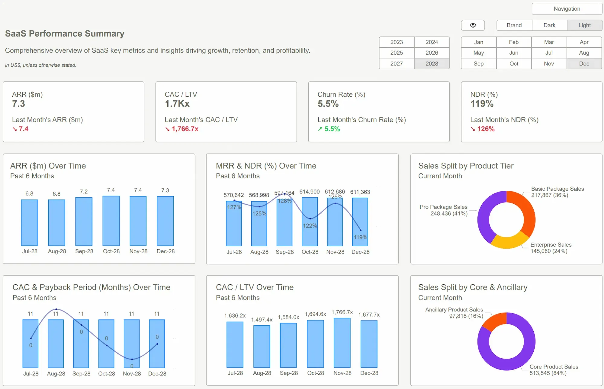
Here are five Power BI dashboard examples from our collection, mapped to the framework:
- Financial Health Dashboard (Strategic): The ultimate CEO view. It visualizes your P&L, cash flow, and burn rate to give you one simple number: your cash runway. No more stitching together three spreadsheets five minutes before a board meeting. You know exactly how much time you have to make your next move.
- Sales Pipeline Dashboard (Operational): For the sales manager who lives by their numbers. It tracks new leads, conversion rates by stage, and pipeline velocity in near real-time. It ends the debate over "how are we tracking?" and lets the team focus on "how do we close?"
- Marketing Attribution Dashboard (Analytical): Your marketing team is spending money, but do you know what’s working? This dashboard lets you explore which channels, campaigns, and content are actually driving qualified leads and revenue. It’s built for slicing data, not just viewing it.
- HR Headcount & Attrition Dashboard (Strategic/Operational): A hybrid view for leadership and HR. It tracks headcount growth against plan, monitors employee turnover by department, and flags potential retention issues before they become crises. It turns HR data from a reactive report into a strategic asset.
- Customer Support Dashboard (Operational): Essential for any service business. This dashboard monitors ticket volume, average response time, and CSAT scores. It helps support managers staff effectively and ensures service quality doesn't slip as you scale.
Adopting one of these Power BI templates isn't about buying a pretty design. It's about buying time and focus. You bypass months of painful development cycles and internal arguments. You plug in your data and get clarity in an afternoon, not a quarter. The ROI is immediate.
 Forbes Data AnalyticsPower BI Dashboard
Conclusion
Let's be blunt. The reason most dashboards fail is a lack of courage. The courage to admit you don't need to track 100 things. The courage to choose the three that actually matter. The courage to build for a specific job, not for a generic audience.
The mindset shift is simple: stop trying to build one dashboard to rule them all. Instead, ask what job needs doing—strategic, operational, or analytical—and deploy the right tool. Looking at proven Power BI dashboard examples is the fastest way to align your team and get started.
You have all the data you need. What you're missing is the right view. The cost of operating with fuzzy, incomplete, or siloed information is staggering—it's in the bad hires, the failed marketing campaigns, and the cash flow surprises. Don't let your company be another statistic. Choose clarity.
Tired of guessing? Your business deserves clarity. Browse our templates and find the view that finally makes sense of your data. See the truth, today.Get Started >
Subscribe to our newsletter
Stay ahead with the latest insights, tips, and trends in PowerBI and data visualization.
Join the network that is unlocking the full potential of their data - one dashboard at a time.
Related posts
Explore more insights and tips with these related posts curated just for you.

What Makes a Good Power BI Dashboard? Design Principles and Examples

Power BI Dashboard Examples That Save Time, Impress Leadership, and Actually Work