You downloaded a slick-looking Power BI template. You plugged in your data, spent hours mapping fields, and… nothing.
It’s pretty. It’s colorful. It might even impress someone who doesn’t know any better. But it tells you zero about the actual health of your business. It doesn’t surface risk, flag inefficiency, or give you a single actionable insight. It’s a data graveyard.
This is the core misconception about business intelligence: that the goal is to visualize data. It’s not. The goal is to make better, faster, more profitable decisions.
Most Power BI templates on the market are just digital art—collections of charts and disconnected KPIs. They’re visual fluff. A truly useful template isn’t a canvas; it's a pre-built analytical engine. It’s a framework designed to answer the questions that keep founders and operators up at night. This is the difference between looking busy and actually moving the needle.
Why Your 'Data-Driven' Approach Is Still Flying Blind
Smart teams get this wrong all the time. You’re drowning in data from Stripe, Hubspot, Google Analytics, and your own backend, yet you’re starving for wisdom. You’ve dutifully built dashboards, but you’re still making gut-feel decisions in every important meeting.
Why? Because your tools and habits are stuck in the past.
That sprawling Excel spreadsheet you call a "financial model"? It’s a static calculator, not a diagnostic tool. It breaks if you look at it wrong, and it can’t possibly keep up with the daily velocity of your business. By the time you’ve updated it for the monthly meeting, the data is already irrelevant.
Standard dashboards are no better. They’re passive. They show you what happened—revenue went up, ad spend increased, signups dipped. They almost never tell you why. They show you vanity metrics but hide the context. You see top-line revenue, but you miss that your gross margin is crumbling. You see website traffic, but you miss that your customer acquisition cost (CAC) has doubled on your most important channel.
This isn't just an inconvenience; it’s a high-cost blind spot. The symptoms are painfully familiar:
- Analysis Paralysis: Meetings devolve into debates about what the numbers really mean, with no clear path forward.
- Retrospective Panic: You only notice a spike in customer churn or a drop in your cash runway after the quarter ends, when it’s too late to react.
- Wasted Spend: Your marketing team is optimizing for clicks, not for profitable customers, because they can’t connect the dots between ad spend and lifetime value (LTV).
You’re not flying blind because you lack data. You’re flying blind because your tools are showing you the instrument panel of a different plane.
 Power BI Templates
Stop Visualizing Data. Start Interrogating It
The necessary shift is to stop thinking about “data presentation” and start thinking about “structured inquiry.” A dashboard isn’t a report card; it’s an interrogation room. And your data won’t talk unless you ask the right questions.
Forget “How can I make this look good?” and start asking:
- What’s the one business question this visual must answer?
- If this number turns red, what is the exact operational lever we pull?
- How does this metric relate to our cash flow and profitability?
This is a fundamental change from passive viewing to active analysis. Your dashboard shouldn't just show you your CAC. It should automatically segment it by channel, compare it to your LTV for that same cohort, and scream at you when the ratio becomes unhealthy. It shouldn't just show you revenue; it should show you revenue concentration risk from your top three clients.
This is where professionally built Power BI Templates become a massive tactical advantage. A good template isn’t a blank canvas waiting for you to paint by numbers. It’s a pre-configured analytical framework built by people who have already made the mistakes you’re about to make.
It has the complex DAX measures, the relational data model, and the logical architecture already baked in. It’s not just about saving you the headache of connecting to an API. It’s about giving you a battle-tested system for interrogating your business, built on the principle that, as one HBR article put it, "Metrics Are Easy, Insight Is Hard." A good template delivers the hard part.
 Which Dashboard Type Fits Your Business? 5 Examples Compared
The Anatomy of a High-Impact Template
So what does a genuinely useful template look like in practice? It’s not about aesthetics; it’s about the quality of the answers it provides out of the box. It solves specific, high-stakes problems by enforcing analytical discipline.
Our Power BI Templates are designed precisely for this. They are opinionated frameworks that turn raw data into strategic clarity.
Here are a few examples of what “good” looks like:
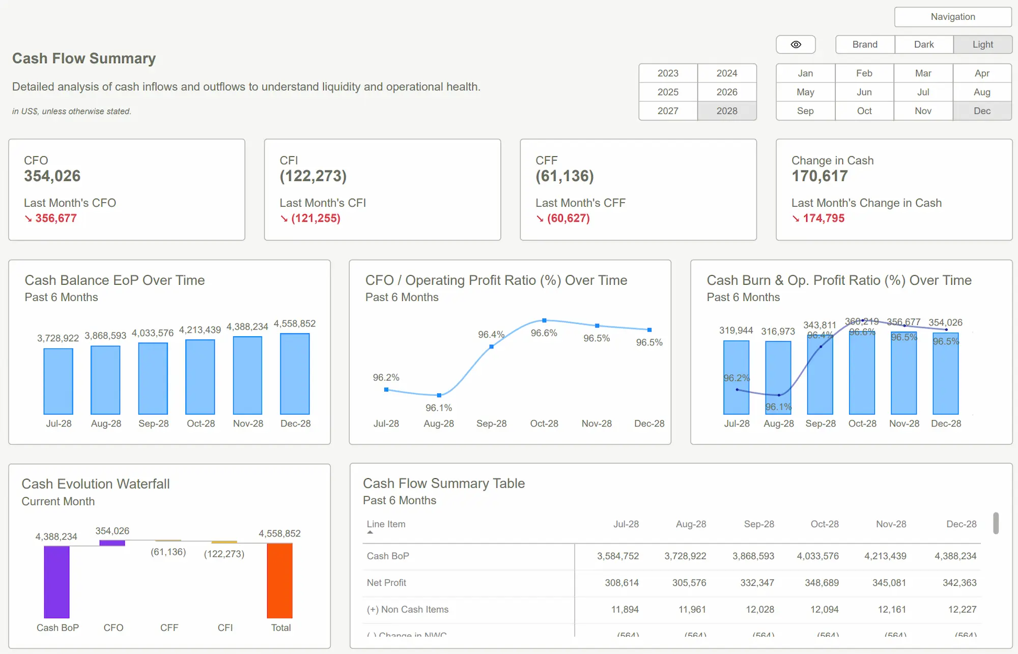
- For Financial Health: A standard dashboard might show you a monthly P&L. A high-impact financial template, however, automatically calculates your cash runway in months based on your current burn rate. It lets you model scenarios: "What if we increase headcount by 10%?" or "What if revenue drops by 15%?" It instantly shows you the impact on your runway. That’s not a report; it's a survival tool.
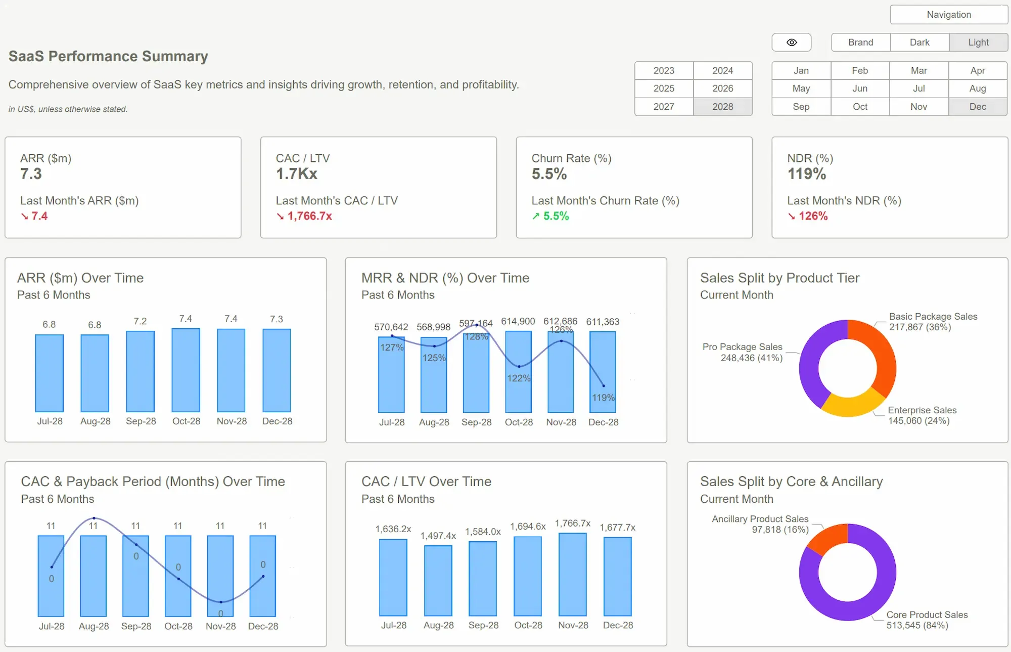
- For Marketing Performance: Forget a simple bar chart of leads per channel. A useful marketing template connects your ad spend data (Google, Meta) to your sales data (Stripe) to reveal the true LTV:CAC ratio for each campaign. It flags diminishing returns, showing you the exact point where pumping more money into a campaign stops being profitable.
- For Operational Efficiency: Instead of just tracking sales, an operational template visualizes your entire order-to-cash cycle. It flags bottlenecks, tracks inventory turnover days against cash conversion, and helps you see how a delay in shipping impacts your quarterly cash flow.
The value isn't in saving a few hours of design work. The value is in the clarity you get the moment you connect your data. The ROI comes from making one better decision—killing an unprofitable ad campaign, renegotiating with a supplier, or securing a line of credit three months before you desperately need it. Adoption is simple because the hard work—the thinking - is already done.
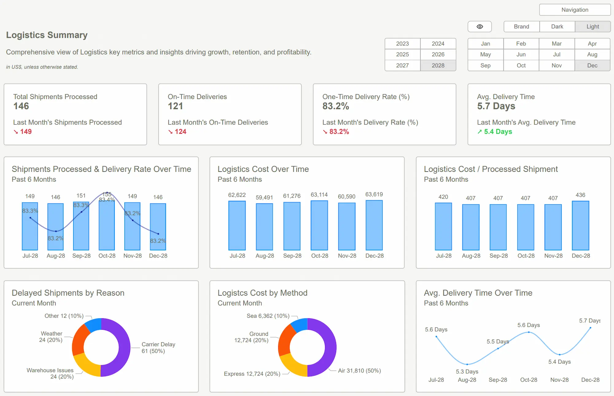 Tableau Dashboards Best PracticesPower BI Dashboard
Conclusion
Let’s be direct. The market is saturated with dashboards that are nothing more than digital decorations. They give you the illusion of being data-driven while obscuring the risks and opportunities that will define your success or failure.
The mindset shift is simple but profound: stop looking for pretty pictures and start demanding a decision-making engine. Your data is an asset, but only if you have the right tools to interrogate it. A dashboard that doesn't challenge your assumptions or guide your next action is a waste of screen space.
The right Power BI templates provide an immediate shortcut to this level of analytical maturity. They embed years of financial and operational expertise directly into your workflow.
So, ask yourself if your current dashboards are helping you see or just helping you look busy. Don't buy digital art. Invest in an instrument that uncovers the truth.
Tired of dashboards that just look good? Get the templates that make you think. Stop guessing. Start seeing. Explore our Power BI Kits and get the clarity your business deserves—today.Get Started >
Subscribe to our newsletter
Stay ahead with the latest insights, tips, and trends in PowerBI and data visualization.
Join the network that is unlocking the full potential of their data - one dashboard at a time.
Related posts
Explore more insights and tips with these related posts curated just for you.

What Makes a Good Power BI Dashboard? Design Principles and Examples

Power BI Dashboard Examples That Save Time, Impress Leadership, and Actually Work