Let’s get one thing straight. If your team is emailing around a multi-page PDF with charts exported from Power BI, you don't have a dashboard. You have a very pretty, very static report. And you’re leaving 90% of the value on the table.
The business world uses “dashboard” and “report” interchangeably. This isn’t just a harmless mix-up of jargon. It’s a fundamental misunderstanding that leads to wasted time, frustrated teams, and slow, reactive decisions. A report is a photograph of the past. A dashboard is a live, interactive conversation with your business.
Confusing the two is like using a race car to deliver mail. Sure, it gets the job done, but you’re completely missing the point. This isn’t about semantics. It’s about the massive strategic difference between passively receiving information and actively interrogating it. Getting this right is the first step to unlocking real insight from your data.
Reveal the Real Problem
The biggest mistake smart teams make is bringing an old-school mindset to a new-school tool. We’re all conditioned by decades of static financial statements, printed sales summaries, and PowerPoint decks filled with bar charts. This is the "paginated report" — a fixed, multi-page document designed for printing or saving as a PDF. It has a beginning, a middle, and an end. It tells one story, from one angle.
So when teams get Power BI, what do they do? They replicate what they know. They build beautiful, pixel-perfect layouts that look great on a slide. They fixate on fonts and logos. The result is a digital version of the same old static report.
This is where the pain starts. The "dashboard" lands in someone's inbox, and the questions begin immediately:
- “This is great, but can I see it broken down by the West region?”
- “What’s the raw data behind this summary number?”
- “Can you re-run this for just the last 45 days instead of the full quarter?”
Suddenly, the analyst who built the report becomes a short-order cook, fielding requests for slightly different views of the same information. The promise of self-service intelligence evaporates. Decisions get bottlenecked. You see that sales are down, but you can’t immediately click to see why without sending an email and waiting. This isn't data-driven agility; it's a data-driven bottleneck.
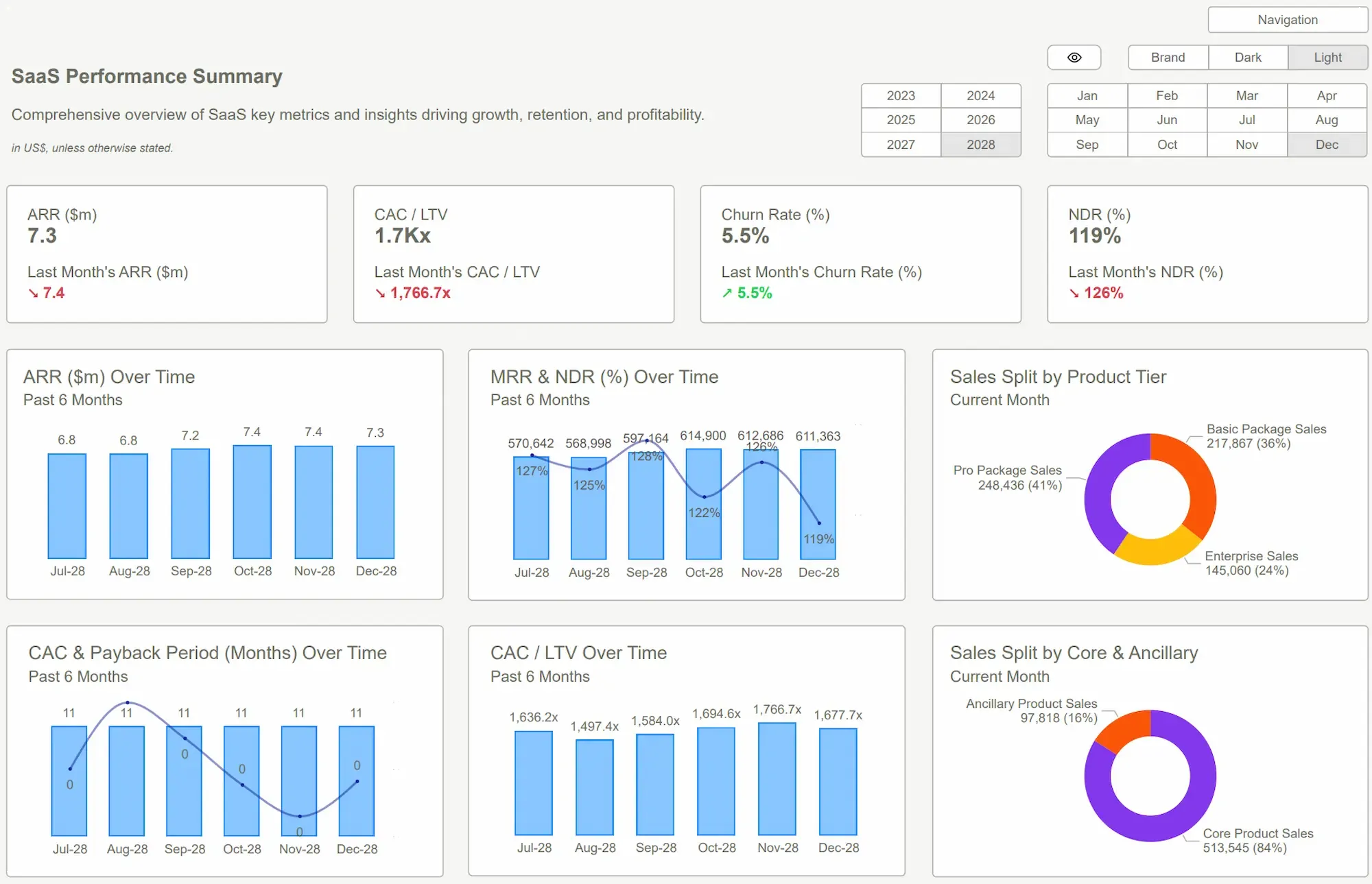
 Power BI Dashboard
Reframe the Thinking
To fix this, you have to stop thinking about presenting data and start thinking about interrogating it.
Let's use a clear analogy:
- A Report is a photograph. It’s a perfect, static snapshot of a specific moment in time. It’s ideal for formal, historical documentation: month-end financials for the board, compliance documents for regulators, or an annual P&L for investors. It's a monologue. You look at it. You file it away.
- A Power BI Dashboard is a conversation. It’s a dynamic, single-screen interface designed for exploration. You ask a question, you get an answer, and that answer prompts your next question. You click a state on a map, and every other chart on the screen instantly filters to show you data for just that state. It's built for operators, founders, and managers who need to know why things are happening, right now.
The goal of a Power BI Dashboard isn't to show you a number. It's to help you understand the entire system that produced that number. A meeting to explain your data is an expensive admission that your dashboard has failed. A true dashboard shouldn't need a chaperone. It should invite curiosity and answer questions you didn't even know you had.
Power BI's core strength is this interactivity—the slicers, drill-throughs, and cross-filtering that connect every piece of data. Using it just to create static PDFs is a profound waste of its potential and your team's time.
 Building vs. Buying Power BI Templates: A Cost-Benefit Breakdown
What Good Looks Like
This is precisely the problem we obsessed over when building Power BI Kit. Our templates aren't just pretty collections of charts. They are pre-built analytical engines designed for conversation, not presentation. We’ve done the hard, structural work of building true dashboard experiences so you don’t have to.
Here’s what that looks like in practice:
- For Finance Teams: Instead of a 10-page PDF report on cash flow, you get our Cash Runway Dashboard. You can drag a slider to change your monthly burn rate assumption and instantly see how many months of runway you have left. You can filter out a specific revenue stream to model a worst-case scenario. No emails, no waiting. Just answers.
- For Marketing Teams: Forget the static report of "last month's leads." Our Marketing Funnel Dashboard lets you click on "LinkedIn Ads" and watch the entire funnel, from MQL to closed-won revenue, update in real-time. You can finally see which channels are actually driving value, not just vanity metrics.
- For Founders & Operators: Instead of trying to stitch together reports from sales, finance, and HR, you get a single, holistic Power BI Dashboard view. You can spot a dip in sales in one chart, click to see which sales rep is struggling, and then cross-filter to see if their performance correlates with a change in product returns.
The ROI isn't just the 50+ hours you save by not building this from scratch. The real return is in the speed and quality of your decisions. You stop making choices based on three-week-old data. You start seeing risks and opportunities as they emerge. Adoption is brutally simple: connect your data source, and our templates light up with your information.
 DAX GuidePower BI Dashboard Examples
Conclusion
Let's be clear: Reports have their place. They are essential for formal, static record-keeping. But they are not tools for running your business day-to-day. For that, you need a true Power BI Dashboard.
The shift is from a passive recipient of information to an active participant in analysis. One fills your archives; the other fuels your growth. One tells you what happened last quarter; the other helps you decide what to do in the next hour.
Stop building glorified spreadsheets and calling them dashboards. Your business doesn't move in monthly snapshots, and your data analysis shouldn't either. The answers you desperately need are already sitting in your systems. It's time to stop looking at pictures of your data and start having a conversation with it.
Tired of static reports and endless questions? Stop explaining your data and start exploring it. Get the clarity you need today with a Power BI Kit template.Get Started >
Subscribe to our newsletter
Stay ahead with the latest insights, tips, and trends in PowerBI and data visualization.
Join the network that is unlocking the full potential of their data - one dashboard at a time.
Related posts
Explore more insights and tips with these related posts curated just for you.

What Makes a Good Power BI Dashboard? Design Principles and Examples

Power BI Dashboard Examples That Save Time, Impress Leadership, and Actually Work