Let’s be honest. Most business dashboards are useless. They’re a chaotic jumble of pie charts and bar graphs that look impressive from a distance but offer zero actual insight up close. They are digital junk drawers, filled with vanity metrics that make us feel busy but keep us strategically blind.
The common misconception is that "data-driven" means visualizing all the data. We get mesmerized by the promise of Power BI, cram every possible KPI onto a single screen, and call it a day. The result isn’t clarity; it’s analysis paralysis.
A great Power BI Dashboard isn't a gallery of charts. It's a focused, hierarchical story that guides you from a high-level "Are we okay?" to a granular "What should we do about it?" This guide isn't about DAX formulas or color theory. It’s about the fundamental logic of building a dashboard that actually helps you make decisions, fast. Forget the fluff. Let’s get to what works.
The Dashboard Illusion: Drowning in Data, Starving for Insight
Even the smartest teams fall into the same trap. They get the expensive software, hire the analyst, and demand a dashboard. What they get back is a reflection of their own scattered priorities. They treat Power BI like an evolution of Excel or PowerPoint—a tool for making data look better, not mean more.
This is the core problem. Your old habits are sabotaging your new tools.
Excel trained us to think in endless tabs and isolated charts. We carry that fragmented thinking into Power BI and wonder why we’re not getting a clear picture. We end up with dashboards that are:
- Overloaded: Trying to track 30 KPIs on one screen is like trying to listen to 30 people talking at once. You hear nothing but noise.
- Disconnected: The marketing chart doesn’t talk to the finance chart. The sales data is divorced from operational capacity. You can't see the cause-and-effect relationships that actually run your business.
- Actionless: You see a line go up or down, but so what? There’s no context, no "what's next." The meeting ends with a collective shrug and a vague promise to "circle back."
The symptoms are expensive. You miss the fact that your cash runway is shrinking because you’re distracted by website traffic. You fail to spot a toxic marketing channel because you're focused on the blended customer acquisition cost. According to McKinsey, firms that fail to place data at the core of their strategy consistently underperform. You're not just making bad dashboards; you're actively creating strategic blind spots.
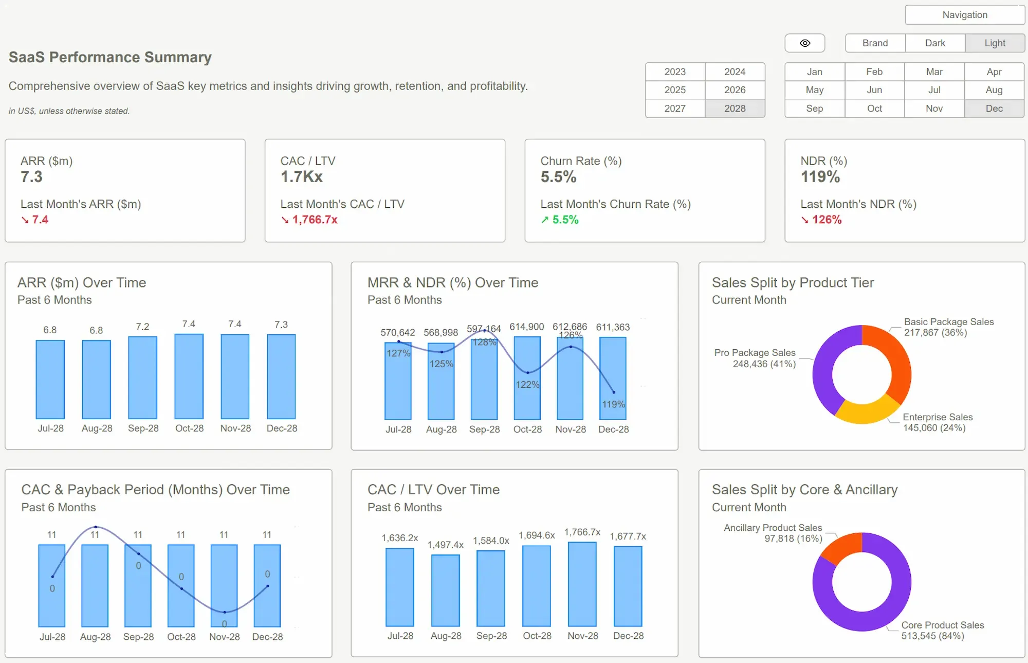
 Power BI Dashboard
Think Like a Pilot, Not a Painter
Here’s the mindset shift that changes everything: Stop approaching your dashboard like a painter with a blank canvas. Start approaching it like a pilot in a cockpit.
A painter can put a splash of color anywhere it feels right. It’s subjective, aesthetic. A pilot’s dashboard is the opposite. It is a masterclass in ruthless prioritization. Altitude, airspeed, attitude, fuel—the handful of metrics that can cause a crash are front and center, impossible to ignore. Everything else is secondary, accessible but out of the way.
Your business deserves its own cockpit. A proper Power BI Dashboard is built to function this way. It answers three questions in a specific, non-negotiable order:
- Health Check: What are the 3-5 critical metrics that define success or failure? (e.g., Net Burn, MRR, Gross Margin). This is your altitude and airspeed. It should be instantly visible.
- Diagnostics: If a health metric is red, where is the problem coming from? This is where you drill down. Is revenue down because of one product line? Is churn up in a specific customer segment?
- Levers: Now that you know where the problem is, what can you do about it? This layer shows the operational metrics you can influence—ad spend, sales outreach, pricing adjustments.
This flow—from high-level health to diagnostic drill-down to actionable levers—is the entire point. It turns a static report into a dynamic decision engine. Power BI is brilliant at creating this interactive, hierarchical experience, but it won’t do it for you. You have to ditch the painter's mindset and adopt the pilot's discipline. That's how you build a Power BI Dashboard that gives you control.
 7 Must-Have Power BI Templates for Small Businesses
Stop Reinventing the Wheel. Just Start Driving.
You could spend the next six months learning advanced Power BI, debating data models, and arguing with your team about which KPIs matter most. You could try to build your own "cockpit" from scratch.
Or you could just skip all that.
The biggest barrier to effective data visualization isn't a lack of technical skill; it's the absence of a proven, battle-tested structure. A blank canvas is intimidating for a reason. You don’t know where to start.
This is the exact problem our templates solve. They aren't just collections of pretty charts; they are pre-built decision engines designed with the pilot’s mindset. We’ve already done the hard work of structuring the narrative, identifying the critical KPIs, and building the drill-down logic for you. Our Power BI Dashboard Examples show this in action.
- For Founders & Finance Teams: Instead of a generic P&L, our Financial Planning & Analysis Template visualizes your cash runway and burn rate against your forecast. You can see, with startling clarity, exactly when you'll run out of money if things don't change. No more guessing.
- For Marketing Teams: Forget vanity metrics. Our Marketing Analytics Template connects ad spend directly to Customer Acquisition Cost (CAC) and Lifetime Value (LTV) by channel. Instantly spot which campaigns are burning cash and which are printing it.
- For Operations Teams: Our HR & Headcount Planning Template visualizes your largest expense—payroll—against revenue and projects future costs, giving you the tools to scale your team without breaking the bank.
The ROI is immediate clarity. You're not buying a design file. You're buying back hundreds of hours of wasted debate and development. You're installing a proven system for seeing your business clearly, so you can start making better decisions tomorrow.
 Coursera: What Is Power BI? What It Is, How It’s Used, and MorePower BI Dashboard Examples
Conclusion
Let’s kill the old idea for good. A dashboard is not a data art project. It’s not a place to dump every metric you can think of. It's a tool for decision-making, and it must be structured as such.
The shift is simple but profound: from a scattered canvas to a focused cockpit. From "what does all this data say?" to "what's the one thing I need to know right now?" This is the philosophy that separates a useless dashboard from an indispensable one.
A well-designed Power BI Dashboard delivers that focus. It provides the situational awareness you need to navigate market shifts, operational drag, and competitive threats. The goal was never to be "data-driven"—that’s a meaningless platitude. The goal is to be decision-driven. Your data is the fuel, but a pre-built template is the high-performance engine that actually gets you somewhere. Stop building and start seeing.
Tired of dashboards that confuse more than they clarify? Stop guessing. Start seeing. Browse our Power BI templates and get the clarity you need to run your business—today.Get Started >
Subscribe to our newsletter
Stay ahead with the latest insights, tips, and trends in PowerBI and data visualization.
Join the network that is unlocking the full potential of their data - one dashboard at a time.
Related posts
Explore more insights and tips with these related posts curated just for you.
What Makes a Good Power BI Dashboard? Design Principles and Examples

Power BI Dashboard Examples That Save Time, Impress Leadership, and Actually Work