Most startups don’t die from a single, catastrophic blow. They die from a thousand tiny paper cuts. A slow bleed of cash, a creeping customer acquisition cost, a product roadmap disconnected from reality. They die while staring at a dozen spreadsheets, each telling a different, incomplete story.
The common misconception is that the answer is more data, more tracking, more complexity. Founders think they need a data science team and a custom-built analytics platform to compete. This is a trap. It’s an expensive, time-consuming distraction from what you really need.
The truth is, early-stage companies don’t need to see everything. They need to see the right things, right now. You can get immense clarity and make faster, smarter decisions with a handful of lean, ruthlessly focused dashboards. This isn't about building a data cathedral; it's about getting a command center up and running before your runway runs out.
Reveal the Real Problem
Even smart teams get this wrong. I’ve seen brilliant founders with world-changing products burn through their seed round because they were navigating with the wrong map. They were obsessed with vanity metrics—website visitors, app downloads, social media likes. These numbers feel good. They look great on a slide. But they don't pay salaries.
Your old habits are the enemy. The "Monday Morning Metrics" email with ten different charts that no one truly understands. The Google Sheet with 27 tabs that crashes your browser. The gut-feel decisions made in a state of low-grade panic because pulling the real data would take half a day.
This isn’t just inefficient; it’s dangerous. These are the symptoms of a deeper problem: operational blindness.
- You can't answer the simplest questions: "How much did it cost us to acquire the customers we signed last month? And are they profitable?" If it takes you more than 60 seconds to answer that, you have a problem.
- Your financial model is a work of fiction: It's a static document you update once a quarter. Your actual burn rate and cash runway should be living, breathing numbers you can see daily.
- Your teams are misaligned: Marketing is celebrating a surge in leads, but sales says they’re all junk. Product is building features for a user persona that stopped being your ideal customer six months ago. Without a shared source of truth, you’re not a team; you’re just a group of people working in the same building.
The cost of this blindness is your most valuable asset: time. Every day you spend guessing is a day you’re not growing.
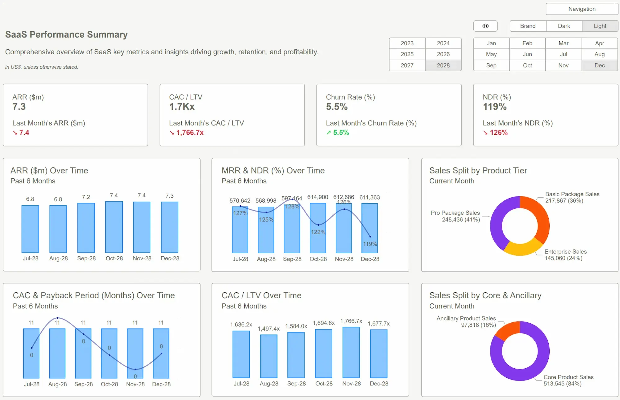
 Power BI Dashboard Examples
Reframe the Thinking
The solution isn't to hire three data engineers and build a "single source of truth" from scratch. You don't have the time or the money. The reframe is to stop trying to boil the ocean.
Forget tracking everything. Instead, ask: "What are the 3-5 questions that, if left unanswered, will kill us?"
That's it. That's the entire framework.
This shifts your mindset from passive data collection to active decision intelligence. You’re not building reports for the sake of reporting. You are building instruments to answer specific, high-stakes questions. Is the engine on fire? Are we losing altitude? Is there a mountain dead ahead?
Most of what companies track is noise. The key is to find the signal. An indicator you can't influence is just trivia. If you can’t look at a number and immediately know what action to take if it goes up or down, it doesn’t belong on your primary dashboard.
This is where a tool like Power BI becomes a weapon for a lean startup. Not as a complex enterprise system, but as a lean, mean, visualization engine. You don't need to build from zero. You can start with a focused set of Power BI dashboard examples designed to answer these critical questions immediately. It’s about leveraging a powerful platform without inheriting the complexity. Connect your data sources—your Stripe account, your QuickBooks, your CRM—and let a template do the heavy lifting of visualization.
 Which Dashboard Type Fits Your Business? 5 Examples Compared
What Good Looks Like
So what are these killer questions and the dashboards that answer them? For 99% of startups, it comes down to these three. They form a complete picture: your financial viability, your business model viability, and your go-to-market viability.
1. The Runway & Burn Dashboard
- The Question: "When do we run out of money?"
- What it Solves: This dashboard kills financial ambiguity. It connects directly to your accounting software and bank accounts to give you a live, no-BS view of cash on hand, monthly net burn, and your precise cash runway in months. No more "I think we have about six months left." You know. You can model how a new hire or a major expense will impact your runway before you commit. This is the ultimate anti-anxiety tool for a founder.
2. The Unit Economics Dashboard (LTV:CAC)
- The Question: "Are we building a real business or a leaky bucket?"
- What it Solves: This is your truth serum. It visualizes the relationship between Customer Lifetime Value (LTV) and Customer Acquisition Cost (CAC). A healthy business needs an LTV that is multiples of its CAC (a 3:1 ratio is a common benchmark). This dashboard stops you from scaling a broken model. It shows you which marketing channels are actually profitable and which are just burning cash.
3. The Sales & Marketing Funnel Dashboard
- The Question: "Is our growth engine working efficiently?"
- What it Solves: This dashboard maps your entire customer journey, from first touch to closed deal. It tracks conversion rates between stages and the velocity—how long it takes a lead to become a customer. You can spot bottlenecks instantly. "Why are we losing so many prospects between the demo and proposal stage?" Now you have the data to investigate, fix the problem, and accelerate your growth.
Using a pre-built Power BI template for these gets you 90% of the way there on day one. You connect your data, and the insights are served up. The ROI is simple: clarity, speed, and a dramatically higher chance of survival.
 DAX GuidePower BI Templates
Conclusion
Let’s be direct. The startup graveyard is filled with companies that measured too much and understood too little. They drowned in data but were starved for insight.
The required shift is simple but profound: stop building reports and start answering questions. Limit your focus to the vital signs of your business—your cash, your unit economics, and your growth engine. Everything else is a distraction until you’ve nailed those.
You don't need a six-figure analytics budget or an in-house data team to get this clarity. You just need the right tools and the discipline to focus. These lean Power BI dashboard examples aren't just pretty charts; they are purpose-built instruments for survival and growth. They give you the answers you need, when you need them, without the fluff. Stop building. Start seeing. The clock is ticking.
Stop guessing. Start seeing. Our Power BI templates are designed for founders and operators who demand clarity. Get the dashboards you need up and running this week. Explore the templates and take control of your data.Get Started >
Subscribe to our newsletter
Stay ahead with the latest insights, tips, and trends in PowerBI and data visualization.
Join the network that is unlocking the full potential of their data - one dashboard at a time.
Related posts
Explore more insights and tips with these related posts curated just for you.

What Makes a Good Power BI Dashboard? Design Principles and Examples
Power BI Dashboard Examples That Save Time, Impress Leadership, and Actually Work