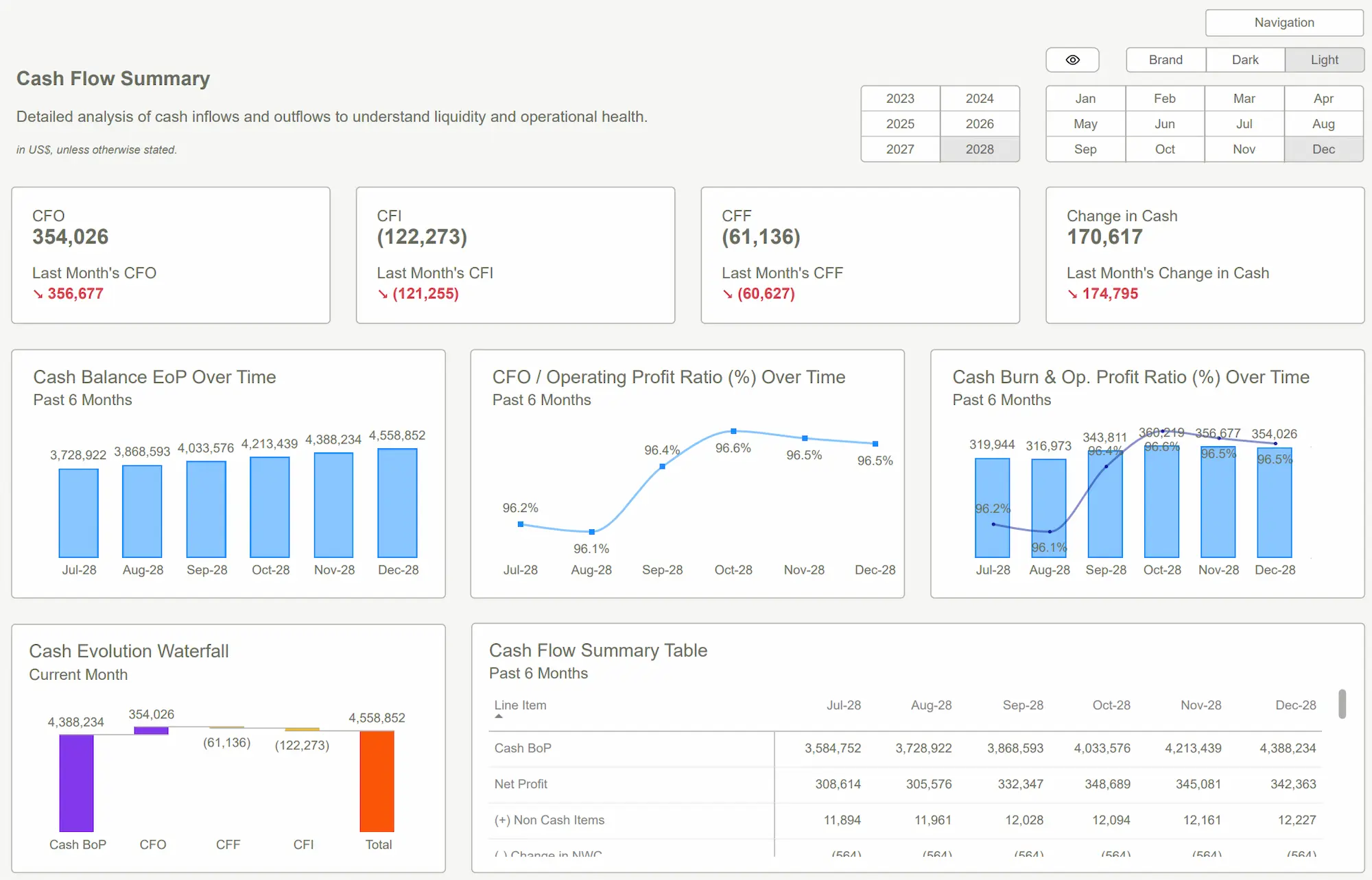
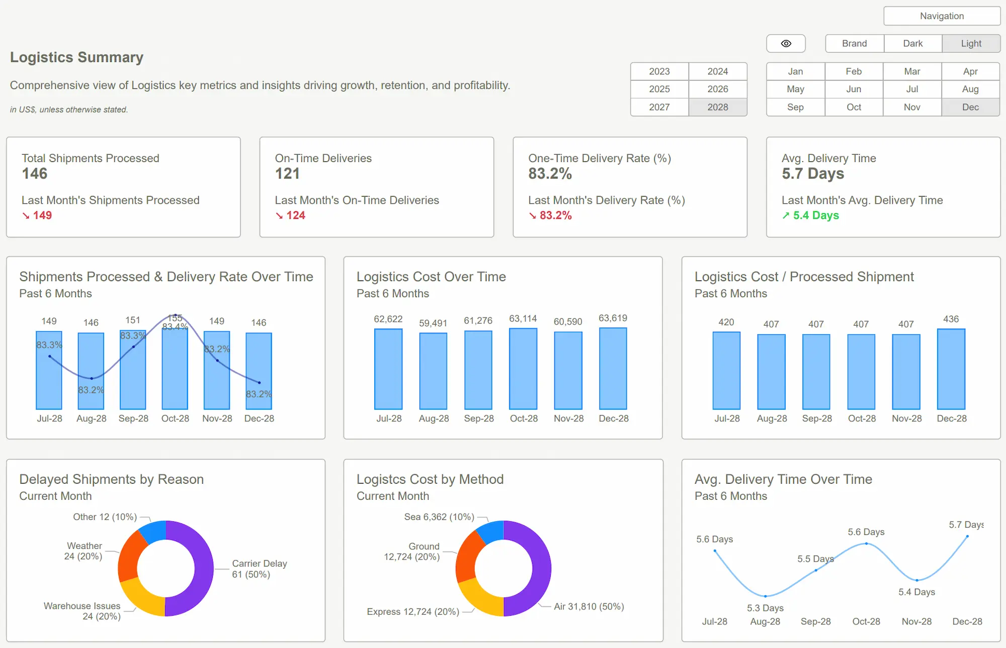
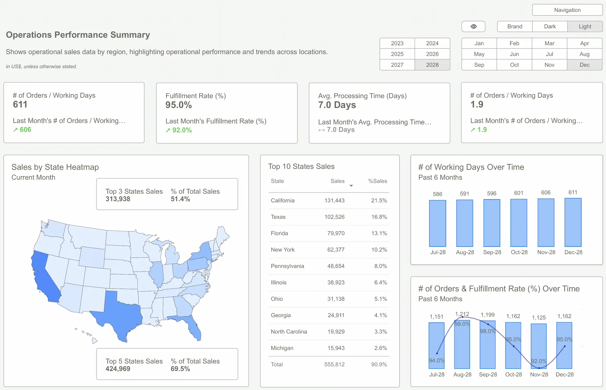
Creating visually stunning Power BI reports can be challenging when working with data-heavy dashboards. Many Power BI users struggle to balance functionality with aesthetics, leading to reports that are hard to read and lack visual appeal.
That’s where Figma comes in. Figma is a powerful design tool that helps you prototype layouts, choose color palettes, and customize your visuals before implementing them in Power BI.
In this guide, we’ll explore how to use Figma to design Power BI reports that are not only informative but also beautifully crafted.
Why Design Matters in Power BI Reports
A well-designed Power BI report can make the difference between a confusing data dump and a clear, actionable insight.
Benefits of Good Design:
- Improves readability by reducing visual clutter
- Increases user engagement with interactive elements
- Enhances data storytelling through intentional layouts
Without a focus on design, reports can feel overwhelming or uninformative. That’s why integrating Figma into your design process can help you elevate your dashboards.
 Power BI Data Modeling: Best Practices
How to Use Figma to Design Power BI Reports
Figma is a cloud-based design tool that allows you to prototype and test layouts before implementing them in Power BI. Here’s how to get started:
Steps to Design a Power BI Report in Figma:
- Create a new Figma project and set the canvas to match your report’s dimensions.
- Prototype your layout by adding frames, text boxes, and placeholders for visuals.
- Choose a color palette that aligns with your brand or the report’s theme.
- Export your design assets as images or SVG files to use in Power BI.
- Implement the design in Power BI using Power BI Desktop.
By using Figma, you can visualize the final look of your report before spending time on Power BI’s built-in customization tools.
Best Practices for Merging Design and Data
When merging design and data, it’s important to focus on usability and user experience.
Key Best Practices:
- Consistency: Use the same fonts, colors, and layouts across your reports.
- Hierarchy: Ensure key metrics stand out by using larger fonts or bolder colors.
- Interactivity: Add slicers and filters to improve user engagement.
How to Customize Your Power BI Theme Using Figma
After designing your report in Figma, you can customize your Power BI theme to match your design.
Steps to Customize Your Power BI Theme:
- Go to Power BI Desktop and click on View.
- Select Themes and click on Customize Current Theme.
- Change the colors, fonts, and visual styles to match your Figma design.
- Save your theme and apply it to all visuals in your report.

Sharing Your Designed Report
Once your report is complete, you can share it with your team to ensure everyone has access to the beautifully designed dashboard.
How to Share a Power BI Report:
- Click Publish from Power BI Desktop.
- Select your Power BI workspace.
- In Power BI Service, click Share and choose the users you want to share the report with.
 The Essential Guide to Power BI Visual Best Practices
Designing Power BI reports with Figma allows you to elevate your dashboards by merging design principles with data insights. By following these steps, you can create engaging, visually appealing reports that improve user experience and boost data storytelling.
Ready to create better Power BI reports? Download our templates and start designing today!
Download our Power BI Templates now and start designing beautiful dashboards with best practices.Get Started >
Subscribe to our newsletter
Stay ahead with the latest insights, tips, and trends in PowerBI and data visualization.
Join the network that is unlocking the full potential of their data - one dashboard at a time.
Related posts
Explore more insights and tips with these related posts curated just for you.

Top 10 Power BI Dashboard Examples to Boost Business Insights

Mastering the Power BI Dashboard: Essential Tips for Effective Design