Let’s be honest. You’re here because you typed “Power BI dashboard examples” into Google, and you’re scrolling through a sea of digital noise. You’ve seen the same brightly-colored, nonsensical charts. Dashboards for fictional coffee shops, dashboards tracking intergalactic sales teams, dashboards with so many gauges and dials they look like a 747 cockpit.
They’re pretty. They’re also useless.
The common misconception is that a good dashboard is a design challenge. It’s not. It’s a strategic one. You don't have a data visualization problem; you have a question problem. The best dashboards don’t show you more data. They give you clearer answers to your most critical business questions.
This post isn't another gallery of fantasy dashboards. We're going to look at the thinking behind dashboards that real teams use to make decisions that matter—the ones that protect cash flow, streamline operations, and find growth levers. This is about function, not fantasy.
Why Your 'Data-Driven' Dashboard is Actually a Data Distraction
Smart people build bad dashboards. I see it every day. Founders and finance leads who can build a sophisticated financial model from scratch will turn around and create a Power BI dashboard that’s little more than a data dumpster fire.
Why? Because they carry over their spreadsheet habits. They think the goal is to get all the data into one place. This leads to the "Everything Dashboard"—a single screen crammed with dozens of KPIs, pie charts fighting for attention, and tables that require a magnifying glass. It looks impressive. It feels productive. But it’s a trap.
This kind of dashboard doesn't provide clarity; it creates decision paralysis.
When every metric is presented with equal visual weight, you lose all sense of priority. Is the 2% dip in social media engagement more or less important than the 15-day increase in accounts receivable aging? The dashboard won’t tell you. It just screams data at you. This is how high-cost blind spots develop. You miss the fact that your cash runway is shrinking because you’re distracted by a dozen vanity metrics. As a McKinsey report rightly points out, many companies are drowning in data but starved for insights. Your dashboard is supposed to be a lighthouse, not part of the flood.
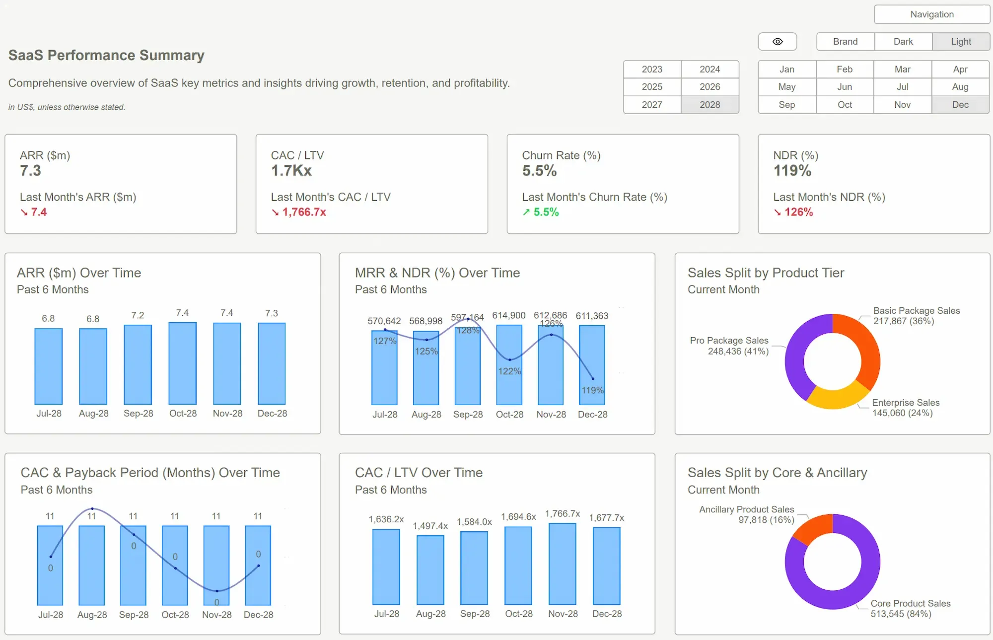
 Power BI Dashboard Examples
Stop Building Dashboards. Start Answering Questions
The reframe is simple but powerful: stop trying to build a dashboard and start trying to answer a specific, high-stakes question.
A dashboard shouldn’t be a passive report. It should be an active decision-making tool. Each one should have a clear job, a single purpose. Instead of a monolithic "Company Health" dashboard, you need a series of sharp, focused views that answer pointed questions:
- The Question: "Are we going to run out of money in the next 6 months?"
- The Dashboard: A Cash Runway & Burn Rate dashboard. It shows one thing: a projection of your cash balance based on current burn and revenue. Nothing else matters on this screen.
- The Question: "Is our new ad campaign actually making us money?"
- The Dashboard: A Marketing ROAS (Return on Ad Spend) dashboard. It tracks spend vs. revenue generated from that specific campaign, including customer acquisition cost (CAC) and lifetime value (LTV). Not impressions, not clicks—profitability.
- The Question: "Which part of our sales funnel is broken?"
- The Dashboard: A Sales Pipeline Conversion dashboard. It visualizes the drop-off rate between each stage, from lead to close. It instantly shows you where deals are stalling.
This is the mindset shift. Power BI is an incredibly powerful tool for answering these questions. But if you give it a vague, unfocused job like "show me all the marketing data," you'll get a vague, unfocused result. Give it a sharp, specific job, and it will give you a sharp, specific answer. Your goal isn't to create a dozen Power BI dashboard examples for a design portfolio; it's to create a single view that prevents one bad decision.
 Building vs. Buying Power BI Templates: A Cost-Benefit Breakdown
What Good Looks Like: The Shortcut to Clarity
This is where the rubber meets the road. You can spend the next three months trying to design these question-based dashboards from scratch. You can argue with your team about which KPIs matter, wrestle with DAX formulas, and tweak visuals until your eyes glaze over.
Or, you can take a shortcut.
This is exactly why I built Power BI Kit. Our templates aren't just collections of charts; they are pre-built strategic frameworks designed to answer these critical business questions out of the box. They are the result of years of seeing what works and what doesn’t in real companies.
Here’s what that looks like in practice:
- For the Finance Team: Instead of building a P&L replica, you use our [Financial KPIs Template]. It immediately focuses you on leading indicators: your cash runway, debtor days, and gross margin trends. You connect your data, and within an hour you have a clear answer to "How healthy is our cash flow?" no configuration needed. This is one of the most vital [Power BI Dashboard Examples] any business can have.
- For the Marketing Team: Forget vanity metrics. Our [Marketing Analytics Template] forces the conversation toward what matters: Customer Acquisition Cost vs. Lifetime Value. It answers: "Are we buying profitable customers?"
- For the HR & Operations Team: Our [Headcount & Salary Planning Template] doesn't just show a list of employees. It visualizes salary distribution by department, gender, and tenure, helping you answer tough questions about pay equity and budget allocation instantly.
The ROI is simple. The cost of a template is a rounding error compared to the cost of a single strategic blind spot. You're not buying a dashboard; you're buying clarity and speed. You're skipping the painful, expensive trial-and-error and getting straight to the answers.
 Data Visualization Best PracticesPower BI Dashboard
Conclusion: Your Data Has a Job. Give It the Right Tools
Stop chasing dashboard inspiration. The perfect dashboard design doesn't exist. But a perfect answer to your most pressing business question does—and it's probably buried in the data you already have.
The critical shift is moving from a "data presentation" mindset to a "question-answering" one. Don't ask, "What can we build?" Ask, "What do we need to know, right now, to de-risk the business?" That discipline changes everything. It turns your dashboard from a passive reporting tool into the sharpest strategic weapon in your arsenal.
The best Power BI dashboard examples aren't defined by their visual flair, but by their relentless focus. They are ruthlessly simple because the questions they answer are critically important.
Don’t waste another week trying to reinvent the wheel. The frameworks exist. The tools are ready. The only thing missing is the decision to stop admiring the problem and start solving it.
Stop guessing. Start seeing. Find the right Power BI template for your team on our site, connect your data, and get clarity in hours, not months. The answers you need are waiting.Get Started >
Subscribe to our newsletter
Stay ahead with the latest insights, tips, and trends in PowerBI and data visualization.
Join the network that is unlocking the full potential of their data - one dashboard at a time.
Related posts
Explore more insights and tips with these related posts curated just for you.

What Makes a Good Power BI Dashboard? Design Principles and Examples

Power BI Dashboard Examples That Save Time, Impress Leadership, and Actually Work