A “good enough” Power BI Dashboard is usually the reason people secretly go back to Excel. It loads slowly, feels cluttered, and nobody is quite sure which number to trust.
A genuinely good Power BI Dashboard does the opposite: it tells a clear story, makes the next decision obvious, and makes you look like the most prepared person in the room. It blends design, data modeling, and UX into something that feels effortless for your users (even if it’s not effortless behind the scenes).
In this article, we’ll break down what actually makes a Power BI Dashboard “good” in practice: the design principles professionals rely on, the technical foundations you can’t skip, and concrete examples you can model. Along the way, you’ll see how starting from proven templates can shortcut years of trial and error.
Design Principles of a High-Impact Power BI Dashboard
A good Power BI Dashboard starts with a brutally simple question: who is this for and what decisions should it drive? If you can’t answer that in one sentence, the dashboard is almost guaranteed to bloat into a pretty-but-useless mess.
1. One owner, one purpose, one hero question
Every Power BI Dashboard should have:
- A primary owner – the person accountable for its success.
- A primary purpose – e.g., “Monitor monthly revenue and margin by region.”
- A primary question – e.g., “Are we on track to hit target this month?”
If your canvas tries to answer finance, sales, operations, and HR questions in one place, users will get lost. Split those into separate dashboards and connect them via navigation, not chaos.
2. Clear visual hierarchy (the “3-second test”)
A user should understand the point of your Power BI Dashboard in three seconds. That’s only possible if you enforce a visual hierarchy:
- Top-left / top row: 3–5 core KPIs (e.g., revenue, margin, churn, NPS).
- Middle: breakdown views that explain why those KPIs look the way they do (by region, segment, product, time).
- Bottom / right-hand side: detail tables, drill-through hints, and supporting metrics.
Ask yourself: If someone only saw the top row of this Power BI Dashboard on a projector, would they already know if we’re winning or losing? If not, rearrange.
3. Less noise, more signal
A bad Power BI Dashboard screams; a good one whispers the right thing at the right time. That means:
- Limiting each page to one main story and 6–8 visuals max.
- Using consistent colors (one accent color for “good”, another for “bad”; one brand color for highlights).
- Avoiding rainbow palettes, 3D charts, and unnecessary gradients.
White space is not wasted space. White space is how you tell the user, “This area matters. Pay attention.”
4. Right chart for the job
The fastest way to ruin a strong Power BI Dashboard is to use whatever visual “looks coolest.” Instead, follow a few simple rules:
- Trends over time → line or area charts.
- Rankings / comparisons → bar or column charts.
- Composition (parts of a whole) → stacked bars, not pie chart salad.
- Distribution → histogram or box plot (when available via custom visuals).
If a stakeholder has to tilt their head and squint, the visual is wrong – even if it’s technically “correct.”
5. Design for non-analysts
Most of the value from a Power BI Dashboard comes from managers, execs, and frontline teams who are not data people. So you design for them:
- Plain-language titles: “Sales by Region vs Target” beats “FactSales vs DimRegion.”
- Callouts: Use cards or text boxes to literally spell out the insight (“EMEA is 12% below target; biggest gap is Enterprise.”).
- Guided interaction: Use clear slicer labels (“Select Region”) and avoid dumping every field into the filter pane.
Your job isn’t to show how much you know about Power BI; it’s to make sure everyone else can use it without a training session.
 Power BI Dashboard
Behind the Scenes: Data, Performance, and UX that Make Dashboards “Feel” Good
You can copy the prettiest layout in the world and still end up with a bad Power BI Dashboard if the data model and performance are shaky. “Good” is mostly invisible engineering.
1. Solid data model = trustworthy numbers
A trustworthy Power BI Dashboard sits on top of a simple, well-structured data model. That usually means:
- A star schema: fact tables (transactions, events) in the center, dimension tables (date, customer, product, region) around them.
- Single-direction relationships wherever possible.
- Clean, conformed dimensions so “Customer” means the same thing across Finance, Sales, and Marketing.
If your model is a spaghetti bowl of many-to-many relationships and bi-directional filters, your measures will misbehave. Good dashboards look calm because the data model is boring.
2. Measures that answer business questions, not just math
A mature Power BI Dashboard doesn’t show raw columns; it answers business questions with measures:
- “What’s our rolling 12-month revenue?”
- “What’s the win rate by segment?”
- “How many active customers do we have this month vs last month?”
Professional templates encapsulate these in vetted DAX (e.g., YOY%, running total, active customers), so you’re not reinventing each KPI by hand – or worse, defining it differently per report.
3. Performance that doesn’t make users wait
Nothing kills adoption like a Power BI Dashboard that takes 30 seconds to load. A “good” dashboard feels instant, which usually comes from:
- Reducing model size (fewer unnecessary columns, correct data types).
- Pre-aggregating where appropriate.
- Avoiding slow patterns in DAX (row-by-row operations when a SUMX over a small, summarized table would do).
Users don’t care whether it’s DirectQuery, Import, or a hybrid – they just feel “fast or not.”
4. Intentional interactions: slicers, drill-through, and navigation
Good Power BI Dashboard design treats interaction like product design:
- A small, focused set of slicers positioned consistently (e.g., top or left).
- Clear paths: “Click a region bar to drill into that region’s detail page.”
- Drill-through pages designed for analysis, not for presentation – more detail, but still structured.
This is where template-based dashboards shine: they come with a complete interaction model baked in, so users know that every Power BI Dashboard in your organization “works the same way.”
5. Accessibility and readability
A good Power BI Dashboard works for everyone in the room, including the person at the back of the boardroom and the exec viewing it on an iPad. At minimum:
- Respect font sizes – no microscopic 8pt text.
- Ensure sufficient color contrast; don’t use “red vs green only” for critical states.
- Use tooltips for nuance, not for essential information that’s invisible until you hover.
If your chart labels can’t be read on a projector, your dashboard is not “good” yet.
 10 Real-World Power BI Dashboard Examples (With Screenshots)
Examples: What “Good” Looks Like in Real Power BI Dashboards
Let’s make this concrete. Here are patterns from real-world Power BI Dashboard scenarios you can steal immediately – or get pre-built via professional templates so you don’t spend weeks recreating them.
1. Executive summary Power BI Dashboard
Audience: C-level and senior leaders.
Purpose: Provide a 30,000-foot view of performance across the business.
What makes it good:
- A single page with 5–7 top KPIs spanning revenue, profitability, customer, and operations.
- Trend lines for each KPI so execs see direction, not just a static number.
- A simple way to change the time window (e.g., Month / Quarter / Year toggle).
- Clickable tiles or buttons linking to more detailed departmental Power BI Dashboard pages (Finance, Sales, Marketing, Operations).
This dashboard doesn’t try to answer every question – it flags where to investigate.
2. Finance Power BI Dashboard
Audience: Finance leaders, controllers, CFO.
Purpose: Monitor profitability, cash, and budget performance.
What makes it good:
- A top row with Revenue, Gross Margin, Operating Profit, Cash, and Budget vs Actual.
- Visuals for P&L over time, variance to budget, and waterfall charts showing movement from last period to this period.
- Ability to slice by entity, region, or product line without breaking calculations.
- A detailed table view at the bottom for drill-down that mirrors standard financial statements.
A finance-focused Power BI Dashboard follows established reporting patterns; it doesn’t invent a new way to read an income statement. Templates help here by encoding those standards for you.
3. Sales & Marketing Power BI Dashboard
Audience: Sales leaders, account managers, marketing managers.
Purpose: Understand pipeline health, revenue performance, and campaign impact.
What makes it good:
- A joint Power BI Dashboard or two tightly linked dashboards: one for Sales, one for Marketing.
- For Sales: KPIs like total revenue, quota attainment, win rate, and average deal size, plus a pipeline funnel and leaderboard by rep or region.
- For Marketing: KPIs like leads, cost per lead, cost per acquisition, and campaign ROAS, plus channel breakdowns.
- A shared set of filters (date, region, segment) so both views can be sliced with the same context.
The magic here is consistency: when Marketing says “Enterprise EMEA Q4,” Sales sees the same slice of data in their Power BI Dashboard, which reduces arguments and speeds up decisions.
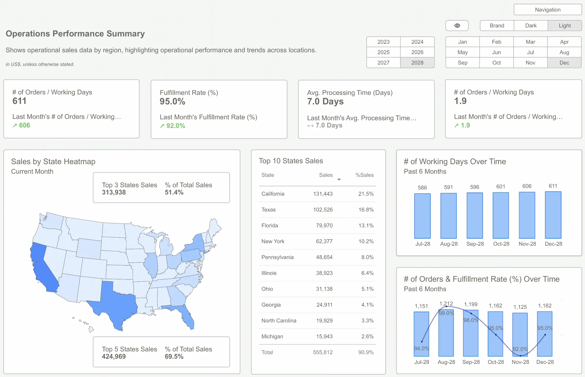
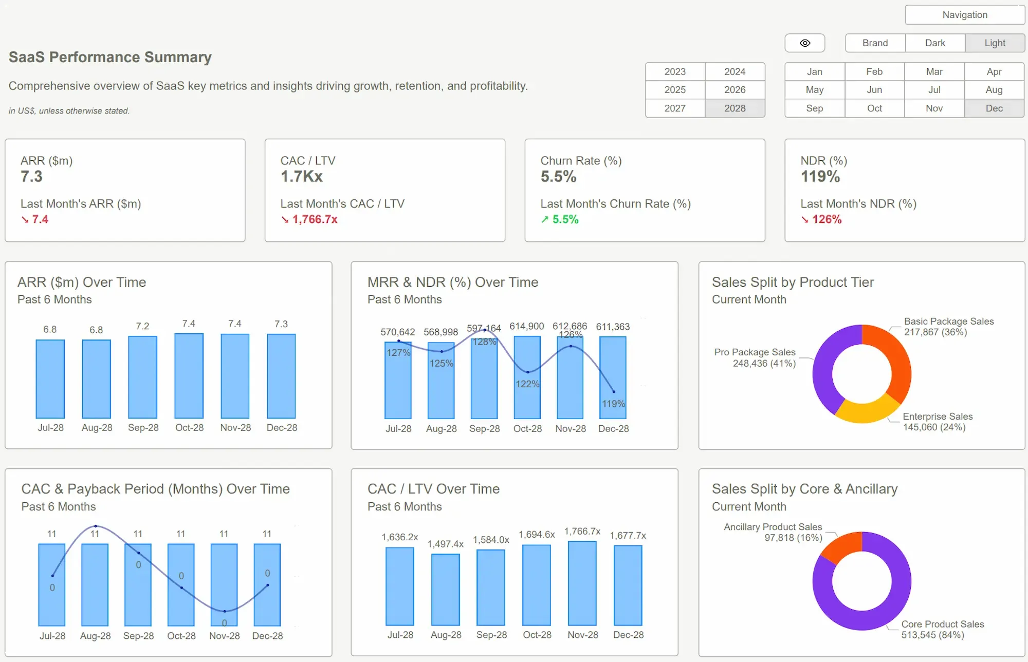
4. Operations, SaaS, or eCommerce dashboards
Finally, think about process-heavy or product-heavy teams:
- An Operations Power BI Dashboard tracks throughput, utilization, downtime, and defect rates, with a clear view of bottlenecks in the process.
- A SaaS Power BI Dashboard highlights MRR, churn, expansion, and product adoption by feature.
- An eCommerce Power BI Dashboard focuses on revenue, conversion rate, average order value, and cart abandonment, with clear segmentation by device, campaign, and geography.
Each of these dashboards “feels” different, but the underlying principles are identical: clear purpose, strong visual hierarchy, trustworthy data model, and interactions that make it easy for non-analysts to explore.
Professional Power BI Kit templates package these patterns into ready-made dashboards so you don’t have to model them from scratch – you plug your data into a structure that’s already proven to work.
 DAX GuidePower BI Templates
A good Power BI Dashboard isn’t defined by how many visuals you can cram onto a page or how advanced your DAX is. It’s defined by how quickly a user can understand what’s happening, why it’s happening, and what they should do next.
When you combine clear purpose, thoughtful visual hierarchy, a solid data model, and purposeful interactions, your Power BI Dashboard stops being “another report” and becomes a decision engine. Whether you build that from scratch or shortcut the process with professional templates is a strategic choice – one that can save you weeks of work and massively increase adoption across the business.
Explore Power BI Kit Templates → Pricing & Buy NowGet Started >
Subscribe to our newsletter
Stay ahead with the latest insights, tips, and trends in PowerBI and data visualization.
Join the network that is unlocking the full potential of their data - one dashboard at a time.
Related posts
Explore more insights and tips with these related posts curated just for you.

Power BI Dashboard Examples That Save Time, Impress Leadership, and Actually Work
Visualizing Retention, Churn, and Survivorship in SaaS: Power BI Dashboard Examples That Tell the Full Story