Understanding your SaaS business means more than tracking monthly revenue or daily active users. The real story lies in how long customers stay, why they leave, and what percent complete a full subscription cycle. In other words: retention, churn, and survivorship.
In this post, we’ll explore how Power BI Dashboard Examples can help you visualize these interdependent metrics clearly and powerfully. You'll see how using professional templates — like those from Power BI Kit — turns scattered insights into a complete picture of customer health and revenue potential.
Whether you're a BI analyst building dashboards or an exec scanning KPIs, these examples can reshape how you understand your SaaS business.
The Metrics that Matter: Retention, Churn, and Survivorship
Let’s define the trio at the heart of SaaS longevity:
- Retention Rate: Percentage of users who renew after 12 months.
- Churn Rate: The inverse of retention — those who cancel or drop off before renewal.
- Survivorship Rate: The share of users who successfully complete a full 12-month subscription cycle.
These metrics aren't just related — they're mathematically and operationally entangled. For instance:
- A drop in survivorship might indicate deeper engagement or onboarding issues.
- A steady churn rate might hide a shift in user behavior patterns only visible through survivorship metrics.
The problem? Most dashboards don’t track these together. Or worse, they bury them in disconnected reports that never tell the full story.
Professional Power BI Dashboard Examples designed for SaaS solve this by visualizing these KPIs in coordinated, interactive views, enabling users to:
- See cohort behavior over time.
- Compare churn timing patterns (early vs. late dropout).
- Align retention efforts with actual survivorship data.
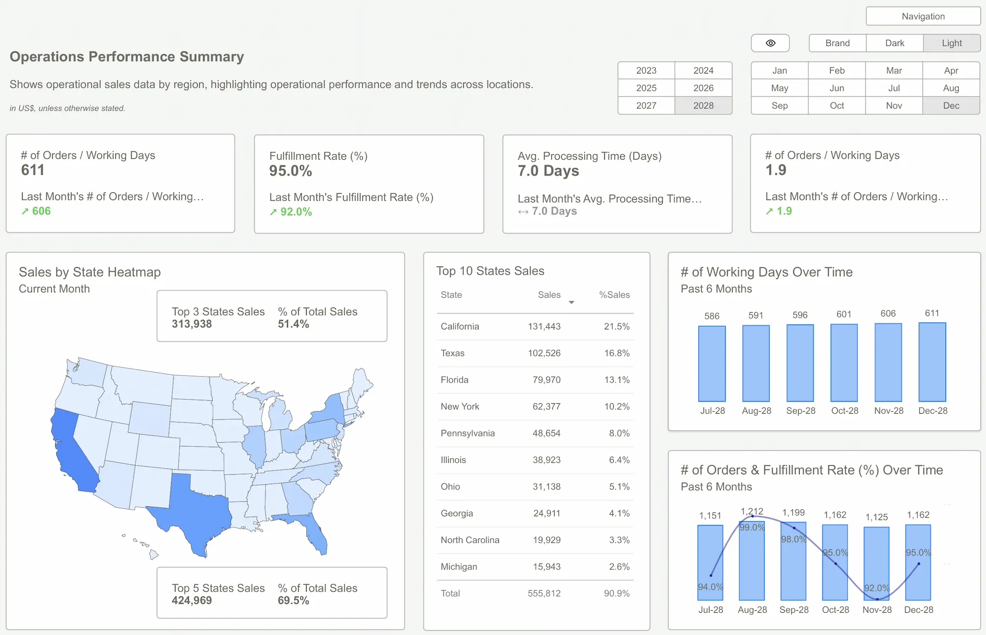
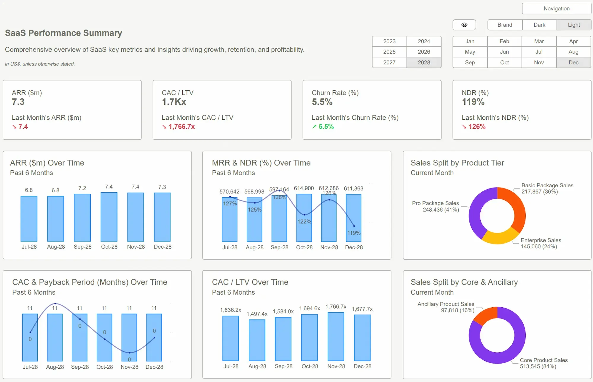 Power BI Dashboard Examples
The Visualization Framework: How Pros Connect the Dots
When visualized poorly, these metrics become noise. But with a structured Power BI dashboard, they become narrative drivers.
Here’s what a professional-grade SaaS dashboard template from Power BI Kit typically includes:
- Cohort Retention Charts: Monthly slices that show which cohorts stay, leave, or lapse over time.
- Survivorship Funnels: Visuals that map how many users make it from signup to 12-month completion.
- Dynamic Churn Tables: Filters to explore churn reasons, timing, and trends across segments.
These visuals aren’t just aesthetic upgrades. They enable deeper storytelling:
- Identify when churn spikes (month 2 vs. month 11).
- Detect retention boosts after onboarding redesigns.
- Forecast long-term revenue based on survivorship patterns.
And because Power BI Kit templates come with pre-modeled data relationships and pre-written DAX, you can explore these insights without building from zero.
 Building vs. Buying Power BI Templates: A Cost-Benefit Breakdown
From Confusion to Clarity: Why Templates Are the Shortcut
Let’s be honest — building a Power BI dashboard that handles these metrics properly from scratch is a technical rabbit hole.
You need:
- Advanced DAX to calculate cohort-based retention.
- Thoughtful visuals that guide rather than overwhelm.
- Clean data models that scale with growing user bases.
Most DIY attempts fall short, leaving you with fragmented dashboards that confuse stakeholders and bury insight.
That’s why professional Power BI Dashboard Examples — like the ones offered by Power BI Kit — are a game-changer. They come with:
- Prebuilt structures for key SaaS KPIs (including retention, churn, and survivorship).
- Optimized visuals that bring clarity to cohort data.
- Plug-and-play ease, so you can start analyzing instead of coding.
With these templates, you’ll spend your time interpreting churn reasons or identifying retention levers — not aligning bar charts or troubleshooting broken slicers.
 DAX GuidePower BI Templates
In SaaS, understanding who stays, who leaves, and who completes the journey is critical for sustainable growth. But these insights only emerge when you visualize metrics from multiple directions — together.
Using Power BI Dashboard Examples built for SaaS gives you a professional edge. You stop guessing and start seeing the full picture: cohort behavior, churn velocity, survivorship trends — all in one place.
If you're ready to move beyond basic dashboards and deliver real strategic insight, it’s time to explore Power BI Kit’s SaaS-focused templates.
Explore Power BI Kit Templates → Pricing & Buy NowGet Started >
Subscribe to our newsletter
Stay ahead with the latest insights, tips, and trends in PowerBI and data visualization.
Join the network that is unlocking the full potential of their data - one dashboard at a time.
Related posts
Explore more insights and tips with these related posts curated just for you.

What Makes a Good Power BI Dashboard? Design Principles and Examples

Power BI Dashboard Examples That Save Time, Impress Leadership, and Actually Work