In the modern enterprise, data is oftendescribed as the new oil. However, oil is useless until it is refined intofuel. For most organizations, that refining process happens within a dashboard.Yet, despite the billions spent on data engineering and backend architecture,the final mile of data delivery, the user interface, is frequently neglected.
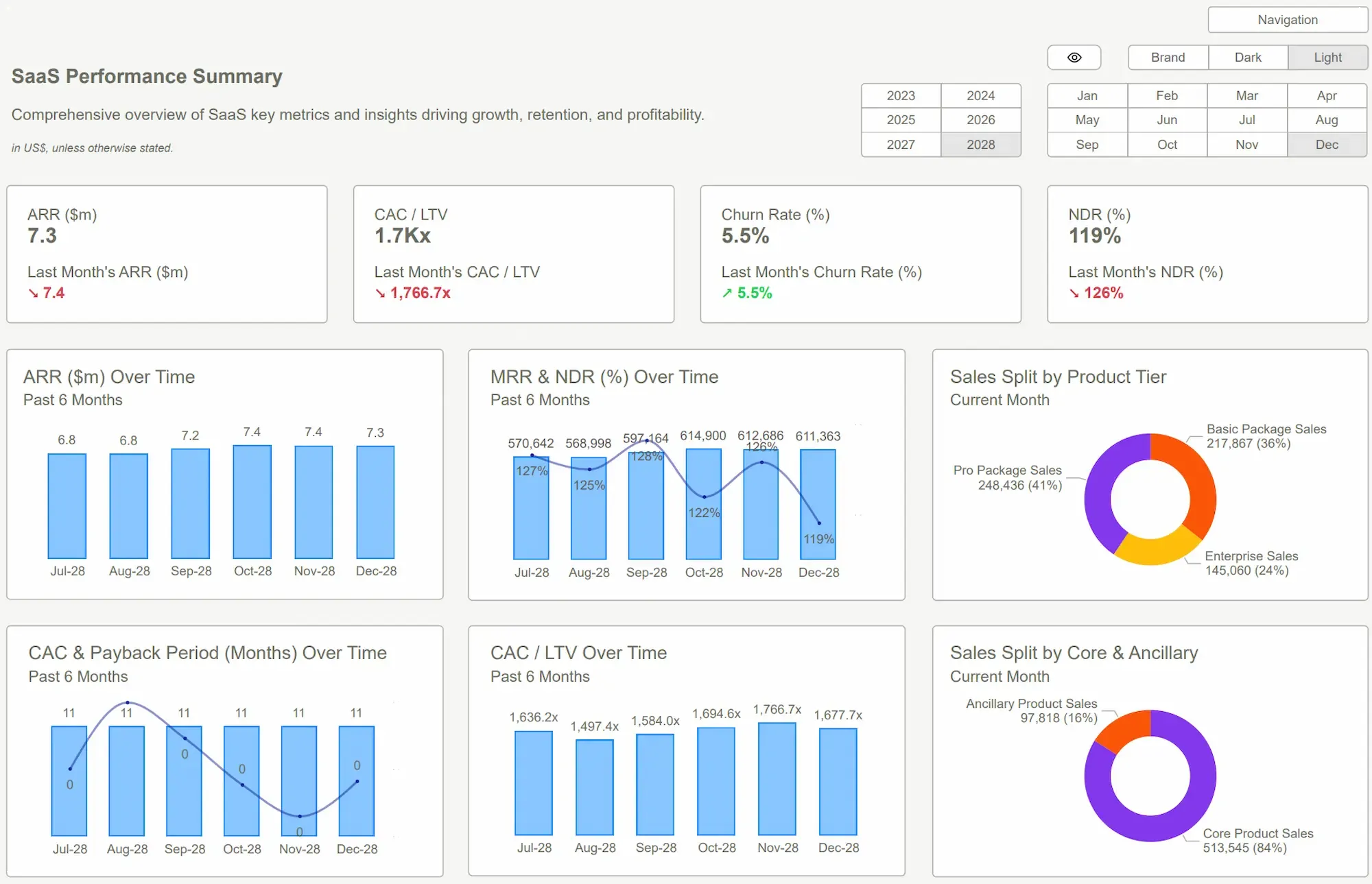
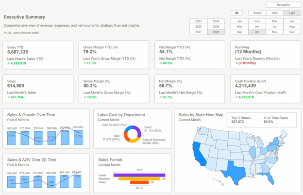
Many teams still rely on dashboards that feeldisconnected, inconsistent, and difficult to navigate. While the underlyingnumbers may be perfectly accurate, the presentation often creates a cognitivetax on the user, leading to confusion instead of clarity. A branded Power bi dashboard solves this gap by bringing structure, consistency, and visual alignment into one unified system. It turns scattered, organic reports into a reliable decision-making tool that teams can actually depend on.
The Problem with Unstructured Reporting
In most fast-growing companies, dashboards groworganically rather than strategically. One department builds a sales tracker;another builds a supply chain overview. Because these reports are built bydifferent individuals with varying levels of design expertise, they inevitablyuse different formats, color palettes, and navigation logic.
Over time, this leads to fragmented reporting. When a leadership team looks at five different reports that all look and feeldifferent, their brains have to re-learn how to read the data every time they switch tabs. This lack of consistency leads to a significant hidden cost: lost productivity. Teams spend more time validating where a metric is located or questioning why the blue on one chart means something different than the blue on another, rather than they do actually making decisions.
This issue is not about data availability; it is about data accessibility. When dashboards lack a professional, branded framework, they feel like temporary tools rather than permanent infrastructure. This erodes trust. If a dashboard looks unpolished or broken visually, users instinctively begin to wonder if the data itself is unpolished or broken. Without a unified visual language, data democratization becomes impossible because the barrier to entry for the average user is simply too high.
Why Professional Power bi Dashboards Outperform the Rest?
A professional Power bi dashboard turns raw data into a clear and reliable decision system. It goes beyond static reports and functions as a structured tool that supports business performance. A branded Power bi dashboard ensuresconsistency, clarity, and usability across teams.
Design plays a critical role in how usersinteract with data. Strong dashboards focus on clarity and flow:
● Logical layout that guides usersfrom key metrics to deeper insights
● Clean visuals that reduce clutterand improve focus
● Consistent colors and typographyaligned with brand identity
Technical strength ensures the dashboardperforms without friction:
● Fast load times, even with largedatasets
● Accurate calculations built on solid data models
● Seamless integration with multipledata sources
Operational efficiency improves how teams usedata daily:
● Quick access to important metricswithout manual effort
● Simple filters and intuitivenavigation
● Reduced dependency on technical teams
A branded Power bi dashboard also supports long-term growth:
● Flexible structure that adapts to new data
● Consistent reporting across departments
● Easy updates without a full redesign
Most importantly, it drives better decisions by making insights clear, reliable, and actionable.
Scaling Excellence with PowerBiKit Templates
One of the greatest challenges in achieving this level of branding is the blank canvas problem. Most data analysts are experts at DAX and SQL, but they are not graphic designers. Expecting an analyst to build a high-end UI from scratch for every report is an inefficient use ofresources. This is where a structured approach becomes essential. By utilizing a PowerBiKit, organizations can bypass the tedious process of manual UI construction.
Using a PowerBiKit allows the data team to focus on the "what" (the data) while the "how" (the presentation) is handled by a pre-optimized system. This ensures scalability; whether the company has ten dashboards or a thousand, they all maintain a cohesivebrand identity and a high level of performance.
Steps to Implement a BrandedDashboard Strategy
Transitioning to a branded environment does notrequire deleting all existing reports. It requires a shift in strategy.
● Audit the Current State: Identify the most-used reports and look for common inconsistencies. Isprofit represented by three different colors across three different pages?
● Establish a Style Guide: Define the rules of the road. This includes your Power bi theme file(JSON), icon sets, and font choices.
● Develop a Core Master Template: Create a North Star dashboard that serves as the blueprint for all future builds. This is where a PowerBiKit becomes invaluable, as itprovides a ready-made foundation that can be customized to the brand.
● Empower the Creators: Provide the data team with the assets they need. When the right way to build a dashboard is also the easiest, adoption happens naturally.
Common Pitfalls to Avoid
Even with the best intentions, branding can go wrong if it prioritizes style over substance. Avoid these common mistakes:
- Over-Branding: Using too many brand colors can distract from the data. If your brand color is bright red, using it for every chart may signal an emergency to the user when the data is actually positive. Use brand colors for headers and highlights, but keep the data visualizations neutral and functional.
- Ignoring Performance: High-resolution background images can slow down report loading times significantly. Use lean, SVG-based designs and native Power bi theme files to keep the experience fast and responsive.
- Complexity Over Clarity: Never sacrifice the readability of a chart for the sake of a cool layout. If a user cannot understand the chart in five seconds, the design has failed.
The Strategic Asset of Visual Data
A branded Power bi dashboard is not merely are porting tool; it is a strategic asset. It aligns teams, improves communication, and accelerates the transition from data-gathering to decision-making. In a world where every company has data, the competitive advantage goes to the company that can actually understand and utilize that data the fastest.
By investing in a professional UI/UX approach, facilitated by tools like a PowerBiKit, organizations ensure that theirinsights are presented with the clarity and authority they deserve. It turns the last mile of data into the most valuable mile.
Conclusion
The transition from raw data to actionable insight requires more than just technical accuracy; it requires a commitment toprofessional presentation. Without structure and consistency, even the most accurate data can lose its impact.
A branded Power bi dashboard brings clarity, trust, and efficiency into everyday decision-making, transforming data from astatic resource into a dynamic system that supports growth and organizational alignment. By standardizing the visual experience, you ensure that every stakeholder, from the front-line manager to the CEO, can draw the same conclusions from the same reliable data.
Explore our Power bi DashboardExamples to see how a structured, branded approach can revolutionize yourreporting. Start building faster, clearer, and more impactful dashboards today.

 Get Started >
Subscribe to our newsletter
Stay ahead with the latest insights, tips, and trends in PowerBI and data visualization.
Join the network that is unlocking the full potential of their data - one dashboard at a time.
Related posts
Explore more insights and tips with these related posts curated just for you.

What Makes a Good Power BI Dashboard? Design Principles and Examples

Power BI Dashboard Examples That Save Time, Impress Leadership, and Actually Work