The landscape of business intelligence is undergoing a fundamental shift. For years, the primary challenge for analytics departments was data ingestion, simply getting disparate data sources to talk to one another. Today, that hurdle has largely been cleared by modern dataware housing. The new bottleneck is communication.
Analytics teams across modern organizations are facing unprecedented pressure to deliver faster, more actionable insights. Executives no longer have the patience for complex, cluttered reports that require a manual to interpret. They expect dashboards that tell a story,explain performance clearly, and highlight the why behind the numbers. As the volume of operational, marketing, and financial data grows, the challenge has moved from the back-end to the front-end: how do we present this information in a way that actually drives a business forward?
Analytics Workflows Are Changing
Traditional reporting methods are becoming a liability. In many legacy environments, every new dashboard request triggers a manual, ground-up design process. An analyst must decide on a color palette, determine a navigation structure, choose the right visuals, and ensure the layout is responsive. This repetitive work consumes a significant portion of a developer's week, time that should be spent on deep-dive analysis or predictive modeling.
This is why we are seeing a mass migration toward the use of structured PowerBI dashboard templates. By adopting a template-based workflow, teams are no longer treating every report as a unique art project. Instead, they are utilizing proven visual frameworks that allow them to focus on data accuracy and insight generation rather than pixel-pushing.
Why Structured BI Dashboards Improve Decision Making?
Business leaders rely on dashboards to guide daily tactical decisions and long-term strategic shifts. When these dashboard slack consistency, the cognitive load on the executive increases. If the sales dashboard looks completely different from the marketing dashboard, the user spends the first few minutes simply orienting themselves rather than absorbing the data.
Structured dashboards solve this by creating a predictable environment. When a layout is consistent, the human brain knows exactly where to look for the most critical information. Key Performance Indicators (KPIs) are usually placed at the top left, the first place the eye naturally lands. Historical trends follow, and granular, drill-down data sit sat the bottom.
This logical arrangement supports faster comprehension and far more productive strategic discussions. When a leadership team enters a meeting, they shouldn't be debating what a visual means; they should be debating what the data is telling them to do next. Well-designed PowerBI dashboard templates embed this clarity into the reporting culture automatically.
Strategic Dashboards: Visualizing Data with Power BI Kit
For organizations looking to move away from the blank canvas problem, the solution lies in curated reporting environments. Power BI kit provides a series of high-fidelity layouts designed specifically to bridge the gap between technical data and executive needs.
Instead of generic shapes and charts, these frameworks focus on the specific needs of different business units. For instance, a finance team needs to see variance and margins, while an operations manager needs to see real-time throughput and service-level agreements. The dashboard examples provided by PowerBI kit demonstrate how to categorize this information so that it remains digestible, regardless of the complexity of the underlying dataset.
By using these pre-built structures, analytic steams can ensure that their reporting doesn't just look nice, but actually functions as a professional tool for business intelligence.

How Do Ready-Made Templates Accelerate BI Development?
The lifecycle of a custom dashboard is often longer than stakeholders realize. It involves wireframing, stakeholder feedback, UI testing, and mobile optimization. Even for a seasoned PowerBI developer, this cycle can take dozens of hours.
The key advantages of this acceleration include:
● Consistent Design Language: Every department speaks the same visual language, makingcross-functional reviews seamless.
● Rapid Deployment: Reports that previously took weeks can now be deployed in days or even hours. Standardized KPI Placement: Leadership knows exactly where to find the pulse of the business on every page.
● Reduced Technical Debt: PowerBI dashboard templates are easier to maintain over time because they follow a standardized logic.
● Onboarding Efficiency: New analysts can produce high-quality work immediately without needing to learn the design style of the company from scratch.
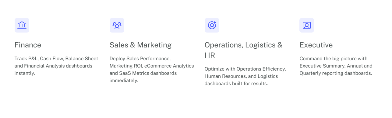
Where BI Templates Deliver the Most Value
While every department benefits from better reporting, there are specific areas where a structured template approach offers the highest return on investment.
● Sales Performance Dashboards
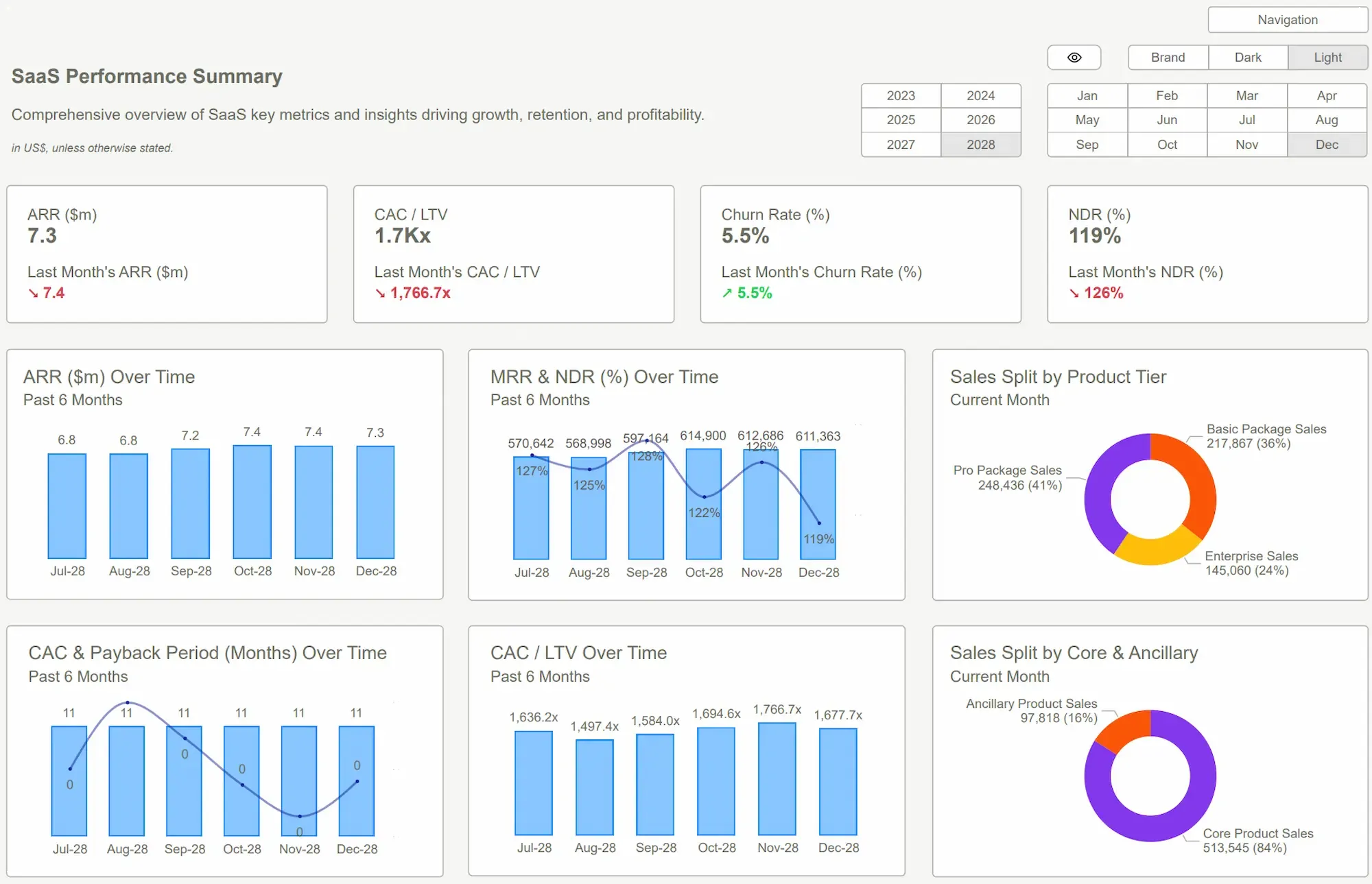
Sales teams are notoriously fast-paced. They need to monitor revenue growth, pipeline health, and quota progress in real-time. A PowerBI dashboard template allows the sales lead to see the big picture (total revenue) and the small picture (individual rep performance)without switching screens.
● Marketing Analytics Dashboards
Marketing data is often scattered across various platforms. A structured template brings clarity to lead generation, cost-per-acquisition, and channel engagement. It allows marketers to compare the performance of different campaigns side-by-side using a unified metrics ystem.
● Financial Reporting Dashboards
Accuracy and clarity are non-negotiable in finance. Financial templates help monitor profit margins, operational expenses, and budget-to-actuals. These dashboards provide the CFO with a clean, summarized view that is ready for a board-level presentation at any moment.
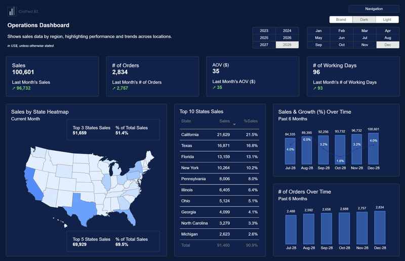
● Operational Performance Dashboards
Operations depend on efficiency. By tracking service delivery metrics and productivity trends through a consistent PowerBI dashboard template, managers can quickly identify bottlenecks and process improvements before they impact the bottom line.
Save Time Instantly With Smarter Dashboard Design
Analytics teams often spend hours learning chart design or experimenting with layouts before a dashboard becomes usable. That time rarely adds value to the actual analysis. With structured templates from PowerBI Kit, professionals see tutorials and start working with clear, polished dashboards immediately.
High-quality layouts help visualize metrics such as sales performance with geographic heatmaps and operational indicators. Strong design improves readability, builds trust in reports, and helps leadership understand insights quickly. When dashboards present data clearly, teams focus on strategy, drive faster decisions, and transform raw numbers into meaningful business stories.
Building a Scalable BI Framework
Ultimately, the move toward PowerBI dashboard templates is about more than just saving time. It is about building a scalable framework for the future. As organizations become more data-driven, the number of reports will only increase. Without a standardized approach, the BI ecosystem will become a Wild West of inconsistent designs and confusing metrics.
By establishing a unified reporting framework, companies ensure that their data assets remain valuable. When everyone, from the intern to the CEO, understands how to read the company's dashboards, the organization can move faster. Consistency breeds confidence, and confidence leads to more decisive action.
Conclusion
The shift toward PowerBI dashboard templates represents the maturation of the analytics industry. We are moving away from the era of bespoke reporting and into the era of reporting systems. For the modern analytics team, success is no longer measured by the ability to build a chart, but by the ability to deliver clear, consistent, and rapid insights.
By leveraging a structured approach like the one offered by PowerBI kit, organizations can transform their data from a confusing burden into a strategic advantage. It allows analysts to return to what they do best: interpreting data and providing the insights that move the needle.
Explore the PowerBI kit Dashboard Examples today and see how a professional UI/UX framework can accelerate your team's path to better business intelligence.
 Get Started >
Subscribe to our newsletter
Stay ahead with the latest insights, tips, and trends in PowerBI and data visualization.
Join the network that is unlocking the full potential of their data - one dashboard at a time.
Related posts
Explore more insights and tips with these related posts curated just for you.

What Makes a Good Power BI Dashboard? Design Principles and Examples

Power BI Dashboard Examples That Save Time, Impress Leadership, and Actually Work