In the modern corporate landscape, organizationsare rarely short on data. They collect vast volumes of operational metricsevery hour, sales reports, marketing performance, financial health indicators,and customer behavioral insights. However, this data often sits trapped acrossdisparate systems and siloed spreadsheets. Without a structured visual layer tounify these numbers, decision-makers often struggle to turn raw figures intomeaningful conclusions.
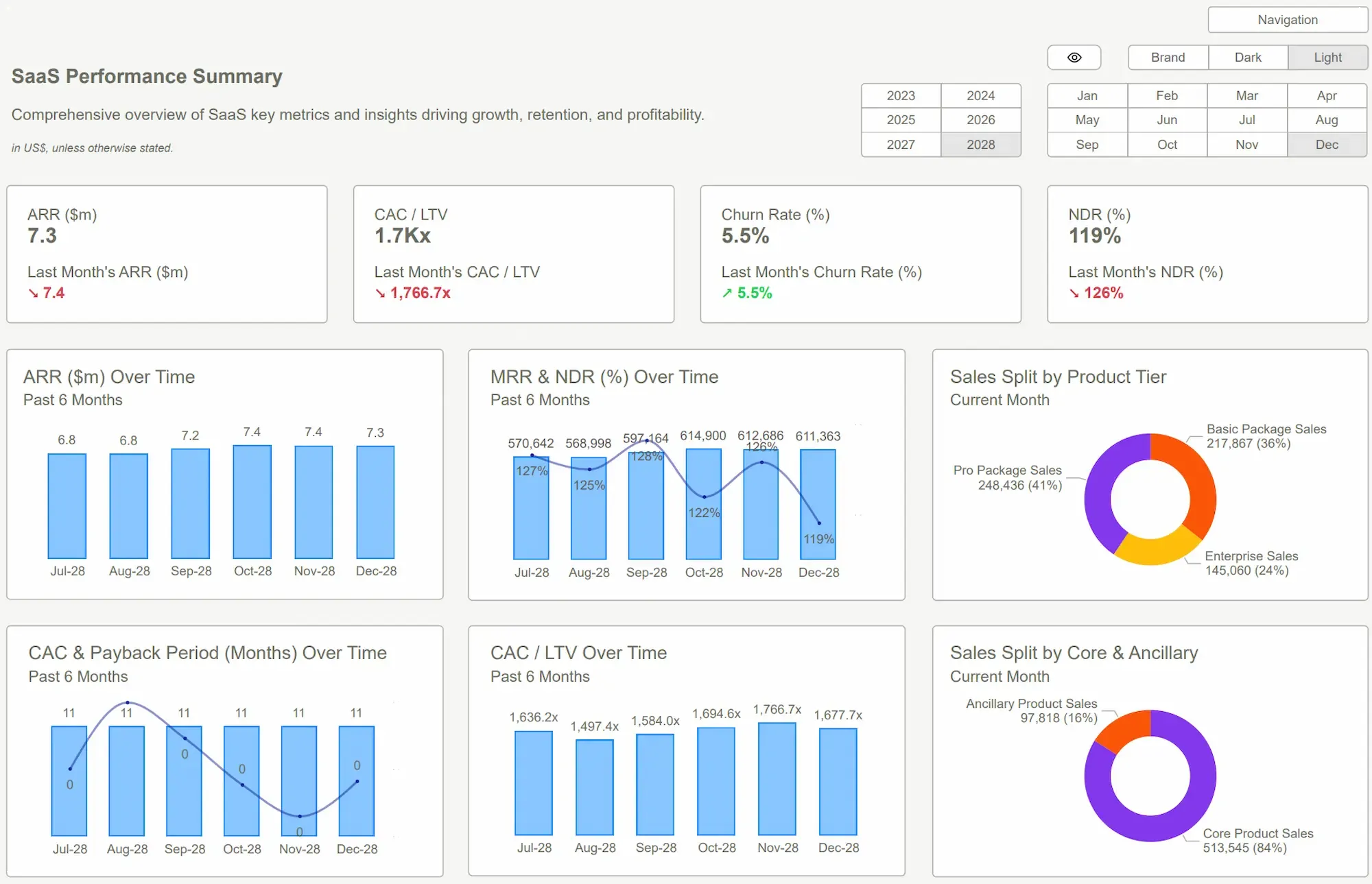
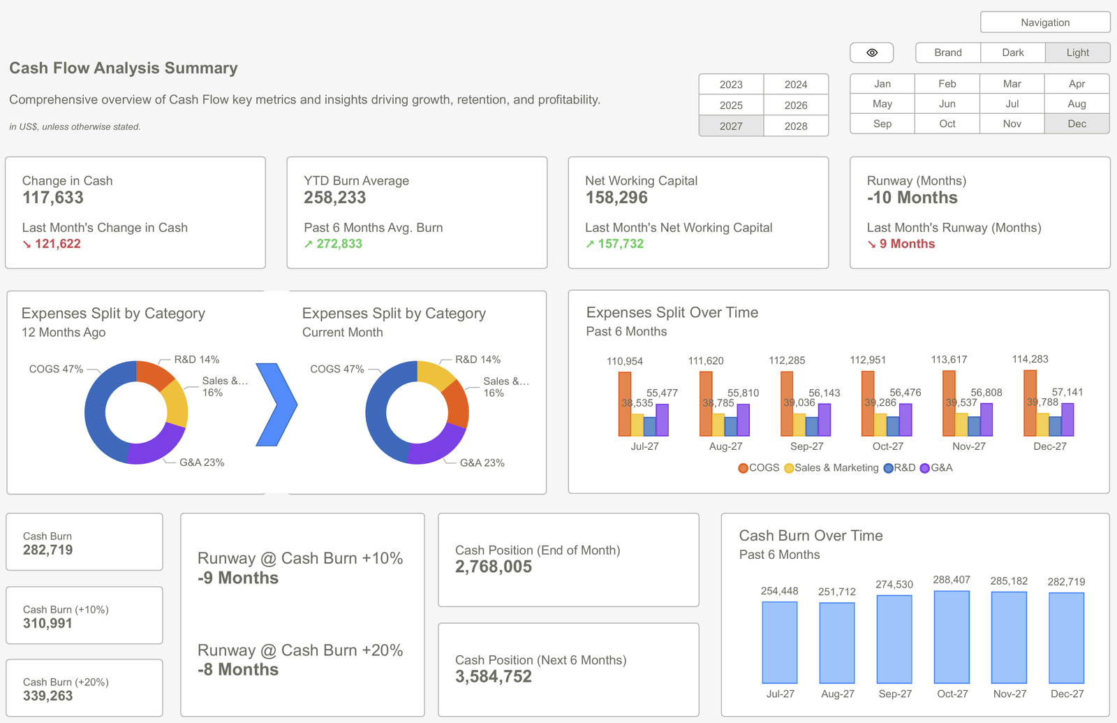
A well-structured sample PowerBI dashboard serves as the essential bridge between raw data and executive action. Insteadof scanning endless rows of a spreadsheet, teams can view trends, performanceindicators, and cross-functional comparisons within a single, unifiedworkspace.
However, building an effective dashboard fromthe ground up is a daunting task. It requires a rare intersection of designexperience, data modeling knowledge, and significant time. For many reportingteams, pre-built templates provide a faster, more reliable starting point thatensures professional standards are met from day one.
Why Businesses Start with a Proven Dashboard Structure?
By starting with a sample PowerBI dashboard, an organization bypasses the trial-and-error phase of report design. These frameworks presentdata through a tested layout that prioritizes usability and clarity. They organize key metrics into a logical hierarchy where the most critical numbersappear first, followed by supporting charts and detailed granular breakdowns. This structure allows everyone, from high-level executives to daily operational teams, to interpret insights with minimal friction.
The benefits of adopting a structured starting point include:
● Professional Visual Layouts: Ensuring that white space, alignment, and color theory are used to improve readability rather than distract from the content.
● Strategic KPI Placement: Positioning performance indicators where the eye naturally lands, typically starting at the top left.
● Built-in Interactivity: Utilizing pre-configured filtering and drill-down capabilities that allow users to explore and analyze the data.
● Rapid Implementation: Cutting the development cycle by removing the need for manual formatting and element arrangement.
The Architecture of Effective Decision-Making
Effective dashboards are not merely collections of charts; they are architectural achievements in data storytelling. A strong sample PowerBI dashboard typically follows a three-layered information hierarchy, often referred to by experts as the Overview First, Zoom and Filter, Then Details-on-Demand approach.
1. The Executive Summary Layer
The top layer of a dashboard should highlight essential business metrics. These high-level figures summarize overall performance at a glance. They allow leaders to determine immediately if the business is on track or if a specific department requires urgent attention. If this layer is designed correctly, a stakeholder should be able to grasp the pulse of the company in under ten seconds.
2. The Analytical Trend Layer
The middle section introduces trend analysis. This is where the dashboard explains the why behind the numbers. Charts in this section display movement over time, revealing seasonal patterns, growth cycles, or sudden regressions. By visualizing these shifts, teams can move from reactive management to proactive strategy.
3. The Granular Detail Layer
The final section offers a deep exploration. Through tables and detailed visuals, analysts can investigate root causes. For instance, if the top layer shows a dip in profit, and the trend layer shows a spike in costs, the detail layer allows the user to identify exactly which vendor or region caused the anomaly.
This layered approach mirrors the way the human brain naturally processes information. By guiding the user from the big picture down to the fine print, a structured dashboard prevents the information paralysis that occurs when too much data is presented all at once.
Accelerating Success with PowerBI Kit Templates
PowerBI Kit offers a curated collection of professionally designed dashboard templates created specifically to meet the demands of high-stakes business reporting. These templates provide the necessary visual hierarchy and ready-to-use components that allow an organization to maintain a gold standard of reporting across every department.
The primary advantage of using a PowerBI Kit framework is the focus on user experience. Visual spacing, color balance, and KPI placement are not accidental; they are based on established data visualization best practices.
For the reporting team, the process becomes incredibly streamlined: they simply connect their unique data sources and replace placeholder metrics with their specific business indicators. This allows for a consistent visual language across the company, ensuring that a report from the Finance team looks and feels just as professional as a report from the Marketing or Sales teams.
Adapting Frameworks to Specific Operational Needs
While a sample PowerBI dashboard provides the essential structural foundation, the ultimate strength of a template lies inits flexibility. No two businesses are identical, and a professional template should be treated as a high-quality chassis that can be customized to fit thespecific engine of a company’s data.
Organizations typically adapt these frame works in several key ways:
● Branding and Identity: Applying corporate color palettes, logos, and typography to ensure the report feels like an integrated part of the company's internal ecosystem.
● Data Integration: Connecting the template to live data streams from CRMs, ERPs, or specialized marketing platforms.
● Custom Logic: Modifying DAX (Data Analysis Expressions) to reflect unique company formulas for Gross Margin or Customer Lifetime Value.
● Stakeholder Tailoring: Adjusting the level of detail based on who will be viewing the report, ensuring that a regional manager sees different details than a C-suite executive.
Conclusion
A sample PowerBI dashboard is more than just a shortcut; it is a standardized method for ensuring that data is communicated effectively. By utilizing structured layouts, logical hierarchies, and professional visual components, organizations can move away from guessing and toward knowing.
Templates provide the design consistency and implementation speed required to keep up with the pace of modern business. When a report follows a clear, professional format, decision-makers can review insights quickly, align their teams, and act with total confidence. By leveraging the expert frameworks provided by PowerBI Kit, any organization can unlock the full value of its data and turn complex numbers into a clear path forward.
Stop building from scratch and start delivering results. Explore our full gallery of PowerBI Dashboard Examples and download the templates you need to create world-class reports in minutes.
 Get Started >
Subscribe to our newsletter
Stay ahead with the latest insights, tips, and trends in PowerBI and data visualization.
Join the network that is unlocking the full potential of their data - one dashboard at a time.
Related posts
Explore more insights and tips with these related posts curated just for you.

What Makes a Good Power BI Dashboard? Design Principles and Examples

Power BI Dashboard Examples That Save Time, Impress Leadership, and Actually Work